
NOTHING DESIGN | 舒梵北京展厅

Commercial Space Design·Completed 2021·450㎡
Designer:Liu Chang
Beijing,China
项目背景 Project Background
本项目是Sufan舒梵位于北京西店记忆文创小镇的店面设计,这个园区四年前还是北京玻璃厂的库房,建筑斑驳,门口的火车铁轨被荒废,渐渐成为了都市文明遗忘的角落。园区转型成文化创意产业后,相继引进了一批国内比较小众的家具品牌新锐,舒梵就是其中之一。
初次跟舒梵接触,他们的创始人希望新店不仅仅只是一个家具展厅,更要融合舒梵家具的特点和设计理念。以及考虑顾客的空间感受,人围绕着家具走动,能直观感受空间里层次和节奏的变化。
人、物、景的构成,相辅相成,既和谐如画,也流动如乐章。
This project is the storefront design of Sufan Shufan located in the Memory Cultural and Creative Town of Xidian, Beijing. Four years ago, this park was still a warehouse of Beijing Glass Factory, with mottled buildings and abandoned train tracks at the entrance, gradually becoming a forgotten corner of urban civilization. After the transformation of the park into a cultural and creative industry, a group of relatively niche domestic furniture brand newcomers have been introduced, and Shu Fan is one of them.
For the first time in contact with Shufan, their founder hoped that the new store would not only be a furniture exhibition hall, but also integrate the characteristics and design concepts of Shufan furniture. And considering the customer's spatial perception, people can move around furniture and intuitively feel the changes in hierarchy and rhythm in the space.
The composition of people, objects, and scenery complement each other, harmoniously resembling a painting and flowing like a musical movement.
户型图
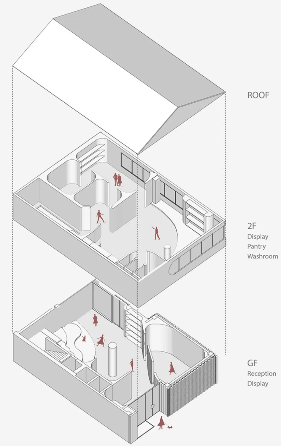
秉承以上关系设想,我们重新构建了顾客、动线、家居产品、陈列之间的格局。
Following the above relationship concept, we have reconstructed the pattern between customers, distribution lines, home products, and displays.
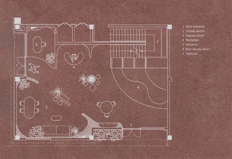
一层有两个入口,空间顺着对角线切成四个部分:一个开放展台、一个三角形的独立区、一个橱窗、以及一个收银台;
There are two entrances on the first floor, and the space is cut diagonally into four parts: an open booth, a triangular independent area, a showcase, and a cash register;
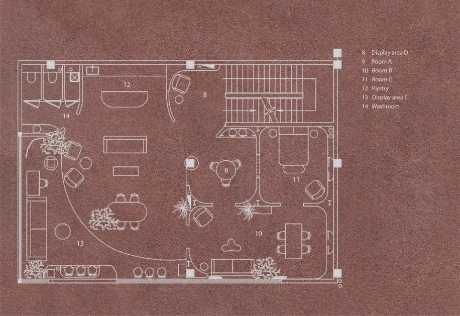
二层以居家的氛围营造三个独立小空间和一个家具开放式展厅,将空间功能公私分区。
The second floor creates a home atmosphere with three independent small spaces and an open furniture exhibition hall, dividing the space into public and private areas.
外立面
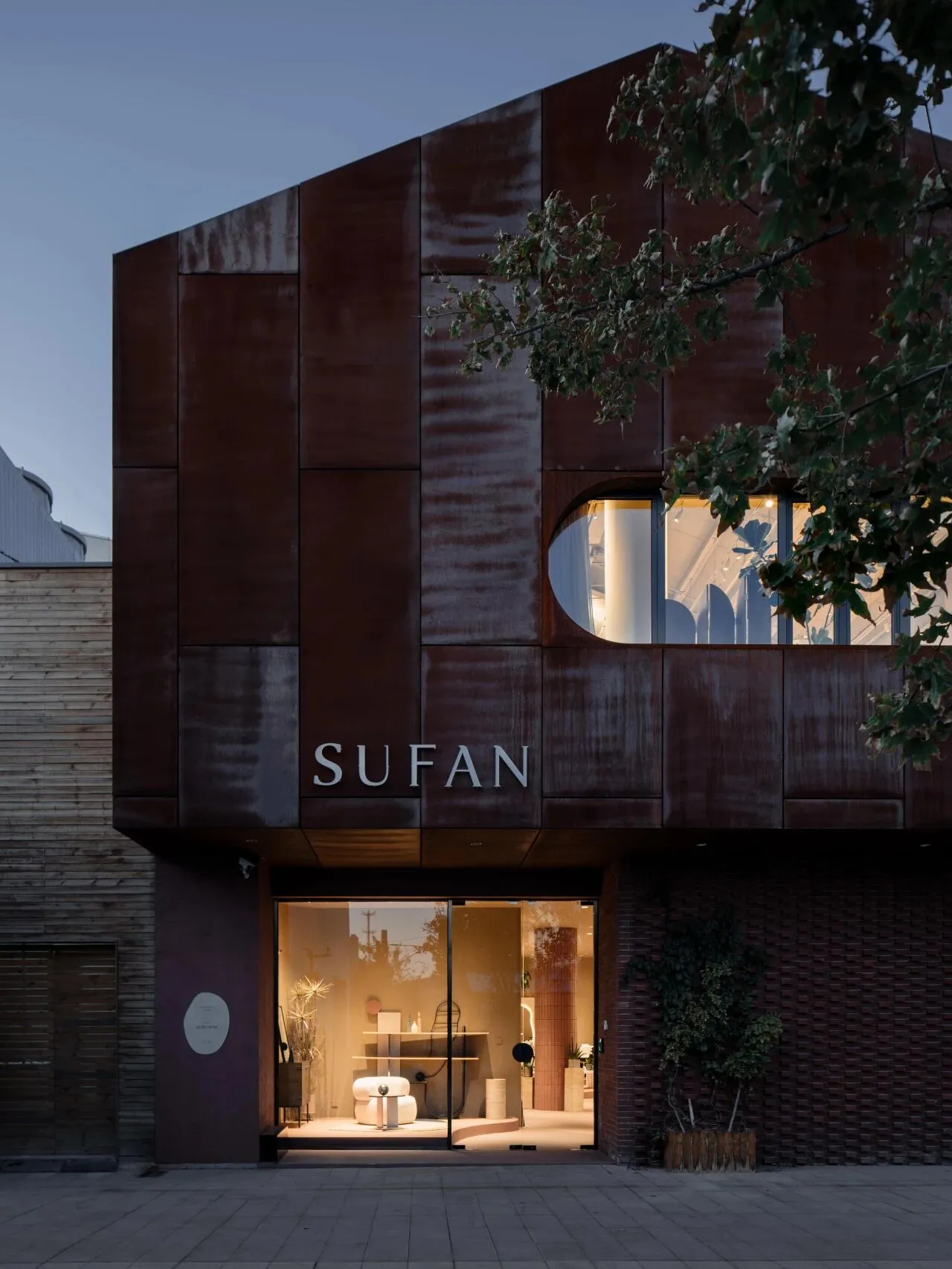
整个空间的设计理念以舒梵2020年新品“曲线之美”为灵感,结合立面、平面、空间秩序、结构关系与空间体验感,通过“曲面形态”为主的造型特点,来体现了舒梵家具柔和、舒适、温馨的美感,也想由此突出产品和环境更和谐统一的关系。
The design concept of the entire space is inspired by Shufan's 2020 new product "The Beauty of Curve", combining the facade, plane, spatial order, structural relationship, and spatial experience. Through the shape characteristics of "curved form" as the main feature, it reflects the soft, comfortable, and warm beauty of Shufan furniture, and also highlights the more harmonious and unified relationship between the product and the environment.
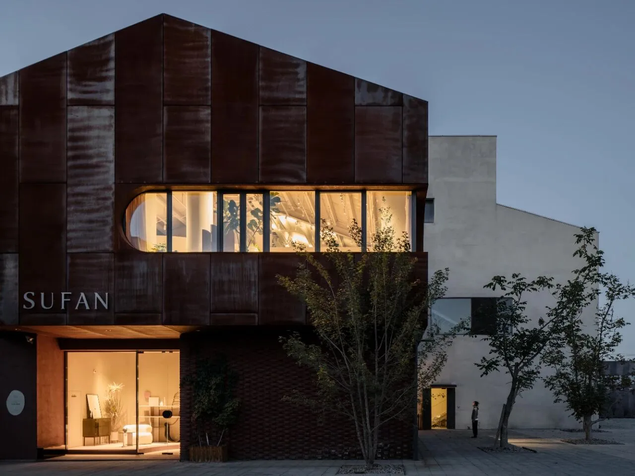
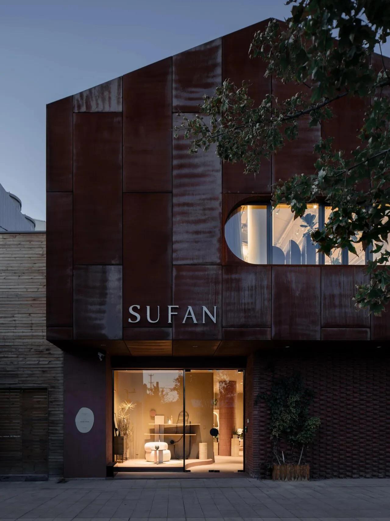
原本的建筑外立面包裹着锈钢板,经过雨水侵蚀,呈现出红色的铁锈,与下面的红砖形成色彩上的统一,质朴却充满着张力。
The original exterior of the building was wrapped in rusted steel plates, which were eroded by rainwater and presented a red rust, forming a color unity with the red bricks below, simple yet full of tension.
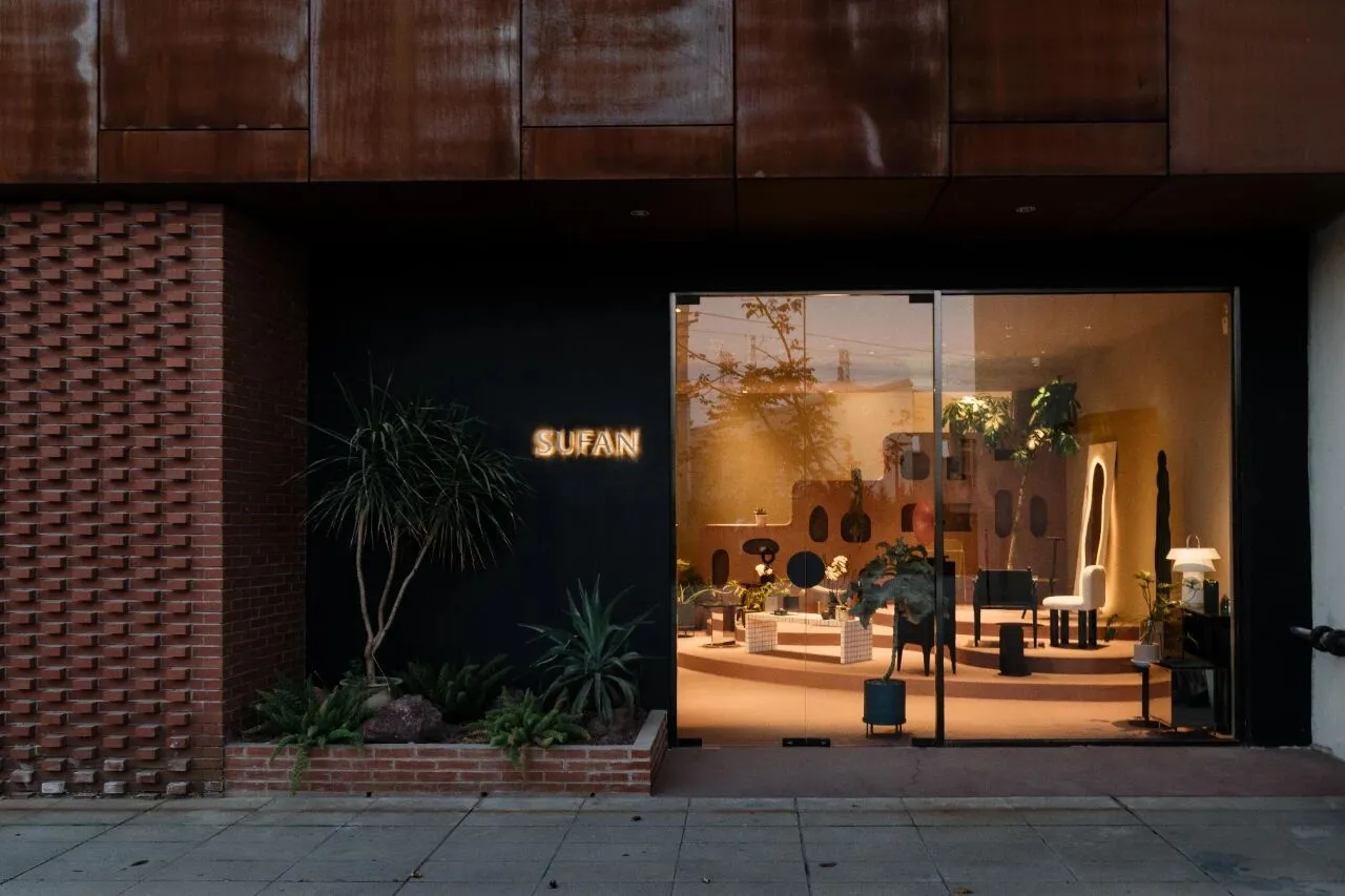
这栋建筑有两个入口,我们适当地改造了一下,主入口的大门刷成了黑色,在门口做了一个花池,弱化门头的主要目的是让整扇玻璃大门就像橱窗一样,突出内部家具陈列展现给公众。
This building has two entrances, and we have made some modifications. The main entrance door has been painted black, and a flower bed has been made at the entrance. The main purpose of weakening the front door is to make the entire glass door look like a showcase window, highlighting the display of internal furniture to the public.
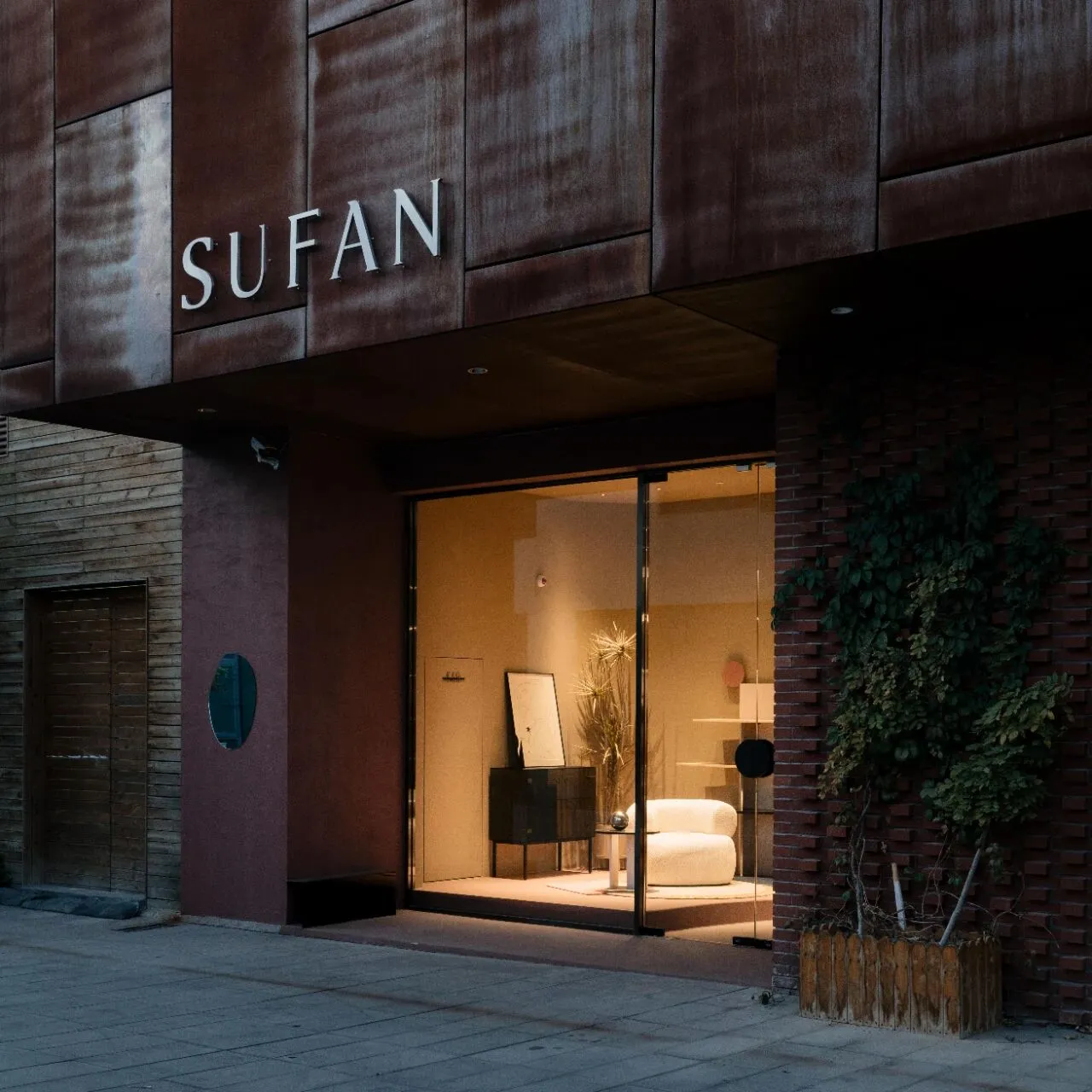
Sufan家具本身的风格偏北欧一些,线条圆润,店面的建筑形态参考了家具的特点,想尽量处理的线条流畅柔和。因此,我们把二楼的窗户也改成圆角,专门找了一模一样的锈板包成了拱形窗户,从而达到一种内外严密的整体性。
Sufan furniture itself has a slightly Nordic style, with rounded lines. The architectural form of the storefront takes into account the characteristics of the furniture, and we want to handle the lines as smoothly and gently as possible. Therefore, we changed the windows on the second floor into rounded corners, and specially found the same rusted plates to wrap them into arched windows, so as to achieve a tight integrity inside and outside.
一层展厅
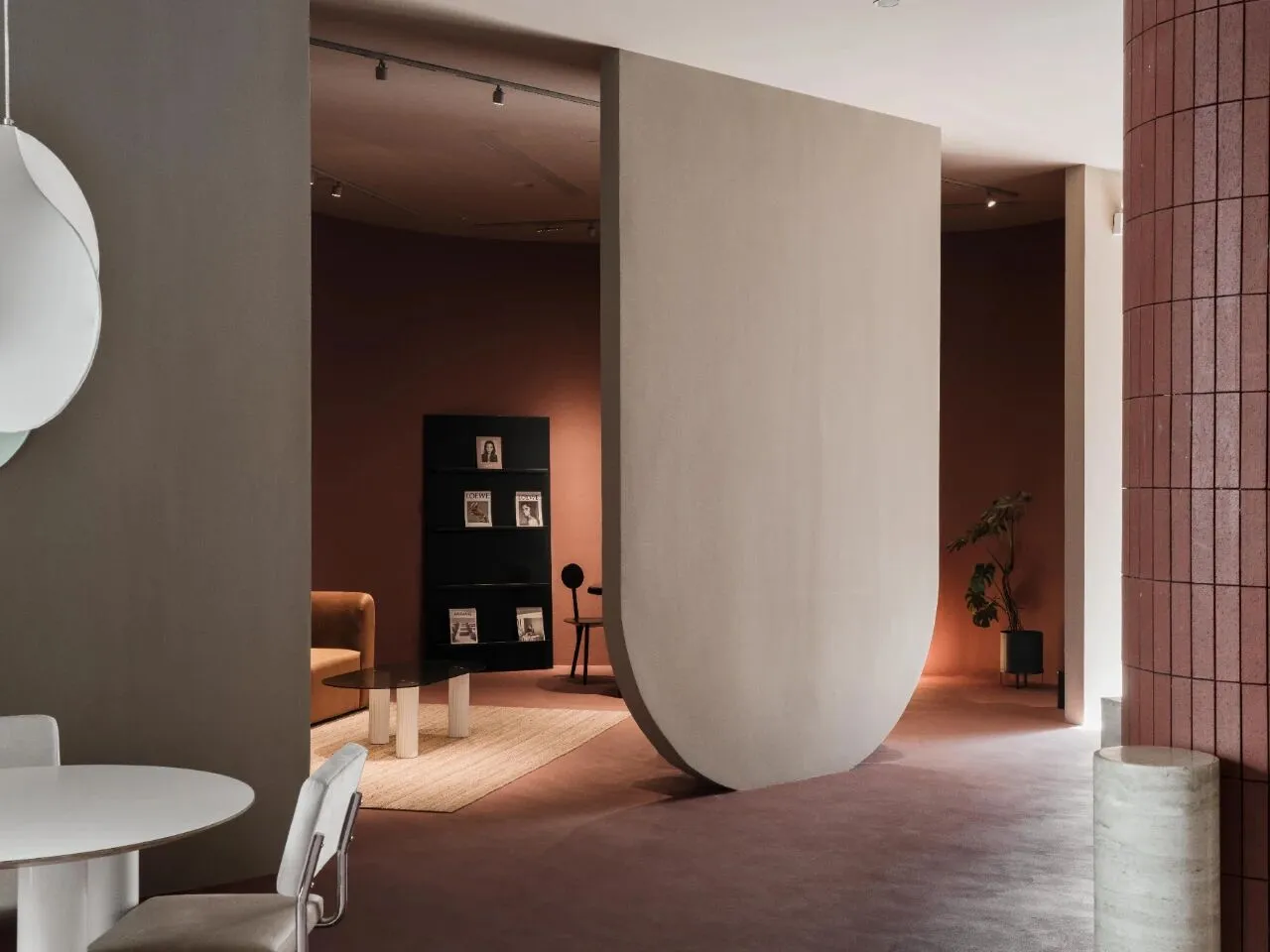
一层空间,我们希望大胆地设计一个比较偏艺术的展厅,结构大胆、格局大胆、材质大胆.
On the first floor, we hope to boldly design an exhibition hall that leans towards art, with a bold structure, bold layout, and bold materials.
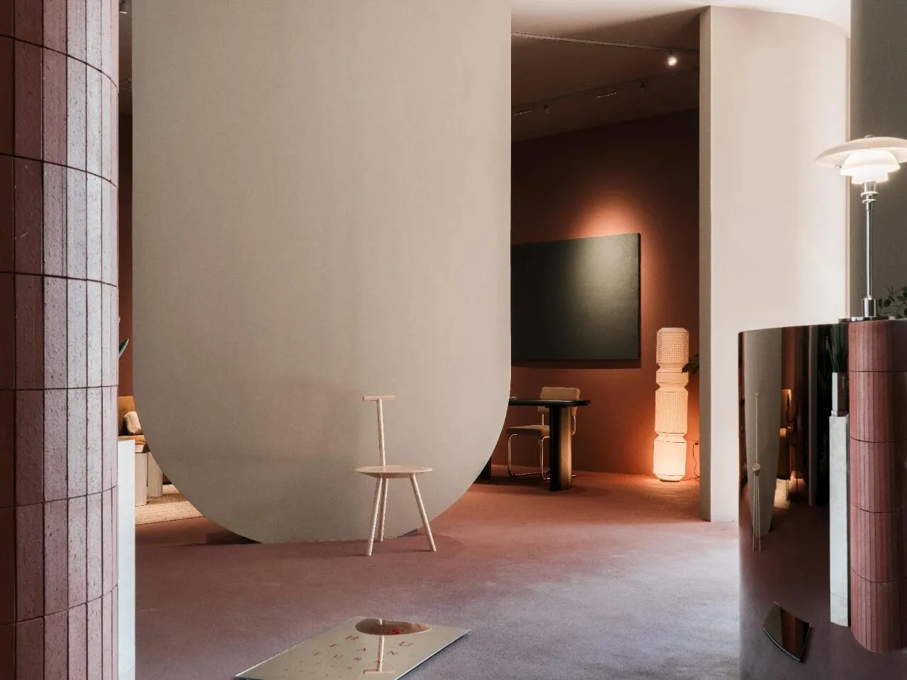
在结构改造上,一些方形的墙柱都处理成圆润线条,比如一层中央的承重柱,原来是方形的,我们把它包成了圆形,还贴了长条红砖,保持颜色一致,能与外面的花园、围墙形成建筑内外的对话。
In terms of structural renovation, some square wall columns are processed into rounded lines, such as the load-bearing column in the center of the first floor, which was originally square. We wrapped it in a circle and pasted long red bricks to maintain consistency in color, forming a dialogue with the outside garden and walls of the building.
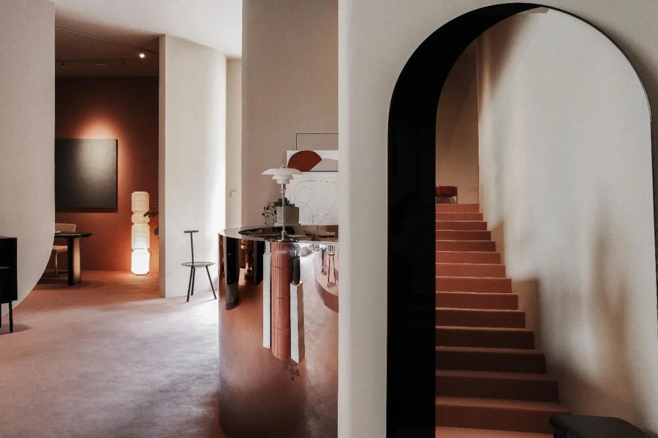
格局上,我们重新规划了展厅动线,利用两个入口对角线将空间切成两片区域:70%的空间是开放的,30%的空间是封闭的。
In terms of layout, we have redesigned the exhibition hall's layout by dividing the space into two areas using two diagonal entrances: 70% of the space is open and 30% is closed.
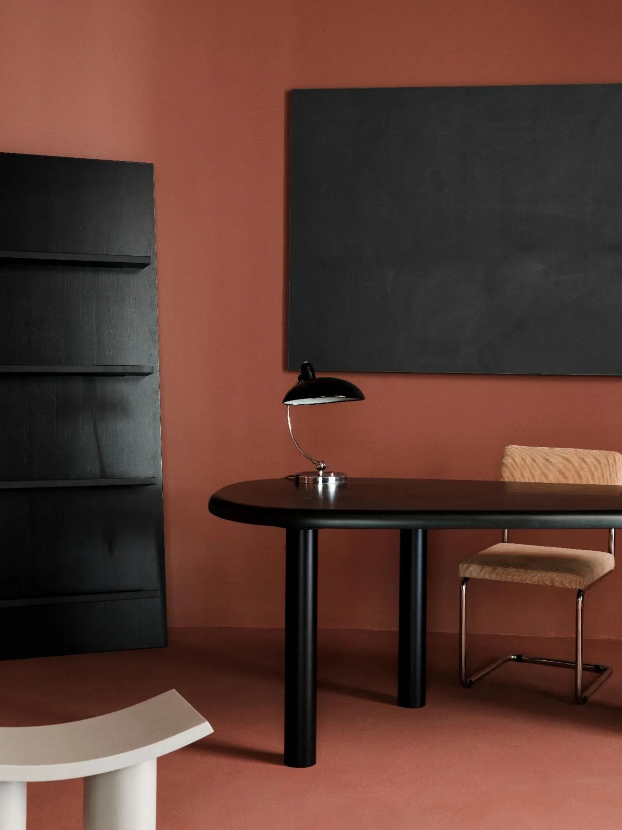
开放区域规划了书桌展示区、餐厅区以及大件展品陈列台;封闭区域设置独立的客餐厅,公私兼备,既有家里大部分空间的展示,也有集中的家具展厅,满足了家具不同的展览需求。
The open area has planned a desk display area, a restaurant area, and a display platform for large exhibits; Set up independent dining rooms in enclosed areas, which serve both public and private purposes. They offer a display of most of the home space as well as a centralized furniture exhibition hall, meeting the diverse exhibition needs of furniture.
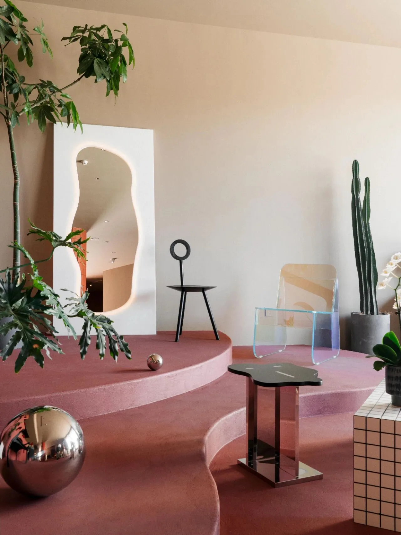
作为购买家具的场所,不仅要满足功能需求,还需要通过设计回应顾客在空间的感受。我们希望每个到访者不管从哪个入口进,第一视角一定是美丽愉悦的景。
As a place to purchase furniture, it is not only necessary to meet functional requirements, but also to respond to customers' feelings in the space through design. We hope that every visitor, regardless of which entrance they enter from, will always have a beautiful and pleasant view from their first perspective.
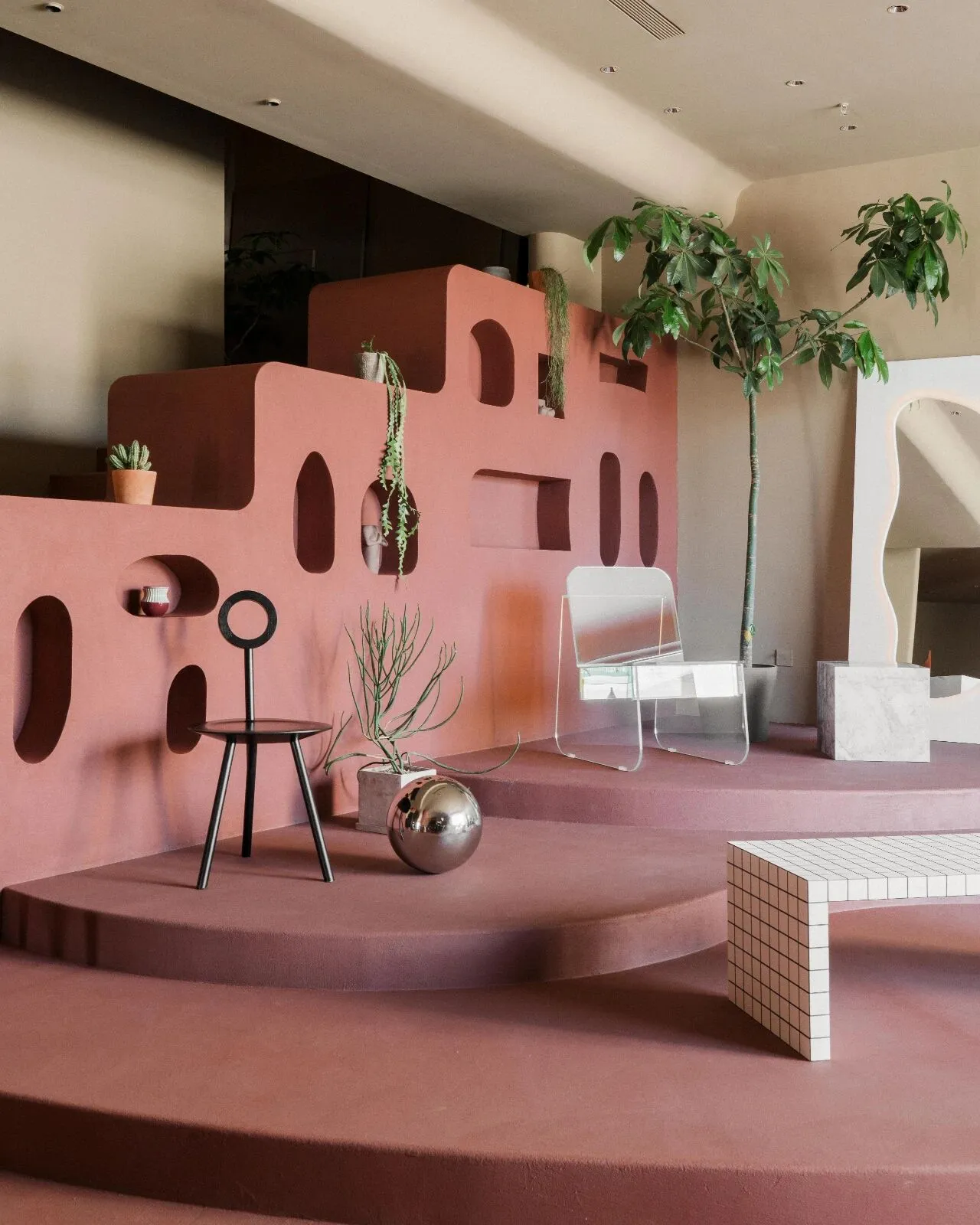
所以,大门处设置了一个阶梯状的弧形展示台,与楼梯侧面的弧形扶手一体,相当于给展示台做了一个微水泥的壁龛背景。
So, a stepped curved display platform was set up at the entrance, integrated with the curved handrails on the side of the stairs, which is equivalent to creating a micro cement niche background for the display platform.
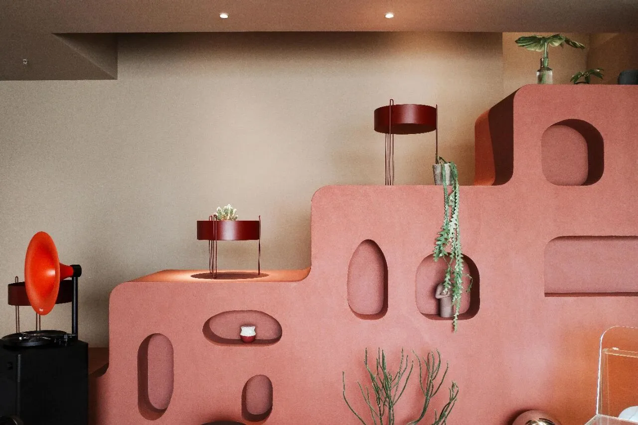
无论你从哪个门进去,第一眼都能看到的这个美美的展示台,三个不同高度的台阶加上壁龛,将各种家具单品以及家居配饰,陈列得错落有致。
No matter which door you enter through, you can always see this beautiful display stand at first glance. With three different heights of steps and niches, various furniture items and home accessories are displayed in an orderly manner.
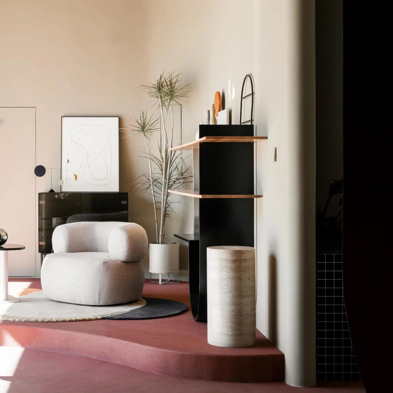
另一扇小门则单独做了一个橱窗,依照居家的陈设布置了一个客餐厅的场景,能沉浸式体验家具的使用感受。进来之后,考虑到了不同区域的规划,收银台专门围合出了一片区域,通过镜面材质拉长空间。
The other small door has a separate display window, which decorates a dining room scene according to the home decor, allowing for an immersive experience of furniture usage. After entering, considering the planning of different areas, the cash register specifically enclosed an area and stretched the space with mirror material.
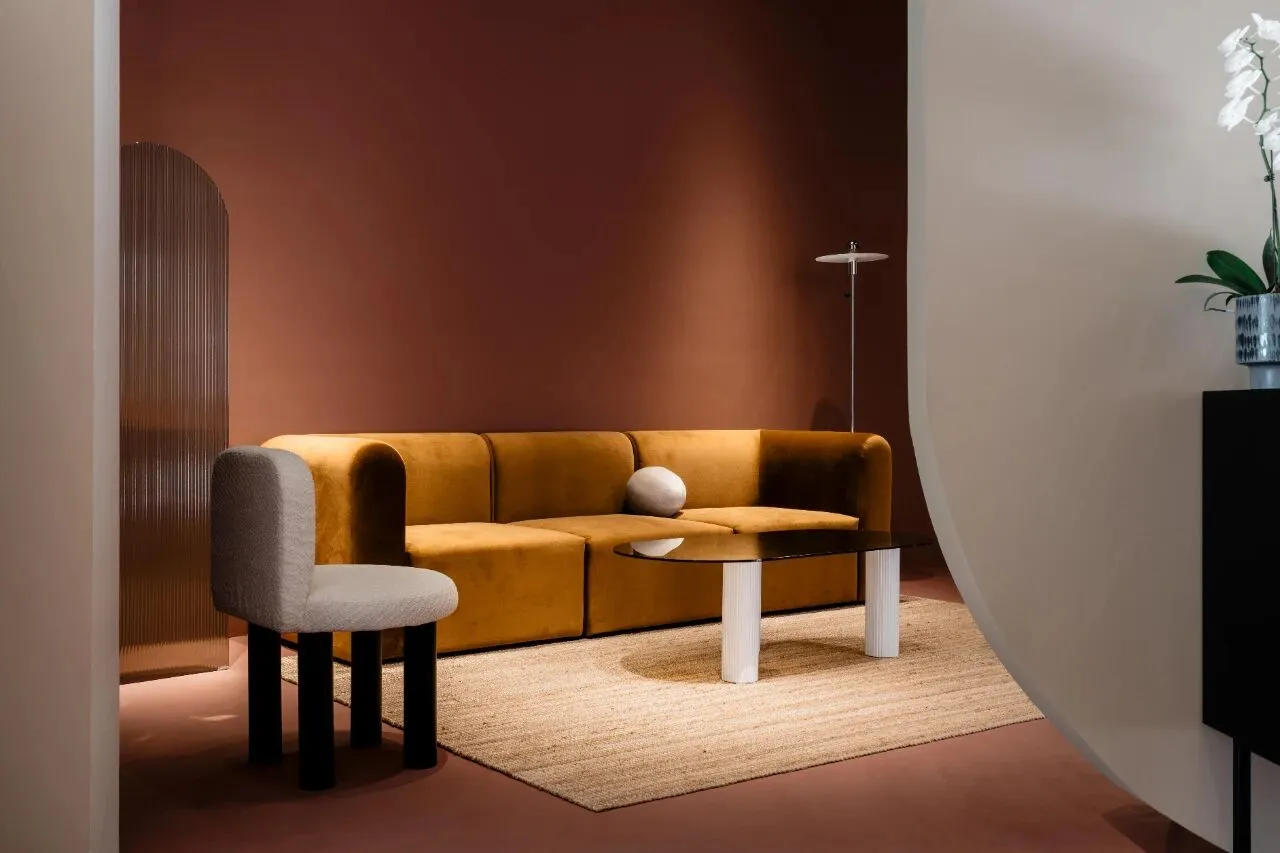
收银台对面是一层私密区,我们希望从空间上就做出一些不一样的一个划分:1.平面上看,它是一个三角形的结构。2.立面上也希望有不一样的划分。我们在中间新做了一面弧形墙,常规做法会做两个拱门,我们想来点创新的思路,于是在中间设计了一个倒拱形,两侧刚好形成了两个门洞,能框取内部空间不同的场景。
Across from the cashier is a private area on the ground floor, and we hope to make some different spatial divisions: 1. From a flat perspective, it is a triangular structure. 2. We also hope for a different division on the facade. We have built a new curved wall in the middle, which is usually done with two arches. We wanted to come up with some innovative ideas, so we designed an inverted arch in the middle, with two door openings on both sides, which can frame different scenes of internal space.
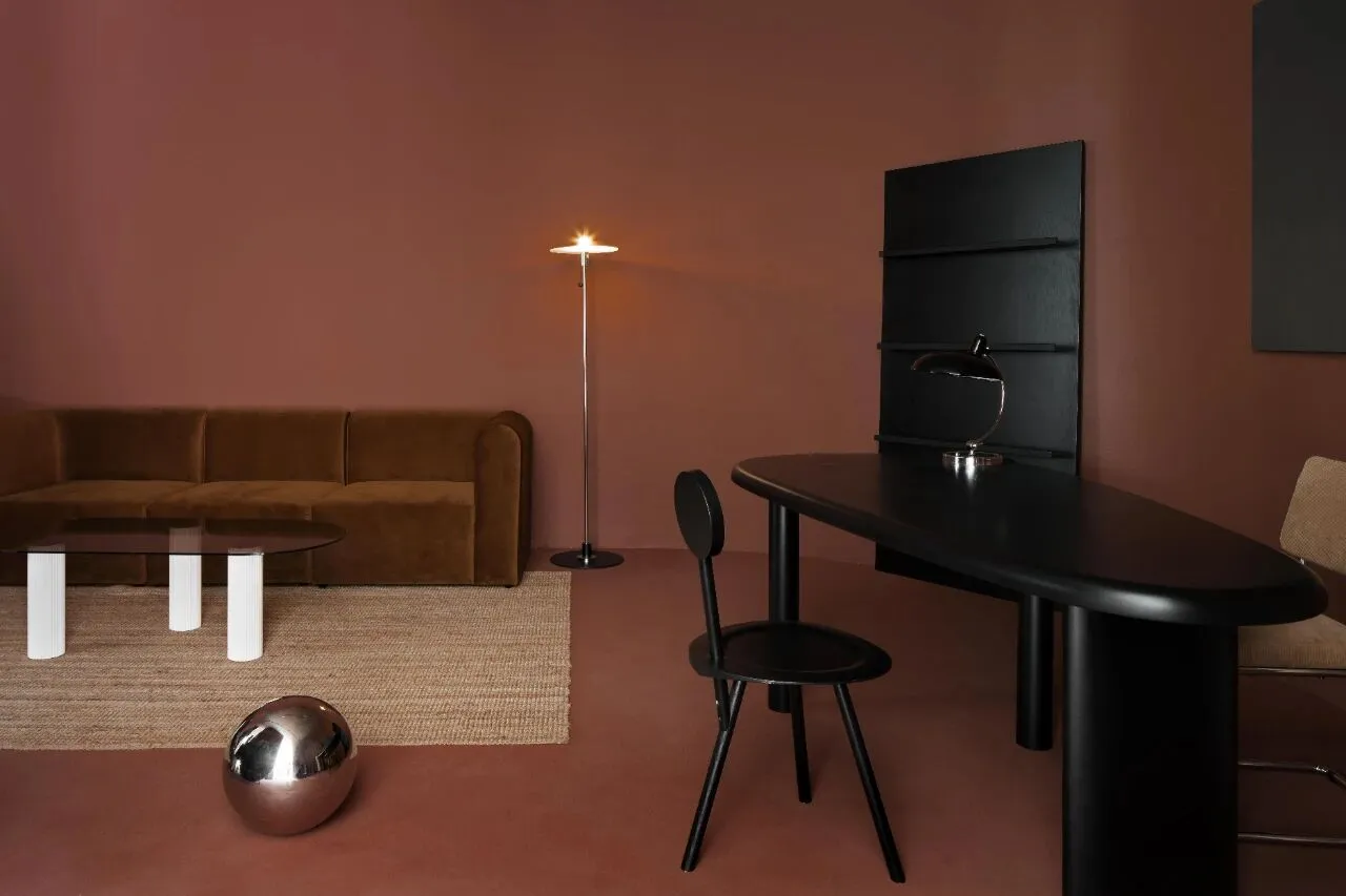
三角形的内部空间的颜色和外面不一样,整体采用了和地面微水泥一样颜色的红色艺术漆。又是一个色系,给空间分区,软装增加了黑色进行了点缀,三角形的餐桌呼应了空间的形状。
The color of the interior space of the triangle is different from the outside, and the overall color is red art paint that is the same as the ground cement. Another color scheme, dividing the space, adding black accents to the soft furnishings, and the triangular dining table echoing the shape of the space.
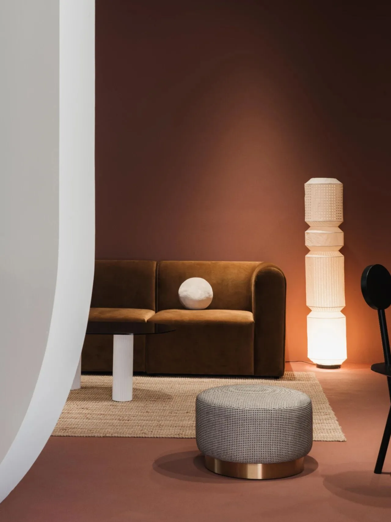
所有的家具都是都是柔和的线条,柔软的材质。比如天鹅绒的沙发,与环境相呼应。
All furniture is made of soft lines and soft materials. For example, a velvet sofa that echoes the environment.
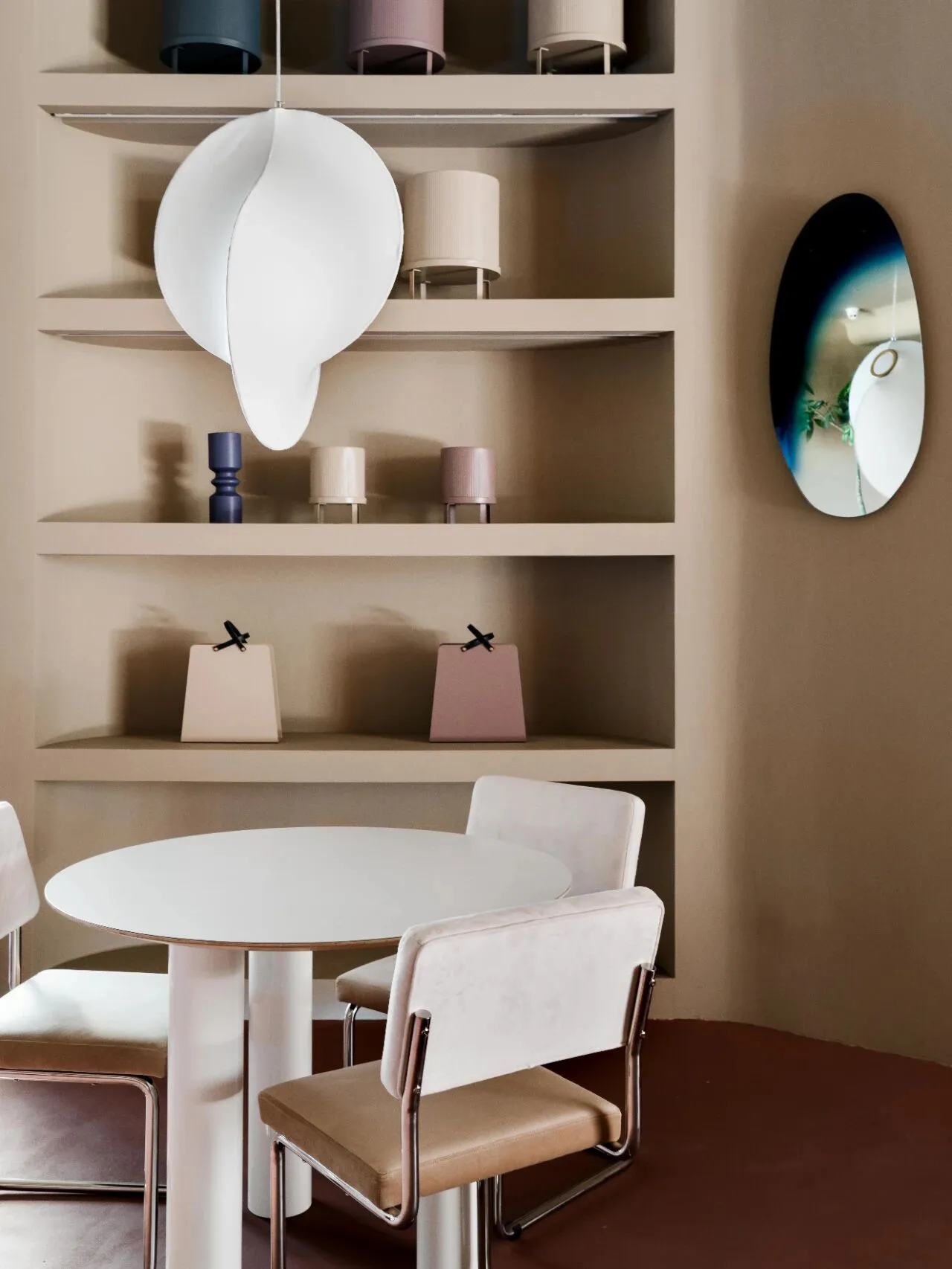
此外,展台对面靠墙的位置布置成了餐区,墙面上设计了壁龛,内侧隔板顺势做成弧形,既能呼应整体,又能呈现出律动的美感。
In addition, the opposite side of the booth is arranged as a dining area against the wall, with niches designed on the wall. The inner partition is made into an arc, which not only echoes the overall design but also presents a rhythmic beauty.
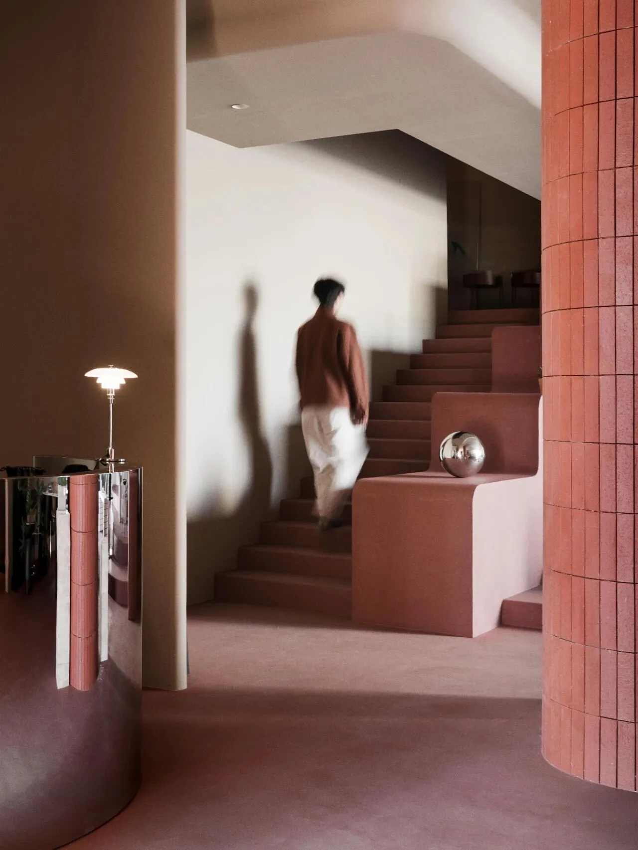
在路径规划时,我们把楼梯的位置放在了展示台后面,楼梯的踏板、扶手与一楼地面整体使用了红色的微水泥,保持统一性。
When planning the path, we placed the position of the stairs behind the display stand, and the steps, handrails, and ground of the stairs were all made of red micro cement to maintain consistency.
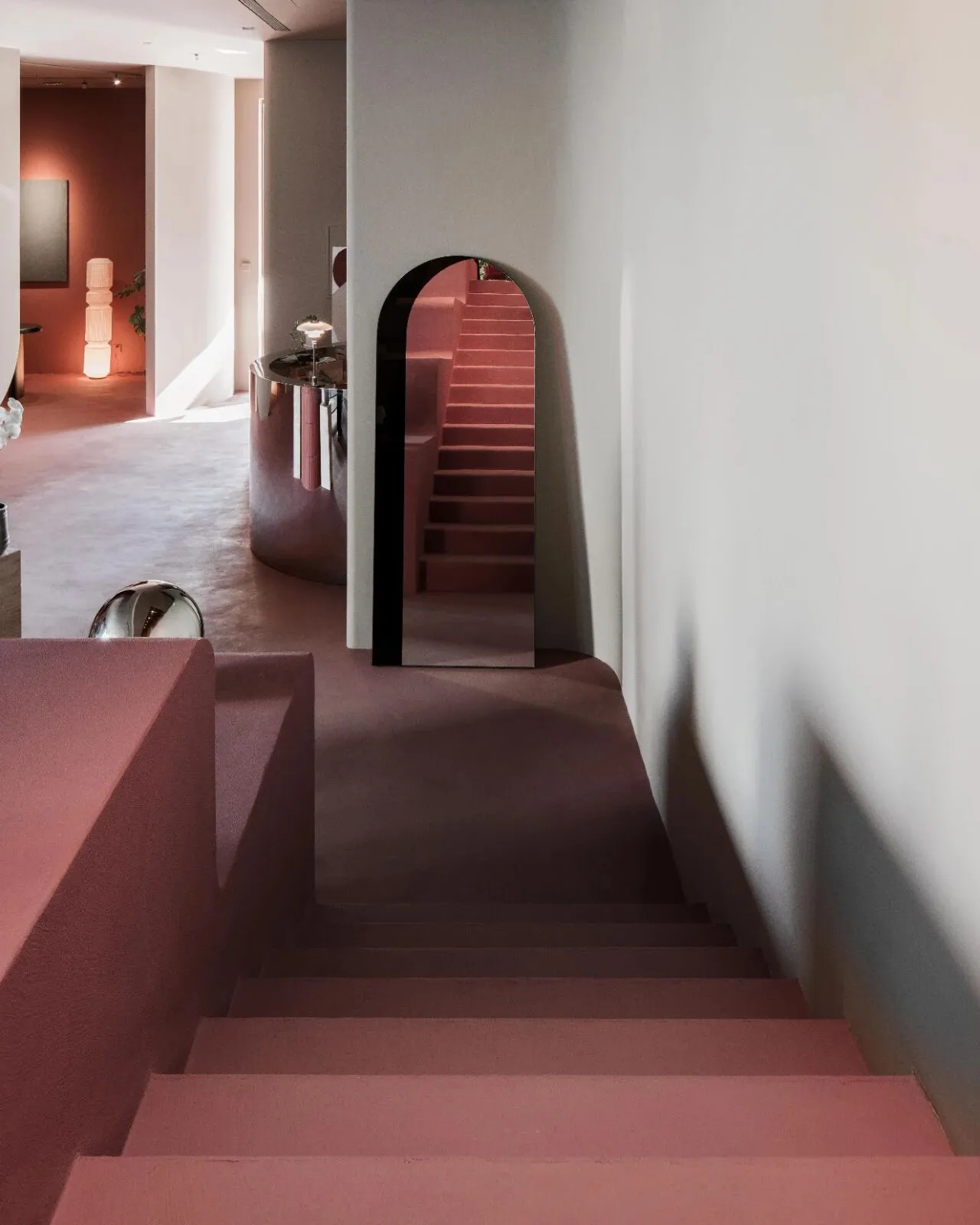
楼梯的起始墙面,摆放了一面拱形的镜子做视觉延伸,一眼望去仿佛是通往另一个空间的入口。
The starting wall of the staircase is adorned with an arched mirror as a visual extension, making it seem like an entrance to another space at first glance.
二层展厅
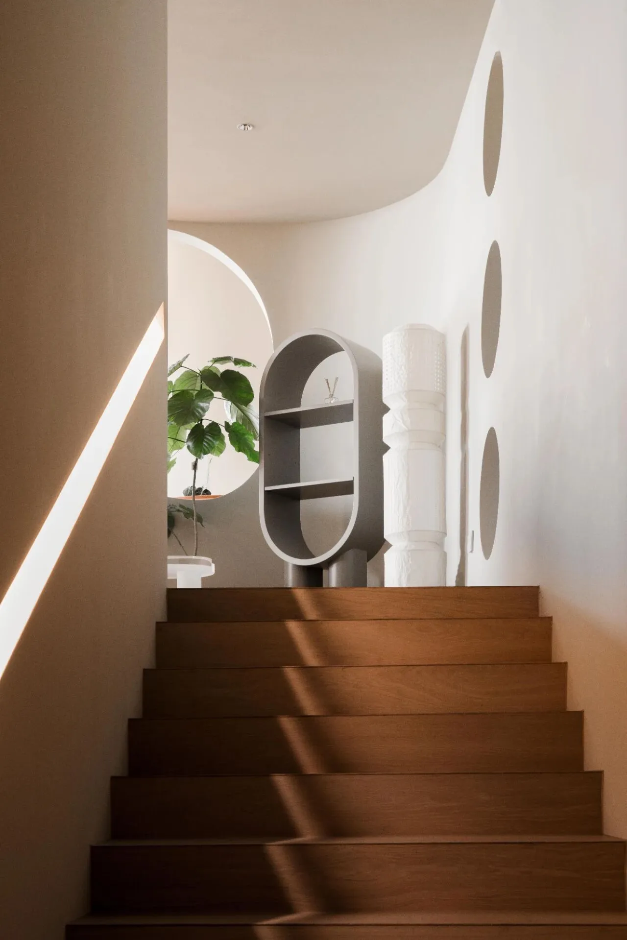
楼梯的转角,地面自然过渡木地板,因为二层空间的设计,我们希望相对偏实用一点,明亮一点,材质温馨一些,是一个大多数人都比较接受的居家感觉。
At the corner of the staircase, the ground naturally transitions to a wooden floor. Due to the design of the second floor space, we hope to be relatively practical, bright, and warm in material, which is a home feeling that most people accept.
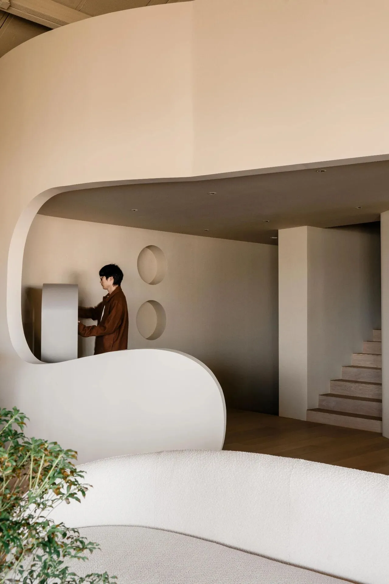
二楼一上来这个区域,延伸出一面墙设计了一个玄关,一来让上楼的视角稍微有点遮挡,二来这里也可以做一个玄关家具的展示。
On the second floor, a wall extends to this area and a foyer is designed, which slightly blocks the view from the upstairs. Additionally, a display of foyer furniture can also be created here.
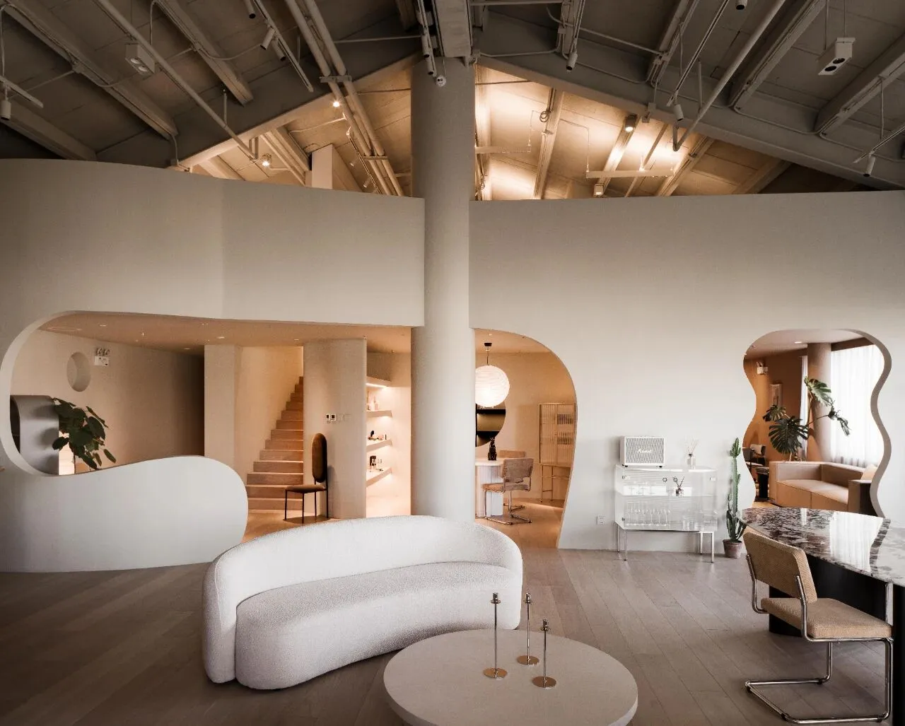
这面墙不能给空间添堵,于是做了一个非常特别的双曲面,左侧上半部分没有遮挡,从立面上看,它是一个弧形,从平面上,它也是蜿蜒的曲线。
This wall cannot add any obstruction to the space, so a very special hyperbolic surface was created. The upper left part is not obstructed. From the facade, it appears as an arc, and from the plane, it is also a winding curve.
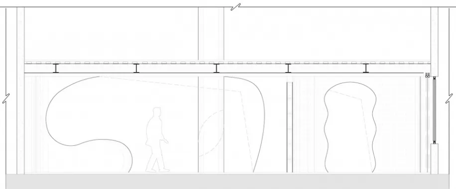
整个线条十分顺畅,我们直接把这个感觉延伸过来,非常自然的又做了一个门洞。门洞特意处理成波浪形,是比较创新的设计。
The entire line is very smooth, and we directly extended this feeling, creating a very natural door opening. The door opening is specially designed in a wave shape, which is quite innovative.
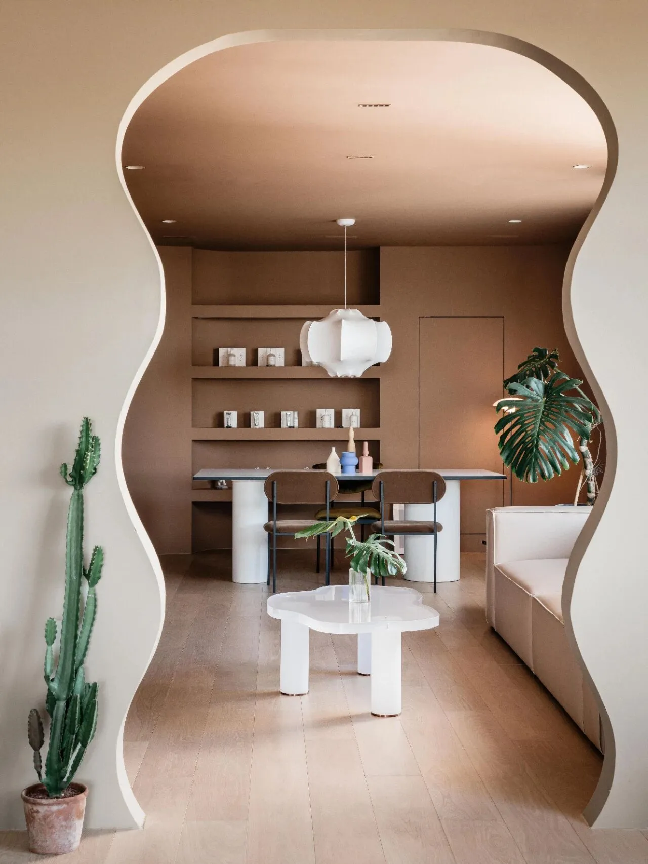
而且波浪型元素能呼应舒梵非常经典的湖泊形状的茶几,线条柔和,非常有质感。这种效果自然是1+1大于2,整体空间变得自由随性,波浪形门洞赋予了空间独特的美感和韵律。
Moreover, the wave shaped elements can echo Shufan's classic lake shaped coffee table, with soft lines and a very textured feel. This effect is naturally 1+1 greater than 2, and the overall space becomes free and flexible. The wavy doorway gives the space a unique beauty and rhythm.
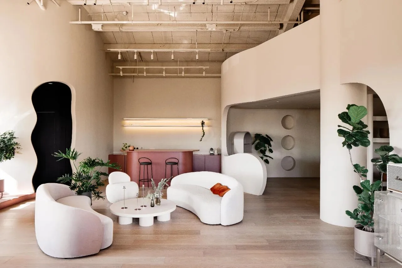
二层的格局规划,由中间的弧形墙隔成一个大展厅和三个独立的小空间。
The layout plan for the second floor is divided into a large exhibition hall and three independent small spaces by a curved wall in the middle.
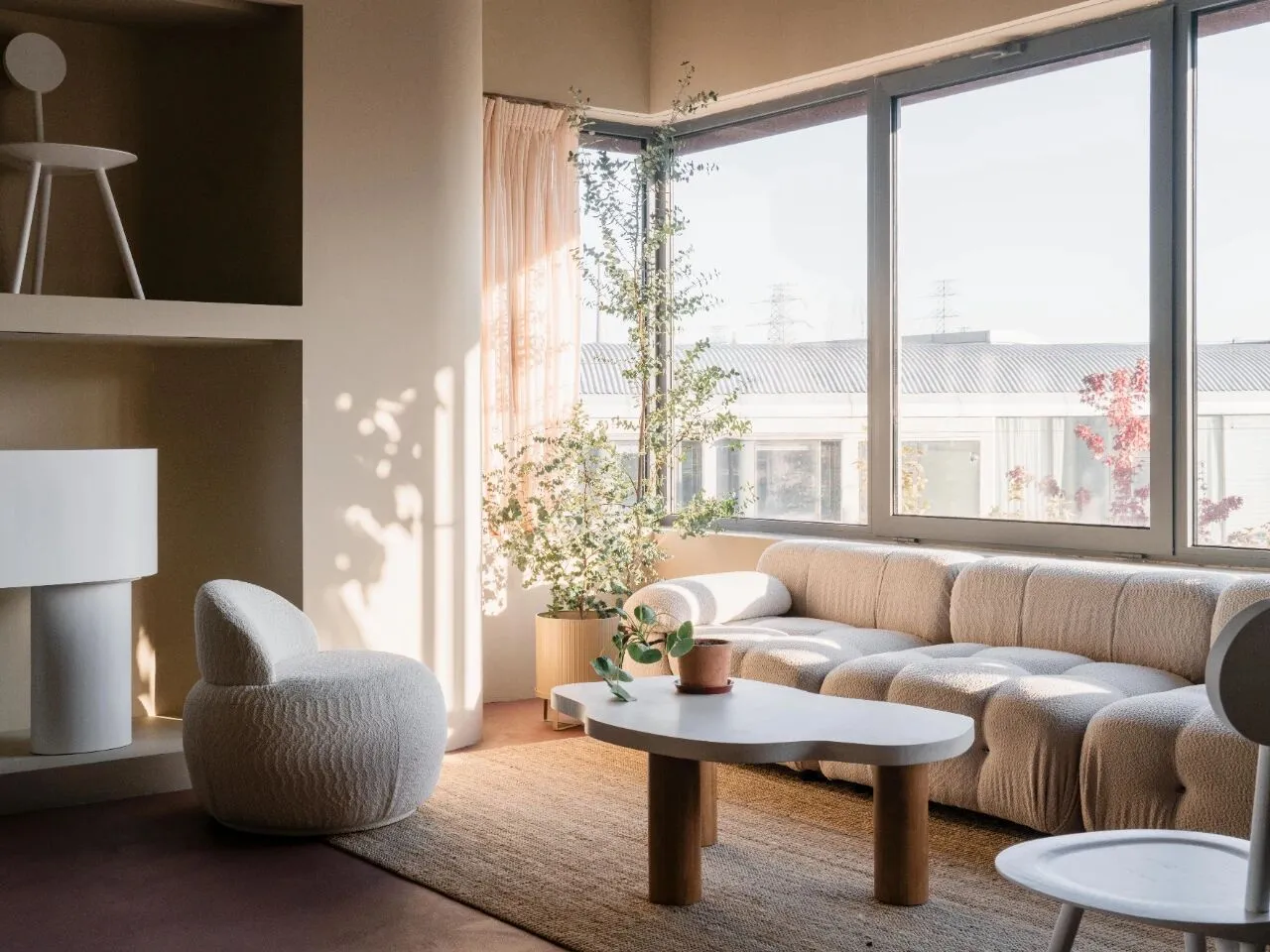
开放式的展厅,家具的陈设相对能摆放的更分散一点。延续一楼的设计,做了一个曲面地台,同样涂刷了红色微水泥,这样的话,它平面上也有弧形,立面上更有层次感。
An open exhibition hall with furniture that can be placed more evenly. Continuing the design of the first floor, a curved platform was created, which was also painted with red micro cement. This way, it has a curved surface on the plane and a more layered facade.
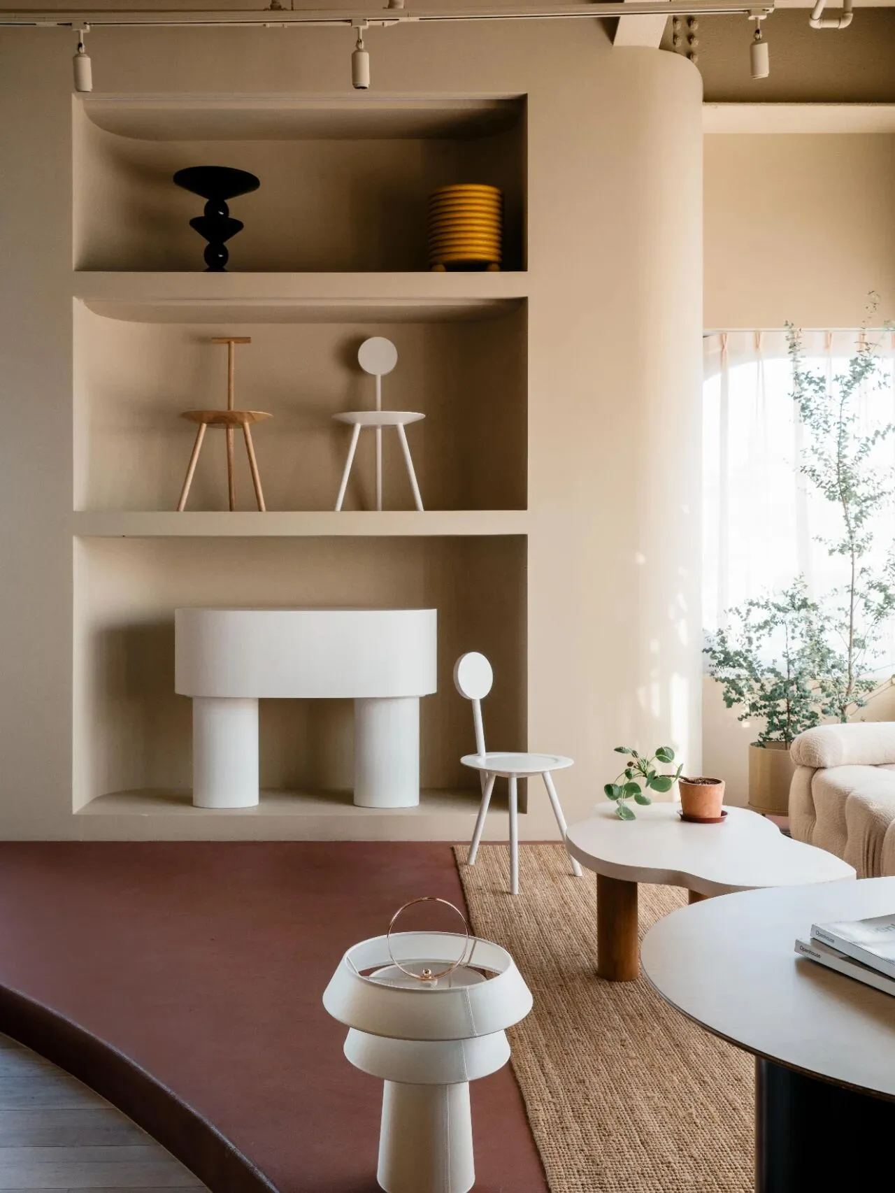
展厅的侧面有根拆不掉的柱子,我们将柱子包了起来,做了一个比较大的壁龛,能陈列一些体量小巧的桌椅,比如书桌,椅子,边几,弧形壁龛与Sufan家具的圆润造型完美结合。
There is a pillar on the side of the exhibition hall that cannot be removed. We wrapped the pillar and made a relatively large niche, which can display some small tables and chairs, such as desks, chairs, and side tables. The curved niche perfectly combines with the rounded shape of Sufan furniture.
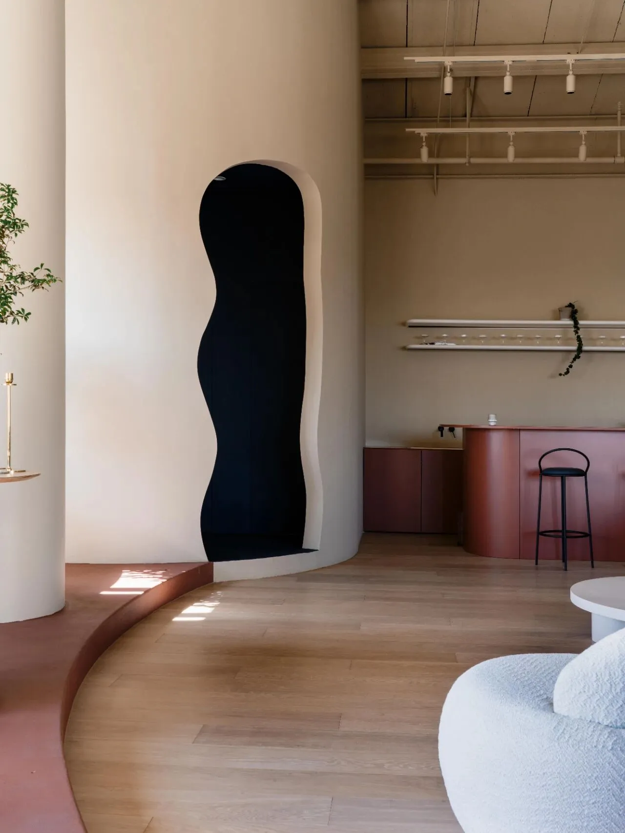
整个展厅配色跟一层也是呼应的,大体的配色是一层是红色占比是40%,米色是60%,到二层展厅以后,就改成了米色占比80%,红色则缩减成20%。整个墙面、顶面是佐敦的米色,包括顶上的消防管,射灯,轨道,就是为了让空间尽可能统一,这样增加米色的比例,空间会更明亮、更简洁温馨。
The color scheme of the entire exhibition hall also echoes that of the first floor. The overall color scheme is that the proportion of red on the first floor is 40%, and the proportion of beige is 60%. After reaching the second floor exhibition hall, it has been changed to beige accounting for 80%, while red has been reduced to 20%. The entire wall and roof are in Jordan beige, including the fire pipes, spotlights, and tracks on top, in order to make the space as unified as possible. This increases the proportion of beige, making the space brighter, simpler, and more cozy.
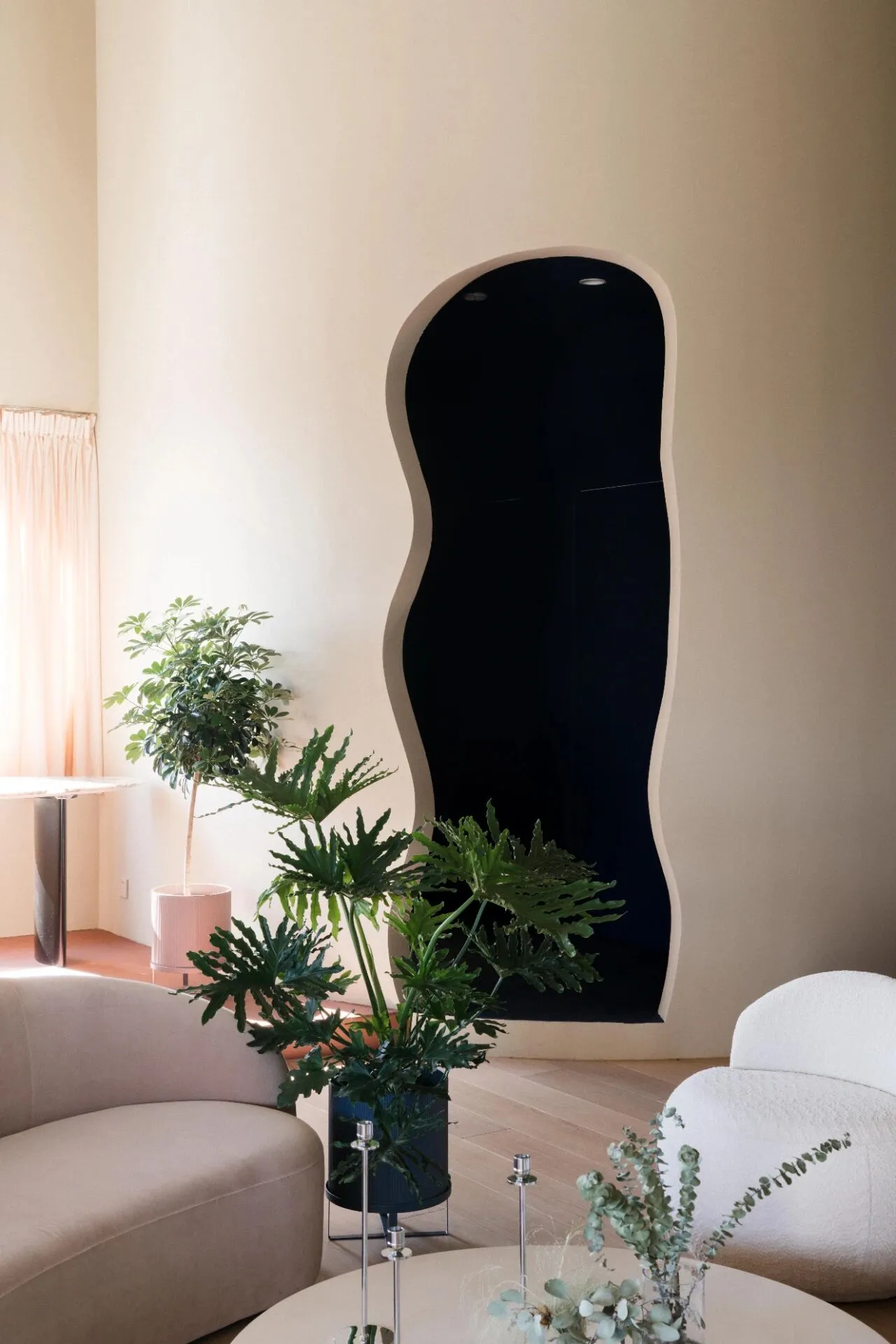
卫生间的门洞也是一个非常不规则的拱形,细节与整体呼应,包括整个卫生间的建筑面也是延伸出来的圆弧结构。
The door opening of the bathroom is also a very irregular arch, with details echoing the overall design, and the entire building surface of the bathroom is also an extended circular arc structure.
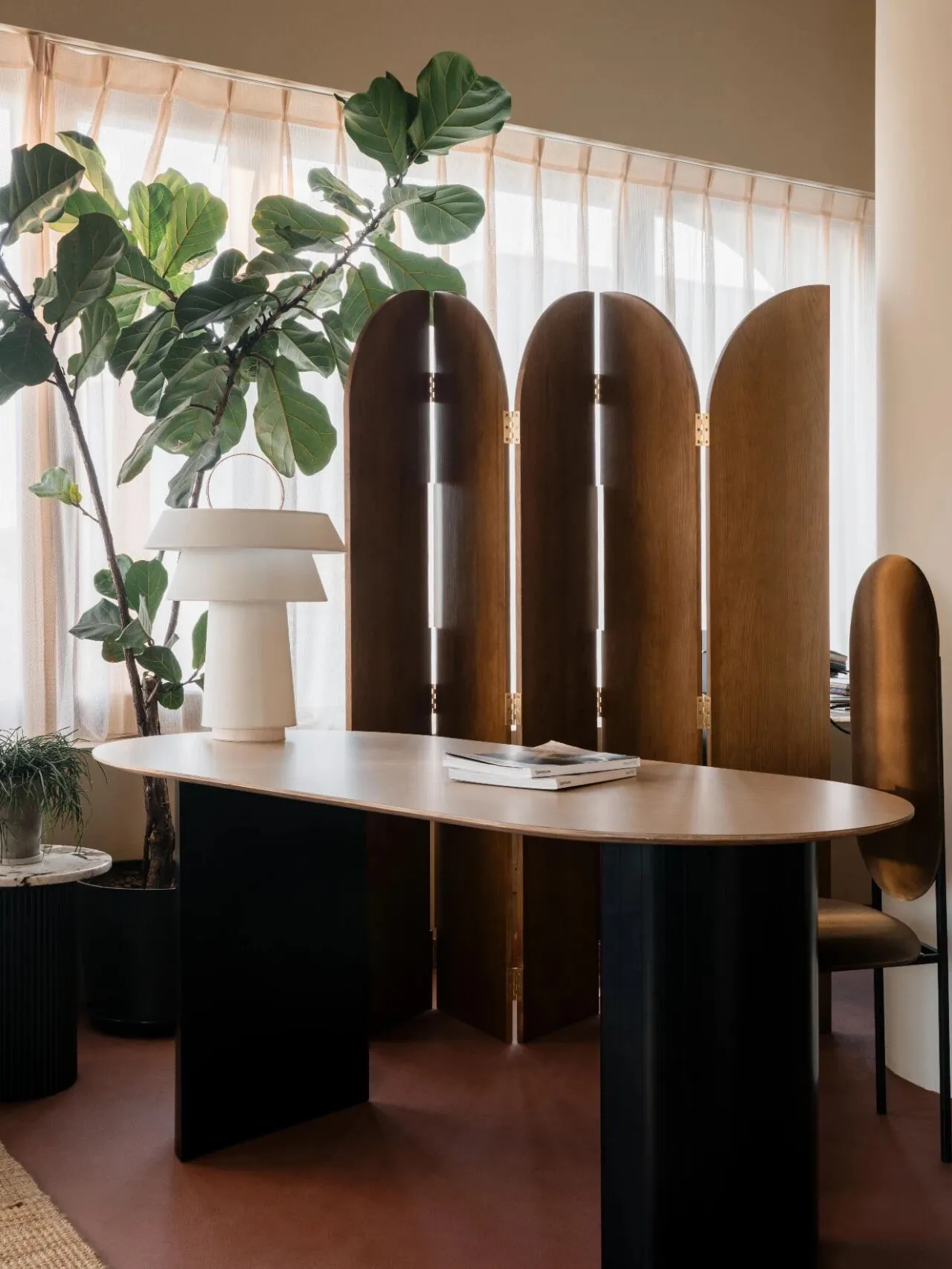
卫生间左侧的窗台面,选择跟墙面一样的米色窗帘。
Choose beige curtains that are the same as the wall for the window sill on the left side of the bathroom.
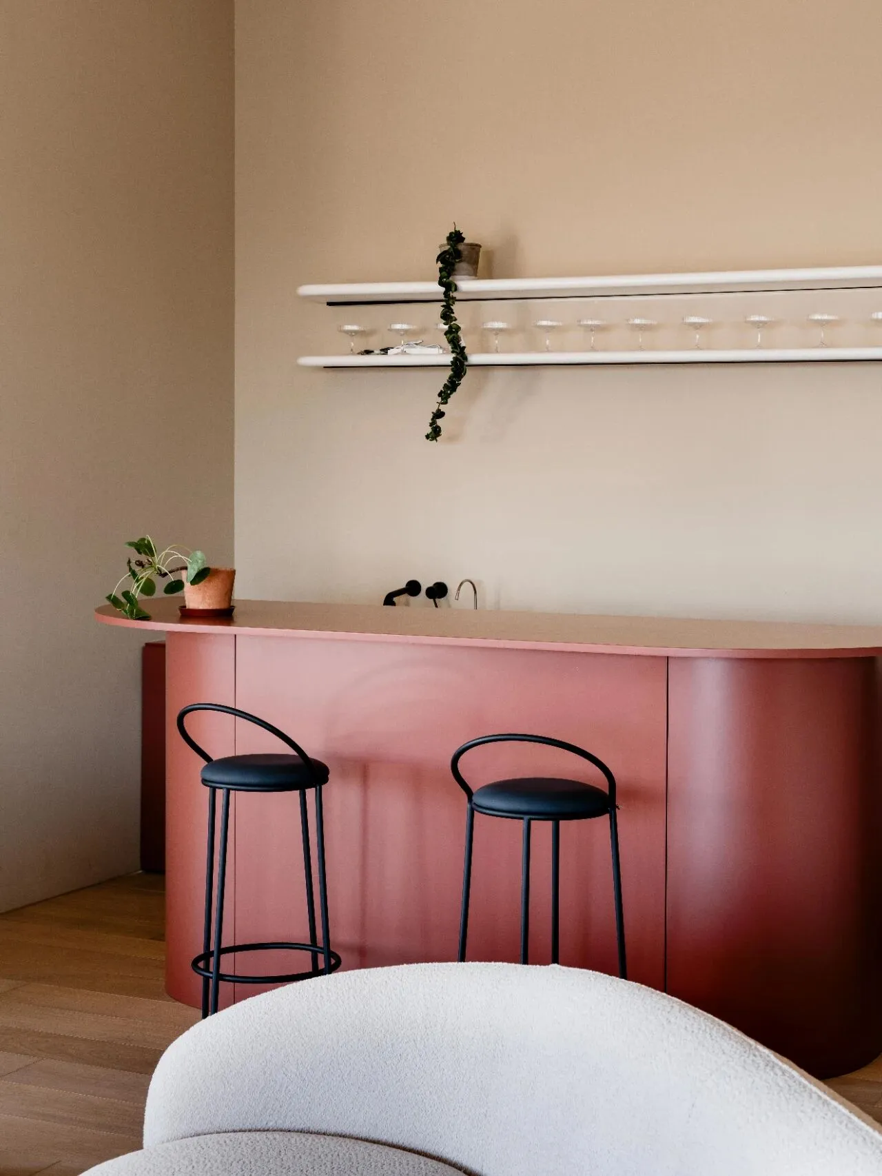
右侧是橱柜区,其实也是一个水吧。为了迎合家具的曲线,岛台做成了弧形,颜色呼应红色微水泥,做成了砖红色,醒目又好看。
On the right is the cabinet area, which is actually a water bar. In order to cater to the curves of the furniture, the island platform has been made into an arc, with a color that echoes the red cement and is made into brick red, eye-catching and beautiful.
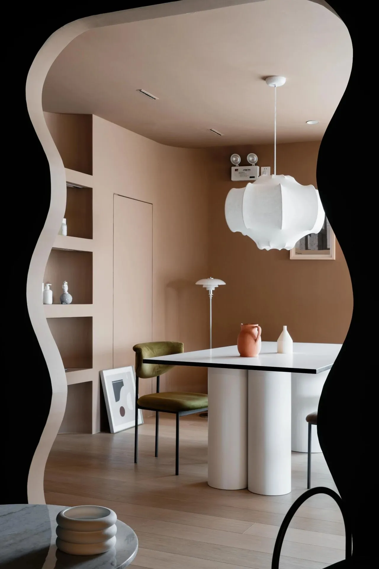
二楼的三个小空间,通过不同圆润程度的门洞进行连接。这三个小空间每个颜色都不一样,各有各的功能,分别模拟起居室、餐厅,卧室。
The three small spaces on the second floor are connected by door openings with varying degrees of roundness. These three small spaces are each of different colors and have their own functions, simulating a living room, dining room, and bedroom.
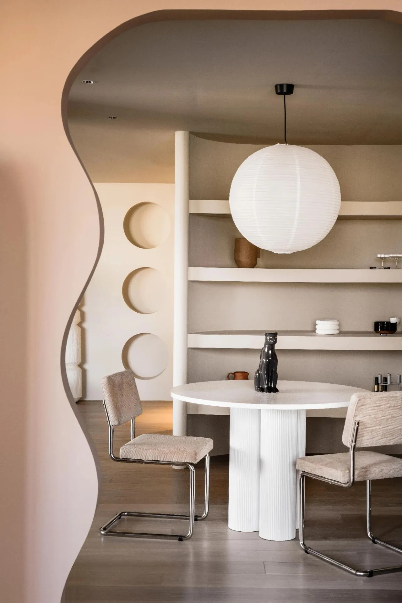
每个空间之间通过波浪形、圆形门洞,借鉴中式园林的构景手段,透漏的空间景致就如“犹抱琵琶半遮面”。含蓄雅致,平添了使人一窥究竟的浓厚兴趣。
Through wavy and circular door openings between each space, drawing inspiration from the landscape construction techniques of Chinese gardens, the transparent spatial scenery is like "half covering the surface with a pipa.". Elegant and subtle, it adds a strong interest in getting a glimpse of the truth.
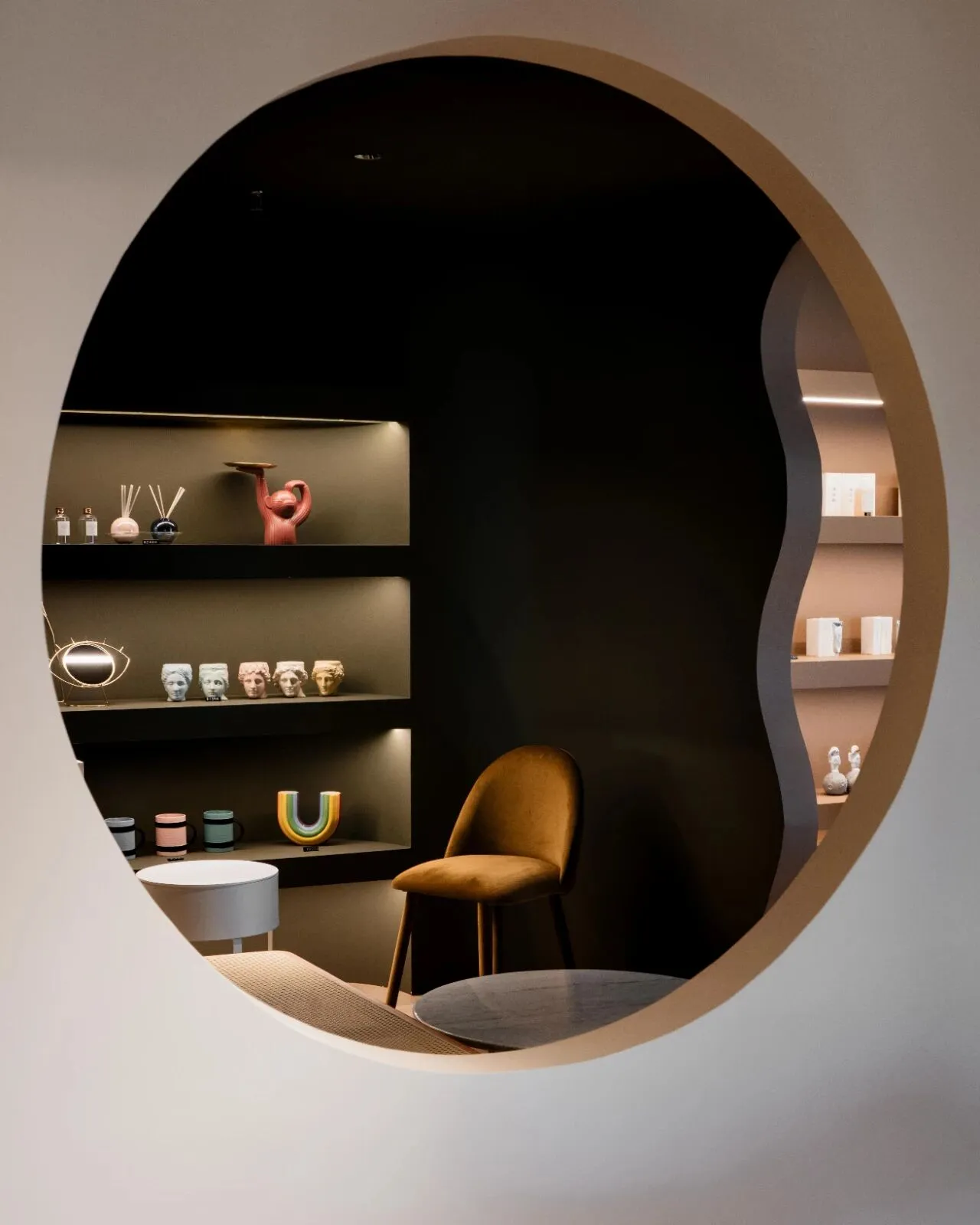
从餐厅的圆洞看向卧室
Looking into the bedroom from the round hole in the restaurant
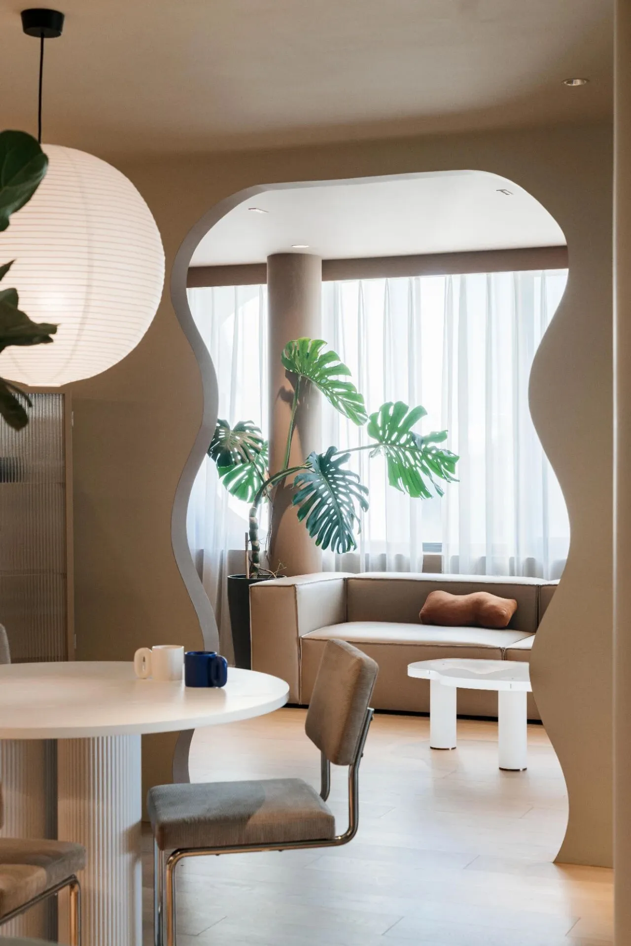
从餐厅看向起居室
Looking towards the living room from the restaurant
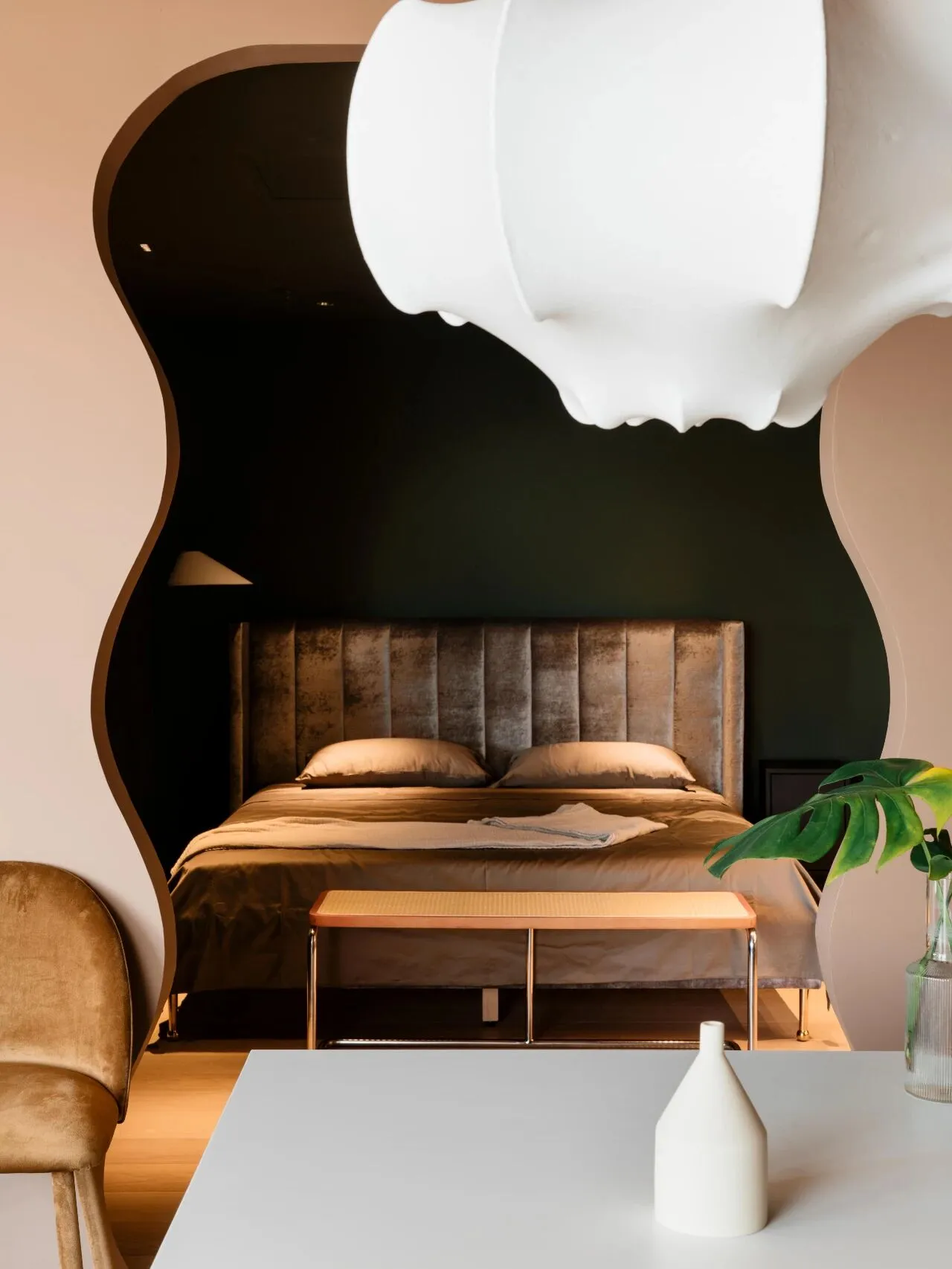
从起居室看向卧室
Looking from the living room to the bedroom
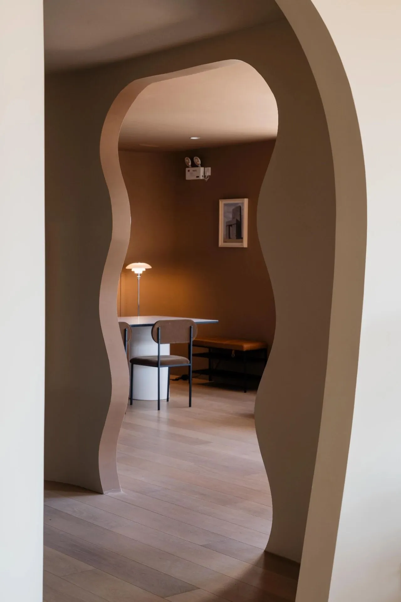
不同的空间颜色都不一样,产生鲜明的对比。波浪形的门洞能形成有趣的画面,不同视角,就有不同的观感。
Different spaces have different colors, creating a sharp contrast. The wavy doorway can create interesting scenes, and different perspectives can create different perceptions.
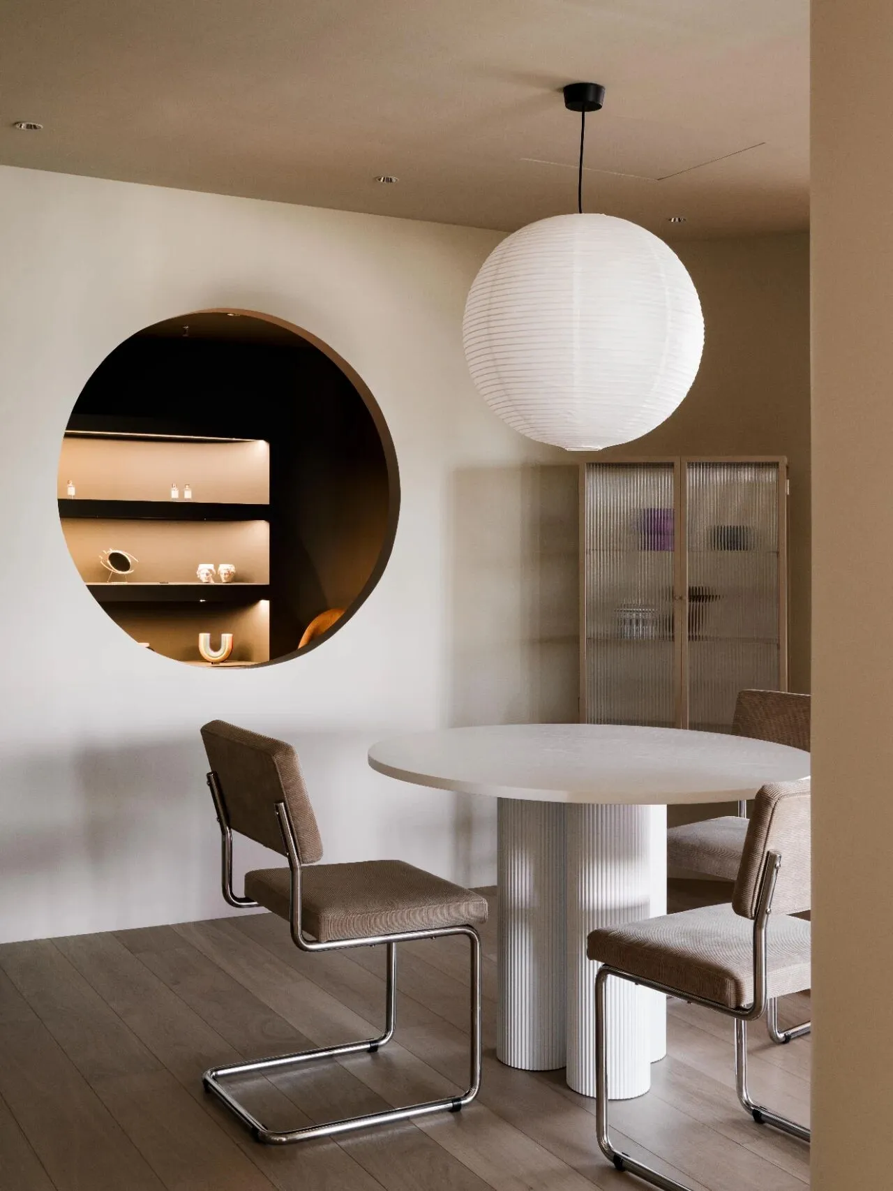
餐厅区域利用圆形纸灯,与白色餐桌一道点亮了整个空间。
The restaurant area is illuminated by circular paper lights, along with a white dining table, to illuminate the entire space.
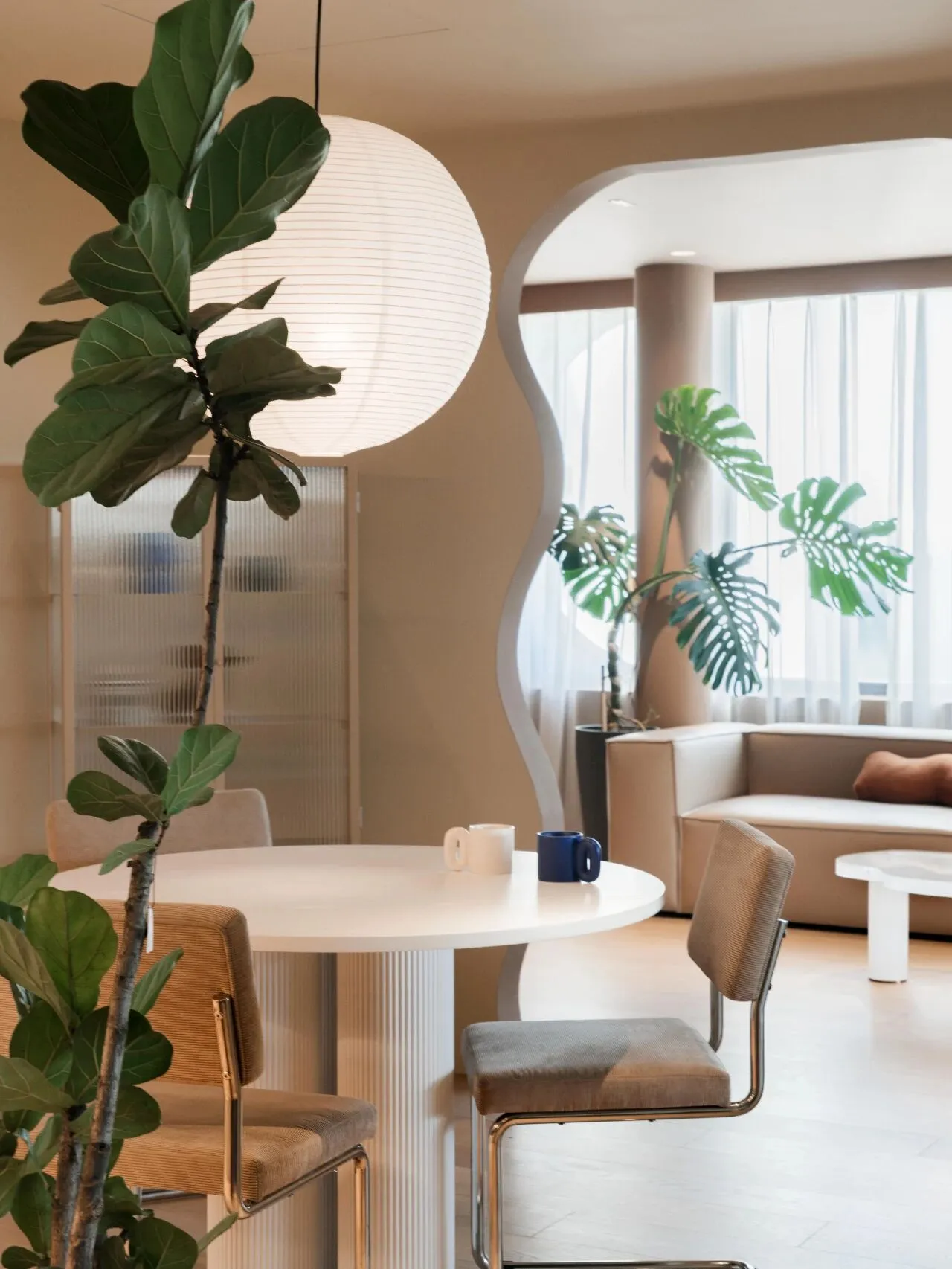
餐厅的其他细节
Other details of the restaurant
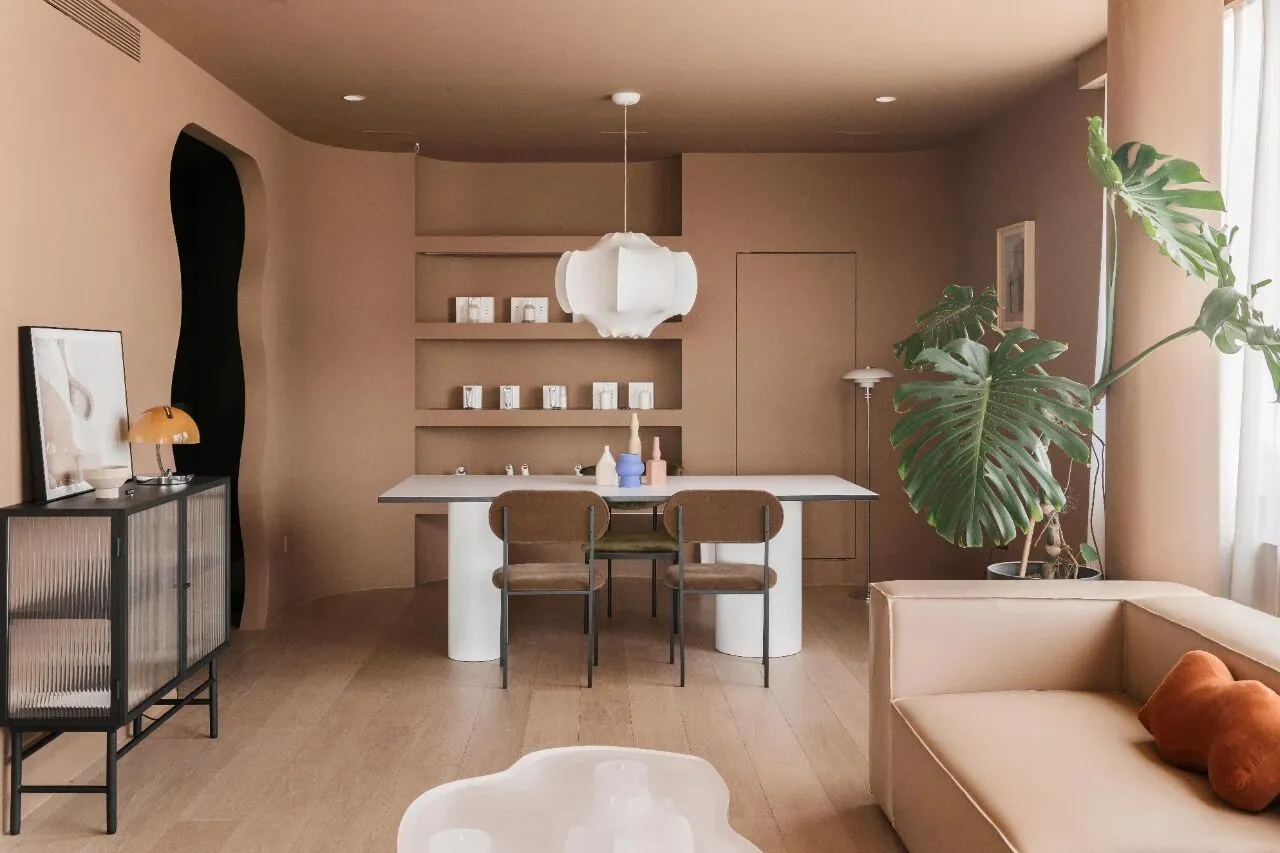
起居室整体刷了颜色更深一点的蜜橘棕,颜色介于红色和米色之间,呼应了整体风格。并且呈现了不一样的色彩感,同时也划分了空间。
The living room was painted with a slightly darker orange brown color, ranging from red to beige, echoing the overall style. And it presents a different sense of color, while also dividing the space.
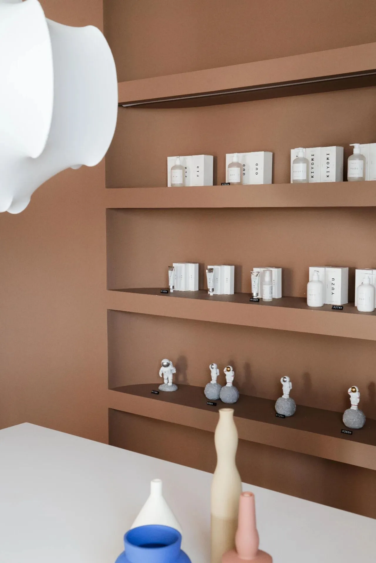
起居室模拟了一个标准的客餐厅,墙面的造型是因为这里原结构有一处消防栓,利用其深度做成了壁龛,增加家居饰品的陈列区。
The living room simulates a standard dining room, and the wall design is based on the original structure of a fire hydrant, which was used to create a niche and increase the display area for home accessories.
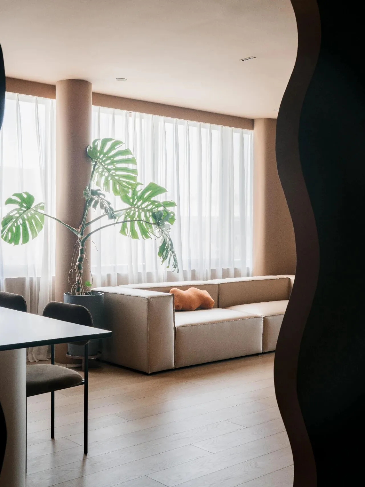
沙发旁边的承重柱也包成了圆柱,刷上了蜜橘棕,整体色调充满着稳重的高级感。
The load-bearing pillar next to the sofa has also been wrapped into a cylindrical shape, painted in orange brown, and the overall color tone is full of a stable and sophisticated feeling.
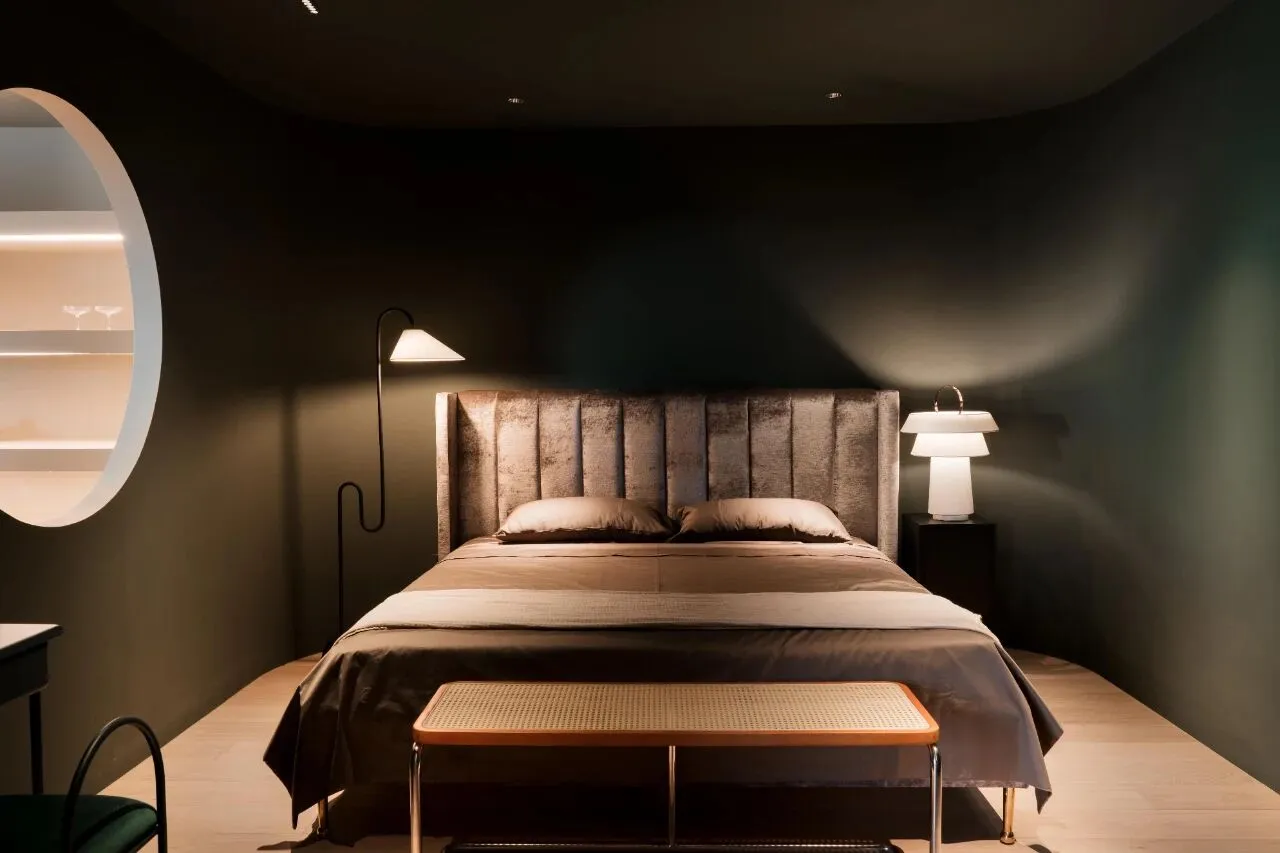
卧室整体是灰绿色调,主要是想营造宁静平和的睡眠氛围。灯光设计采用了氛围光,满足休憩空间微弱的照明需求,也能增加卧室展区的灯光层次。
The overall color scheme of the bedroom is gray green, mainly aimed at creating a peaceful and peaceful sleeping atmosphere. The lighting design adopts ambient lighting to meet the weak lighting needs of the rest space, and can also increase the lighting level of the bedroom exhibition area.
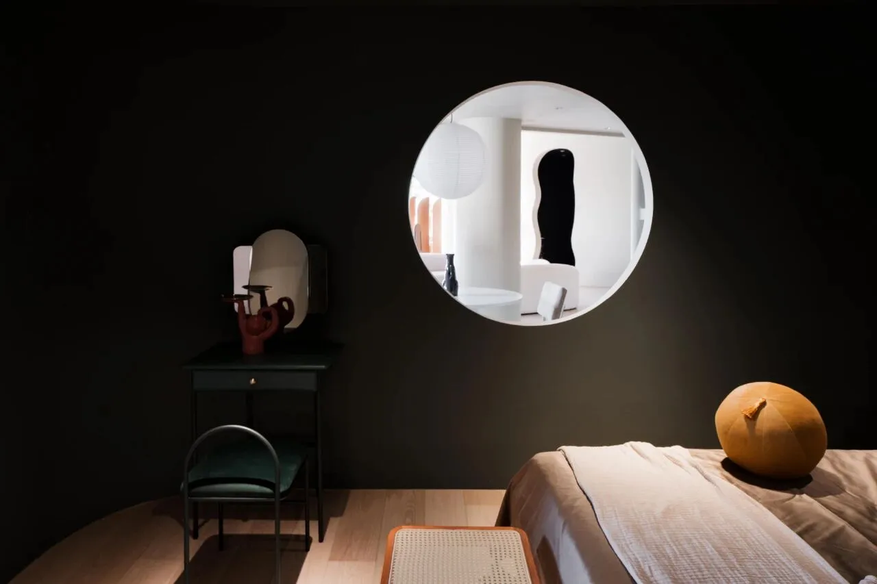
除了商业空间,现代家庭对家的设想,除了材质上的考量,线条的柔和度也相当重要。空间、家具恰当地使用曲线设计,柔化你的视觉,让家更时髦安全。
In addition to commercial space, modern families also consider the softness of lines in addition to material considerations in their home design. Proper use of curved design in space and furniture can soften your visual experience and make your home more fashionable and safe.