
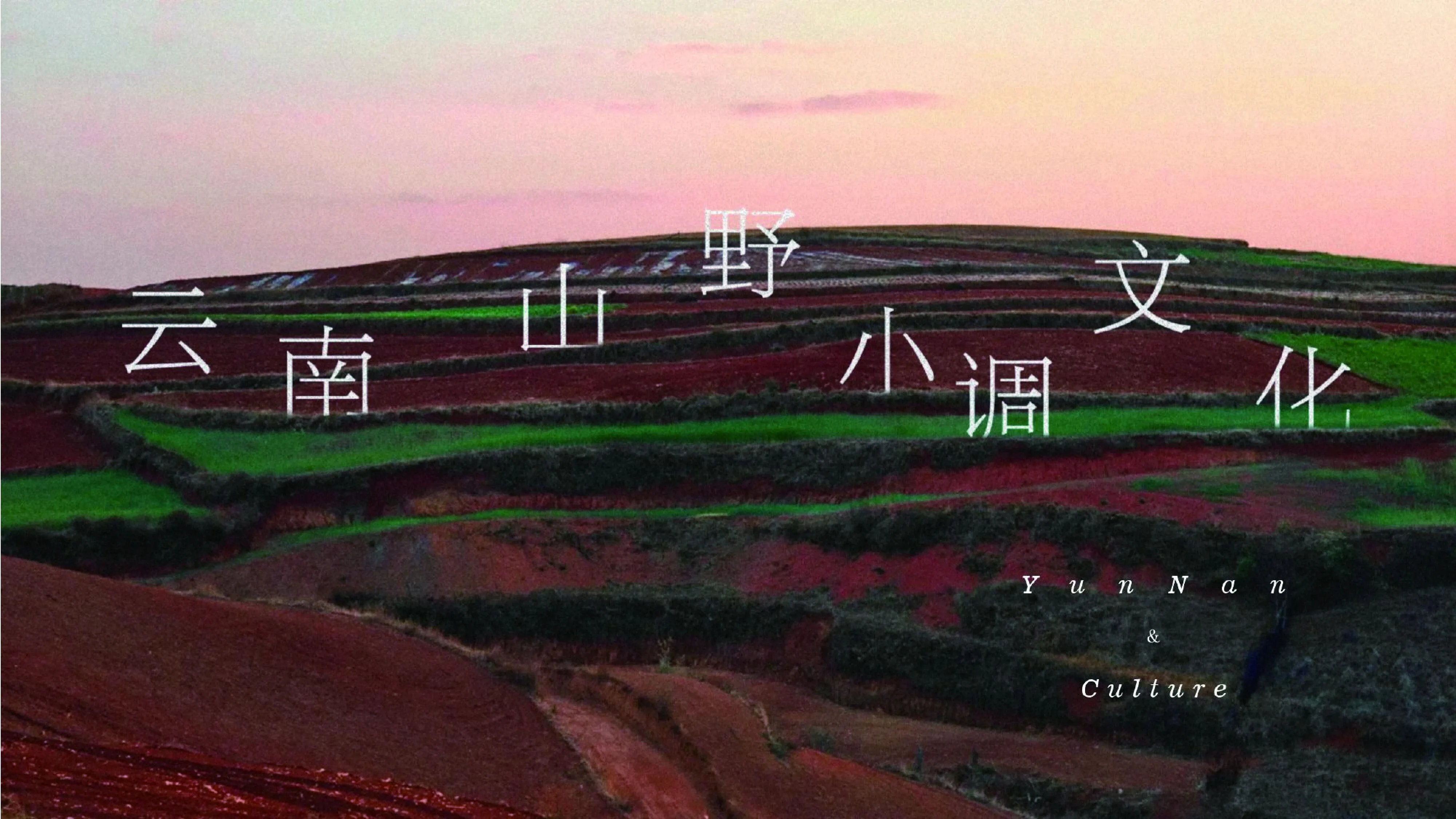
界识设计 | 山野小调 茄子恰恰

茄子恰恰是源自云南主打云南菜的连锁餐厅,因极高的性价比在全国有40+门店,且都是云南的排队王。
茄子恰恰的品牌理念是“以顾客为中心、以奋斗者为本、长期艰苦奋斗”,并秉承“背靠云南好食材,新鲜制作”的经营理念。品牌致力干不断创新,推行品牌战略,努力打造创意云南菜的第一品牌。
This brand originates from a chain restaurant in Yunnan that specializes in Yunnan cuisine. Due to its high cost-effectiveness, it has over 40 stores across the country, and they are all the queue kings in Yunnan.
The brand philosophy is "customer-centric, people-oriented, and long-term hard work", and adheres to the business philosophy of "relying on Yunnan's good ingredients and fresh production". The brand is committed to continuous innovation, implementing brand strategies, and striving to create the first brand of creative Yunnan cuisine.
01
-
VIS品牌标识设计
Brand identity design
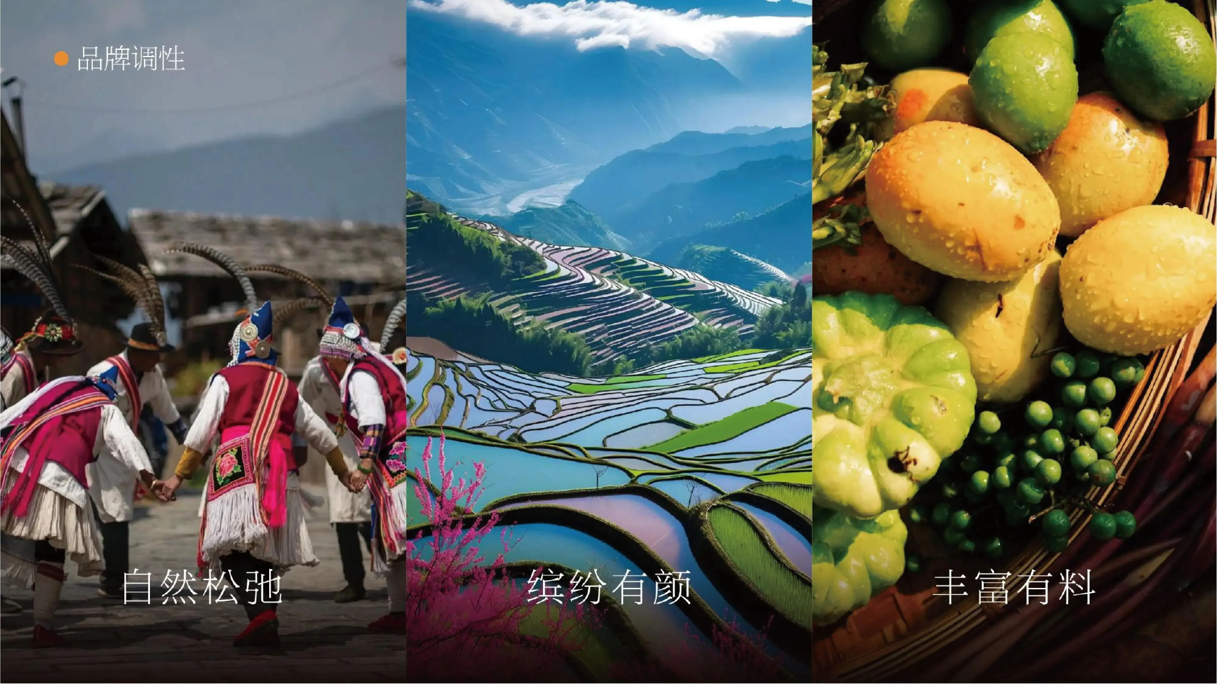
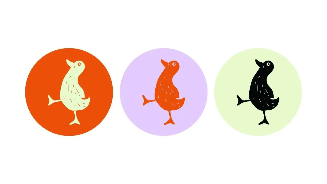
品牌标识采用传统对称鸭纹。在中国传统文化中,对鸭有欢乐、幸福、吉祥之意。在设计中,我们摈弃传统的复杂感和难以理解的抽象感,简化为具有趣味性和辨识度的卡通视觉符号。
The brand logo adopts traditional symmetrical duck pattern. In traditional Chinese culture, ducks are associated with joy, happiness, and auspiciousness. In design, we abandon traditional complexity and difficult to understand abstraction, simplifying them into cartoon visual symbols with fun and recognition.
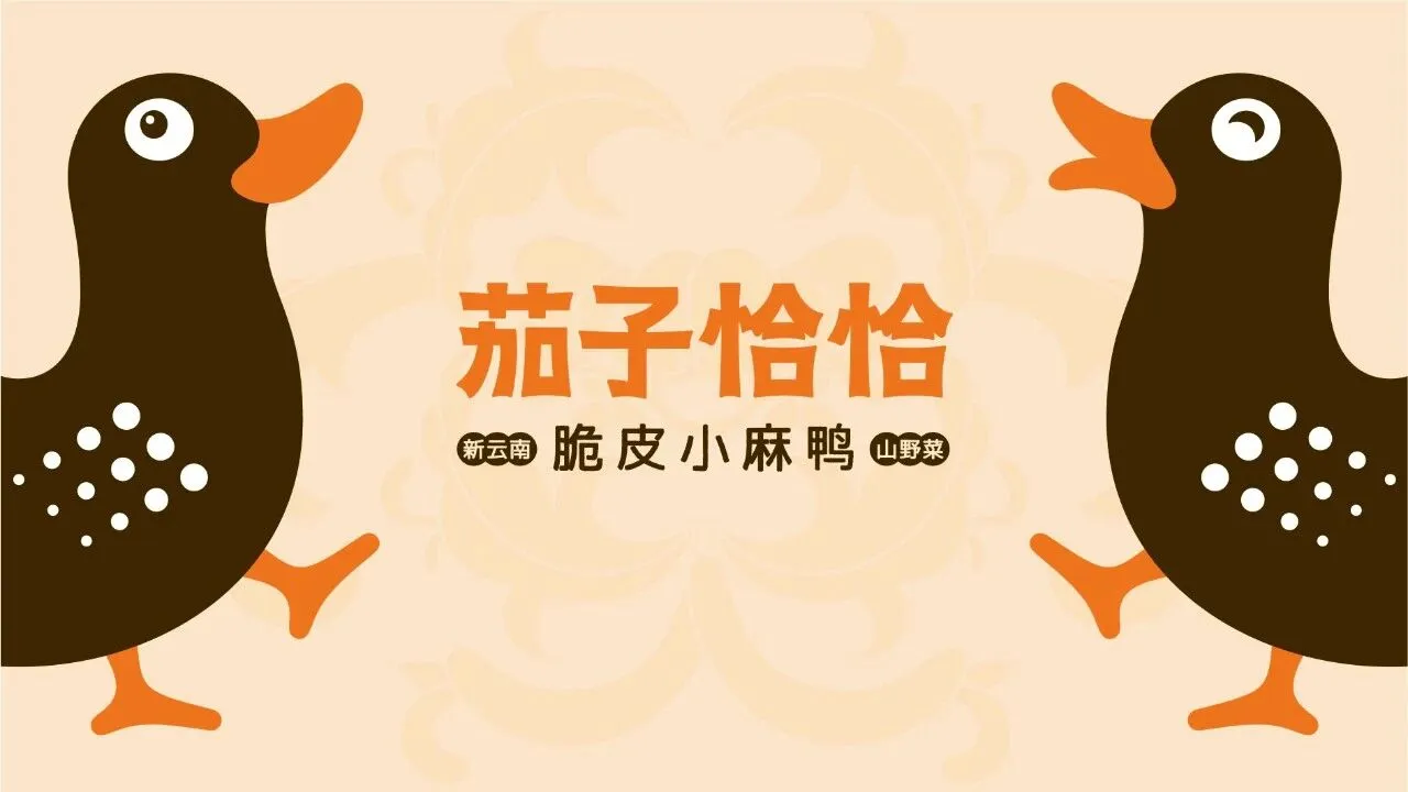

鸭纹的动作提炼了民族舞蹈中具有特色的打跳符号,抬起头哼着山野小调,强化了恰恰鸭特征传递出一种轻松、质朴、悠然的氛围。
字体设计,一笔一划简洁平衡,上扬的弧度呼应恰恰鸭仰头哼唱的角度,搭配和谐。
The movements of the duck pattern extract the distinctive dance symbols in ethnic dance, lifting the head and humming the mountain tune, reinforcing the characteristics of the cha cha duck and conveying a relaxed, simple, and leisurely atmosphere.
The font design is simple and balanced with every stroke, and the upward curve echoes the angle of the duck humming with its head up, creating a harmonious combination.
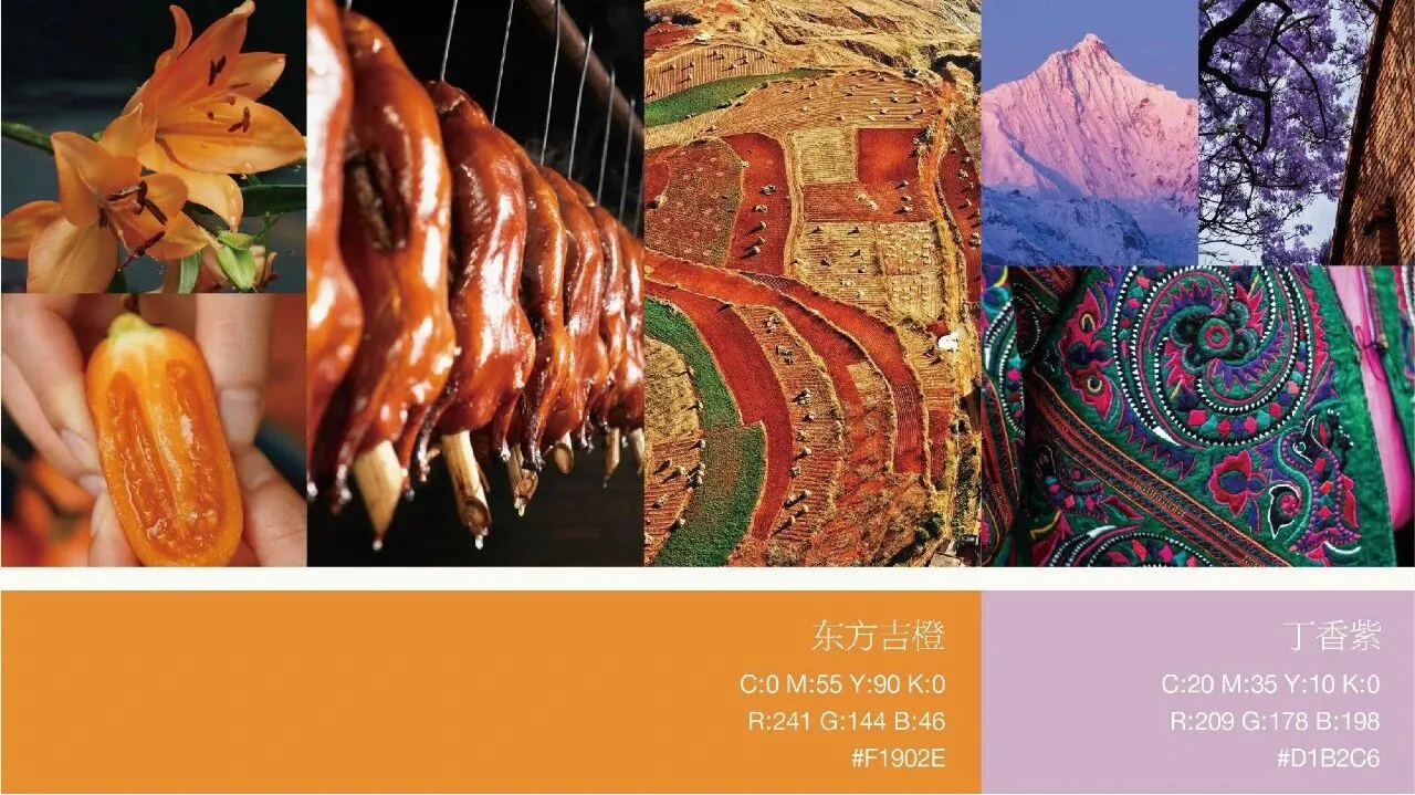
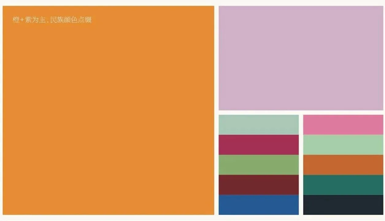
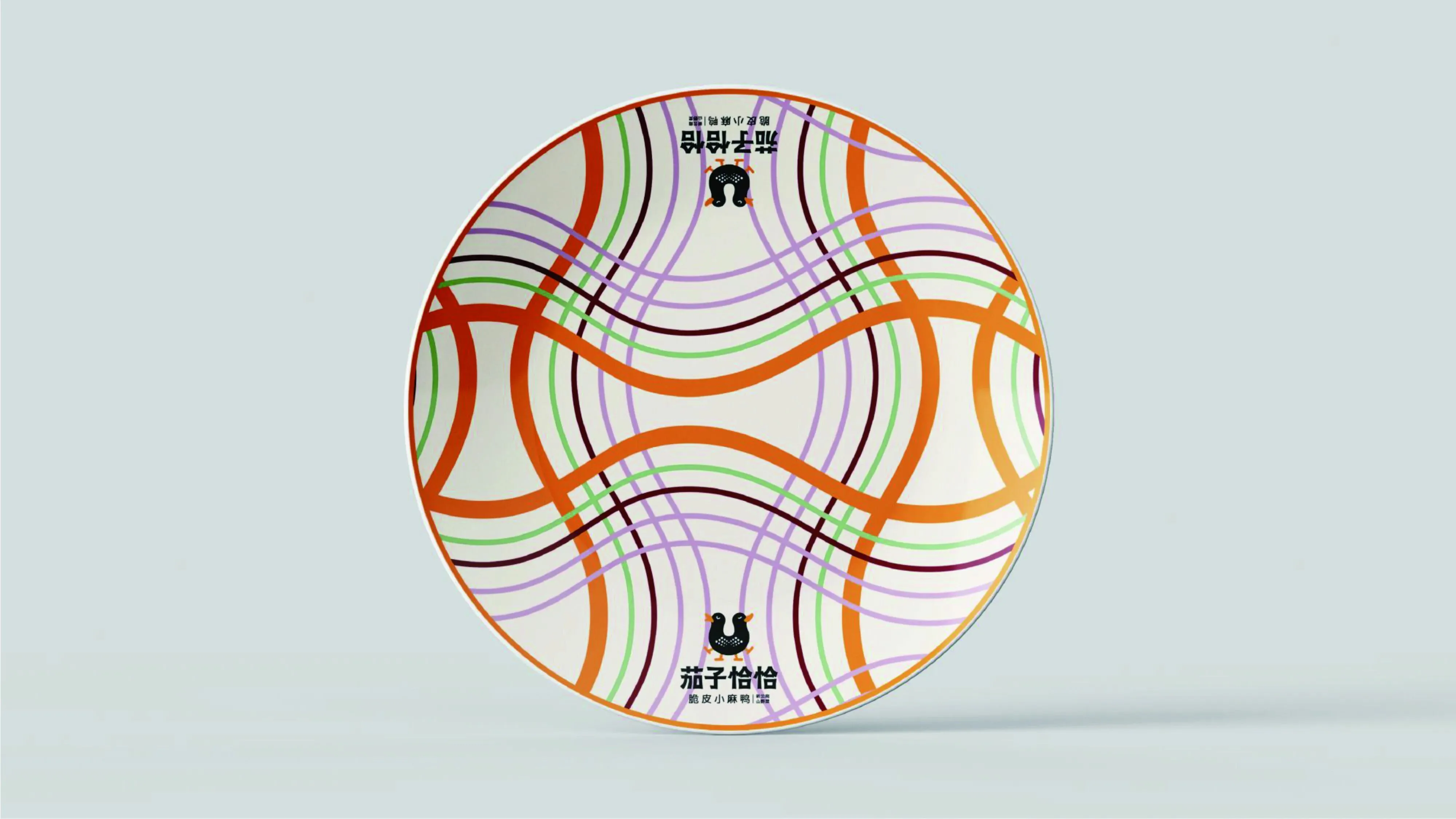
滇地,素有“七彩云南”之称,我们采用“东方吉橙”和“丁香紫”为主色调,其他民族风格配色为辅,展示云南缤纷炫丽的色彩特点。
The font design is simple and balanced with every stroke, and the upward curve echoes the angle of the duck humming with its head up, creating a harmonious combination.
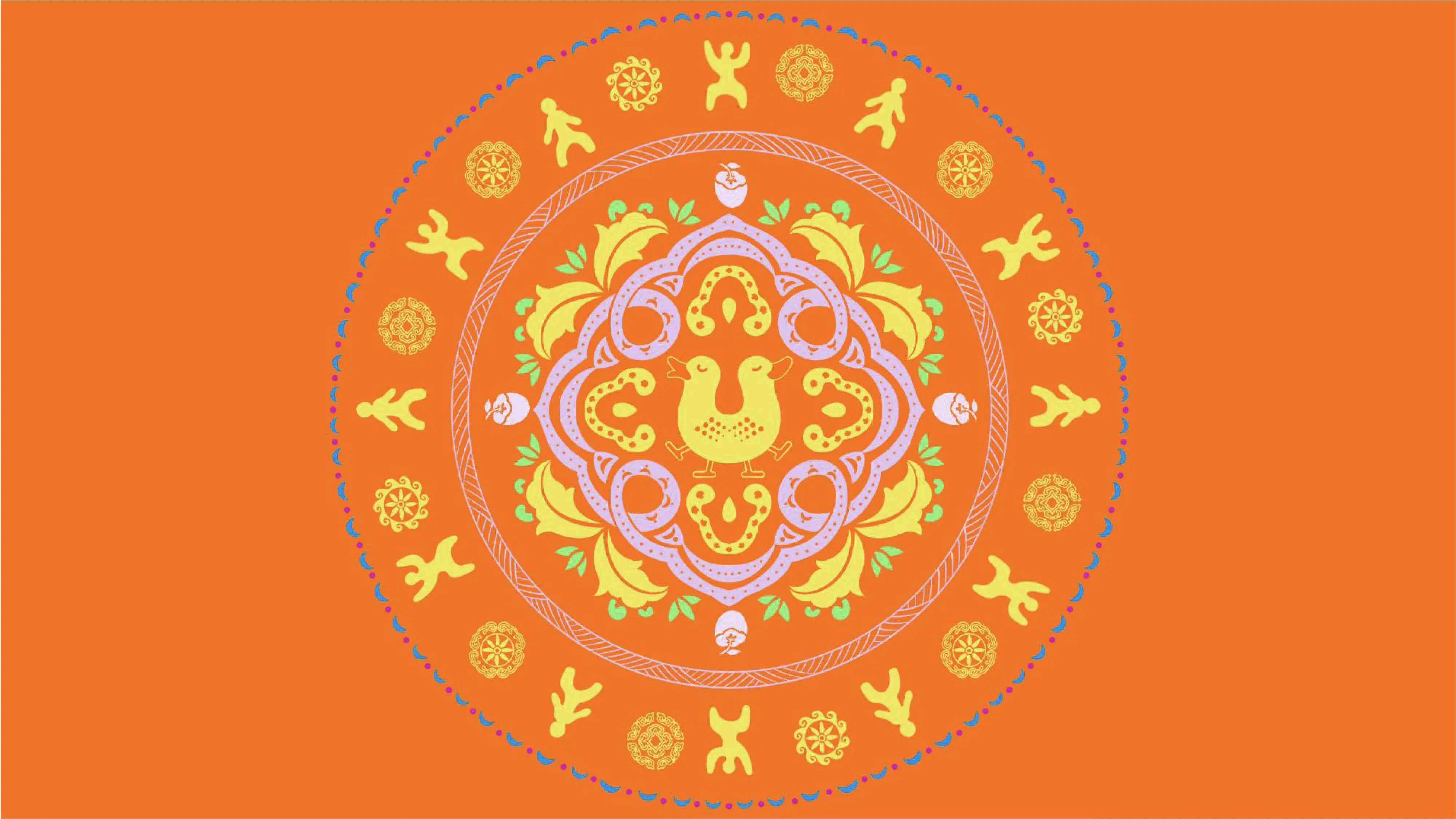
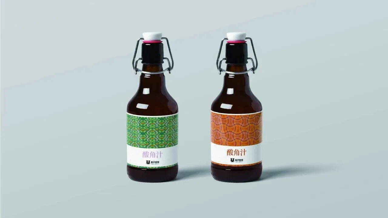
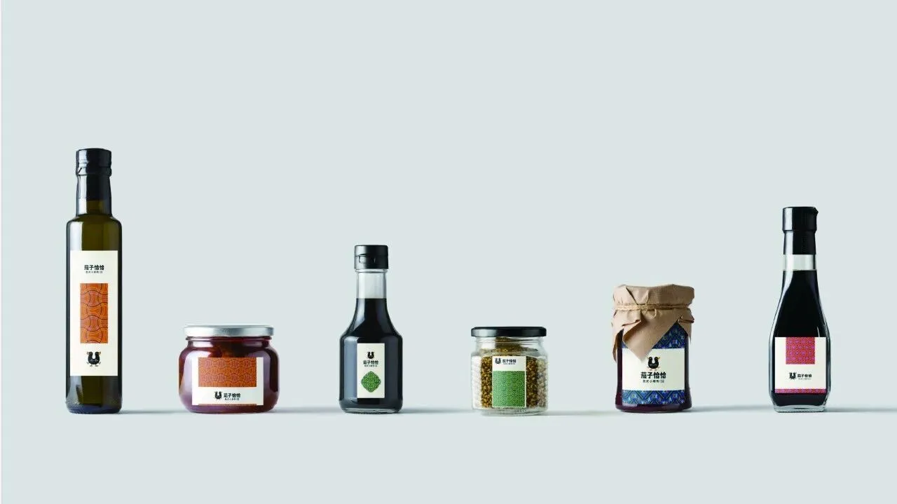
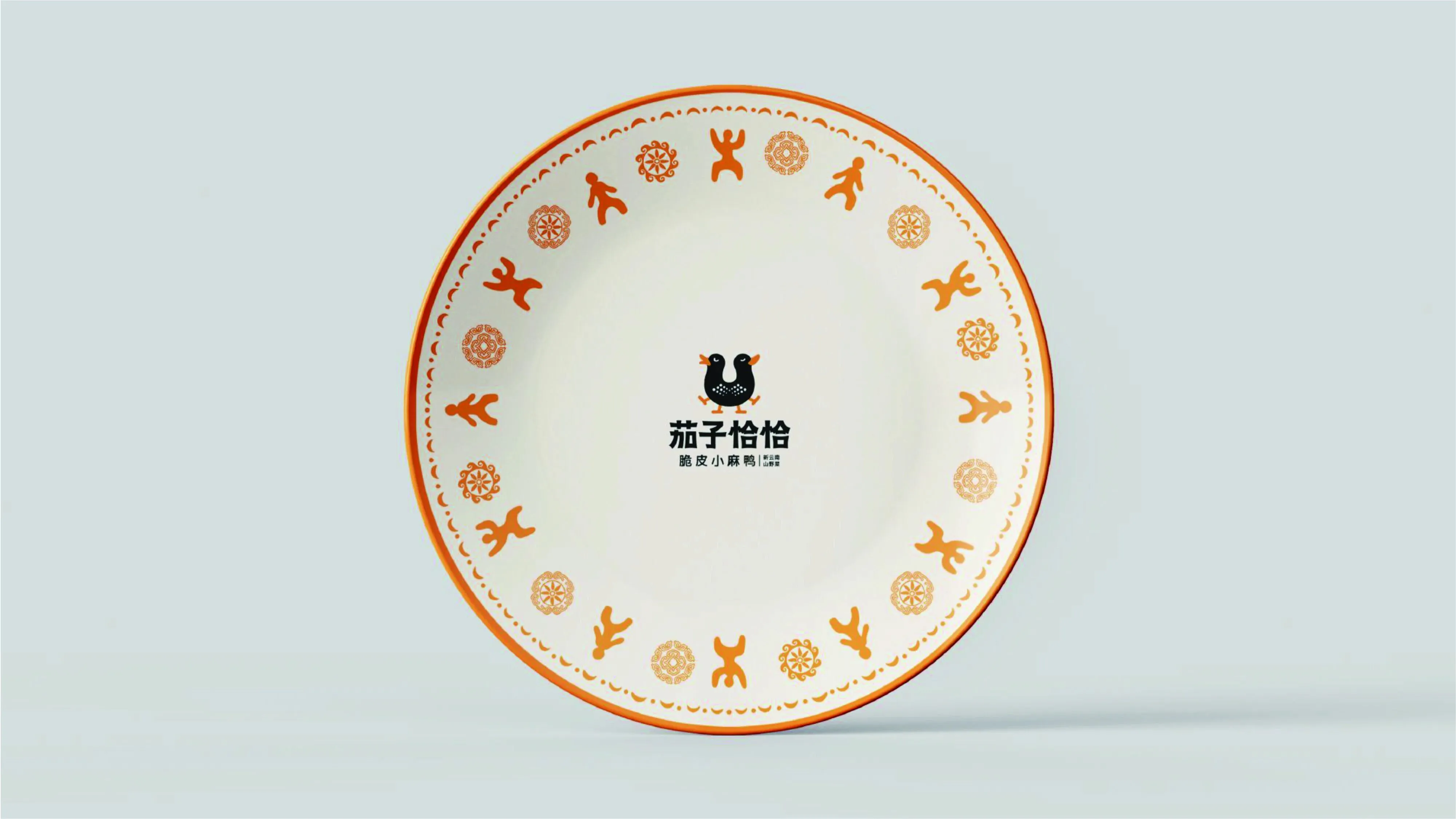
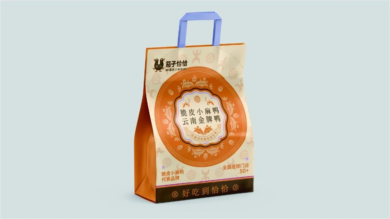
在延展设计中,我们从民族服饰纹样中汲取灵感。
传统纹样最直观地体现了云南人的日常生活、生产劳动、地貌风尚等面貌。云南人对大自然敬畏与崇拜,承载了人们对于美好生活的期望,这是一种文化符号和民族精神的象征,不同的纹样构筑了云南人的思想情感世界。
TIn extended design, we draw inspiration from ethnic clothing patterns.
Traditional patterns most intuitively reflect the daily life, production labor, and landscape trends of Yunnan people. Yunnan people's reverence and worship of nature carry their expectations for a better life, which is a cultural symbol and a symbol of national spirit. Different patterns construct the ideological and emotional world of Yunnan people.
VIS延展
-

02
-
空间效果展示
Space effect display
平面图
-
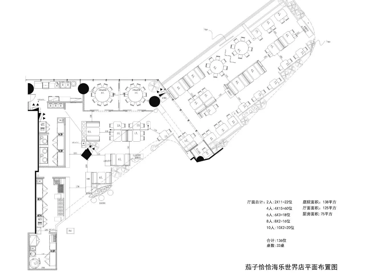
空间图
-
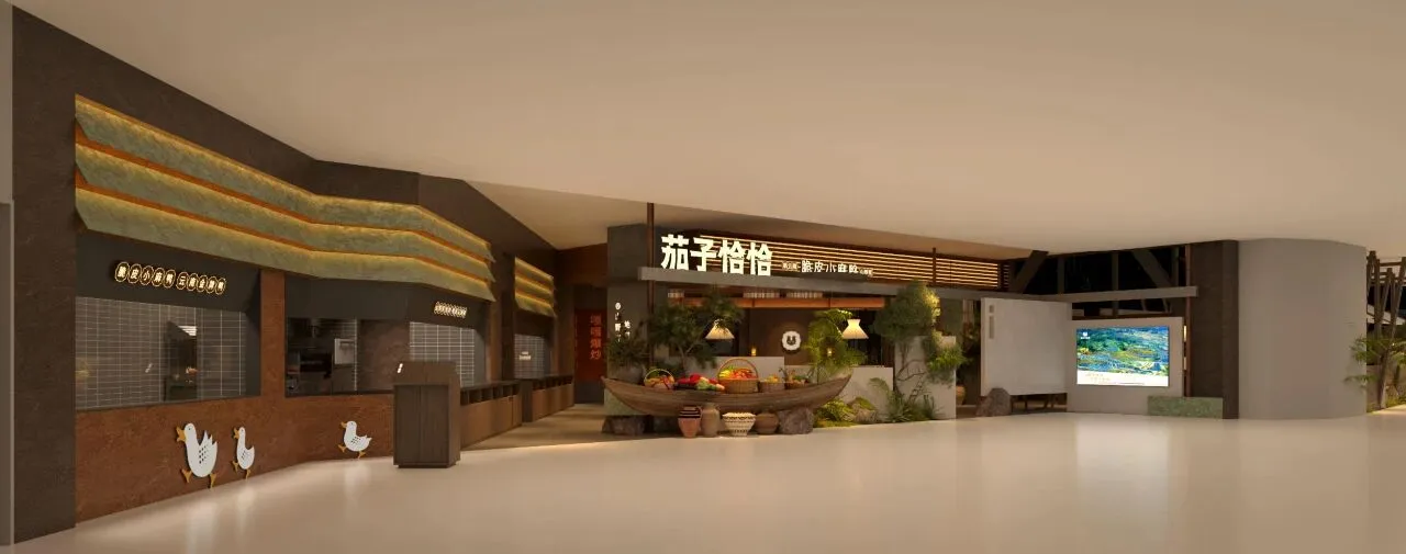
P.01
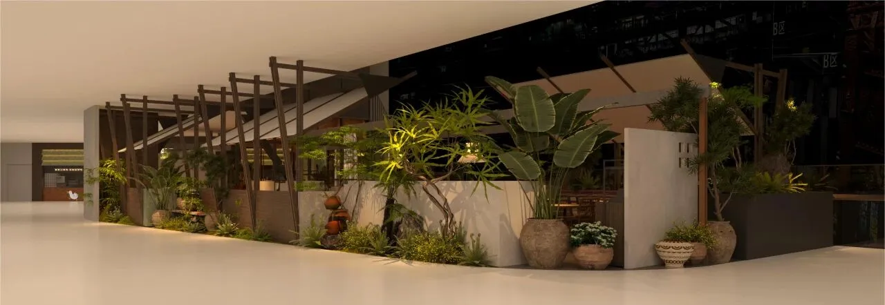
P.02
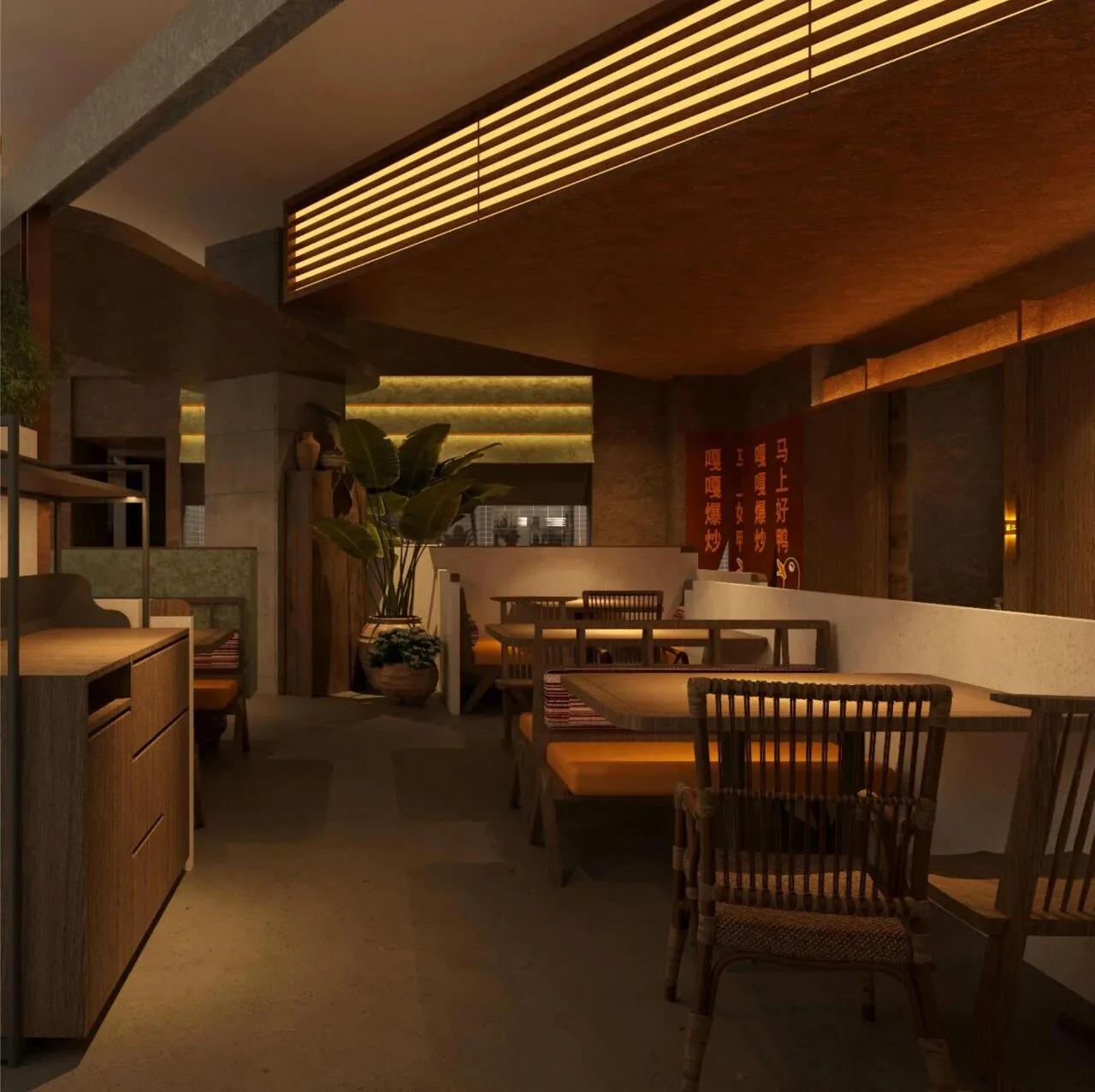
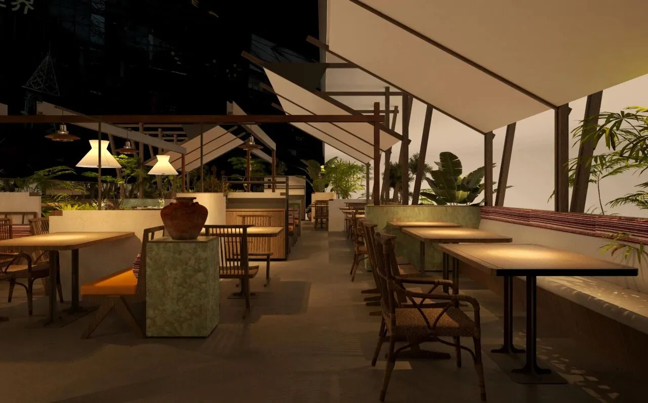
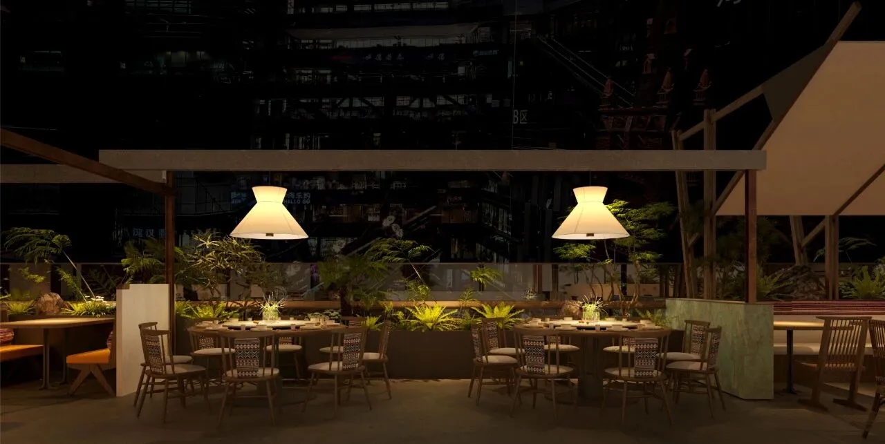
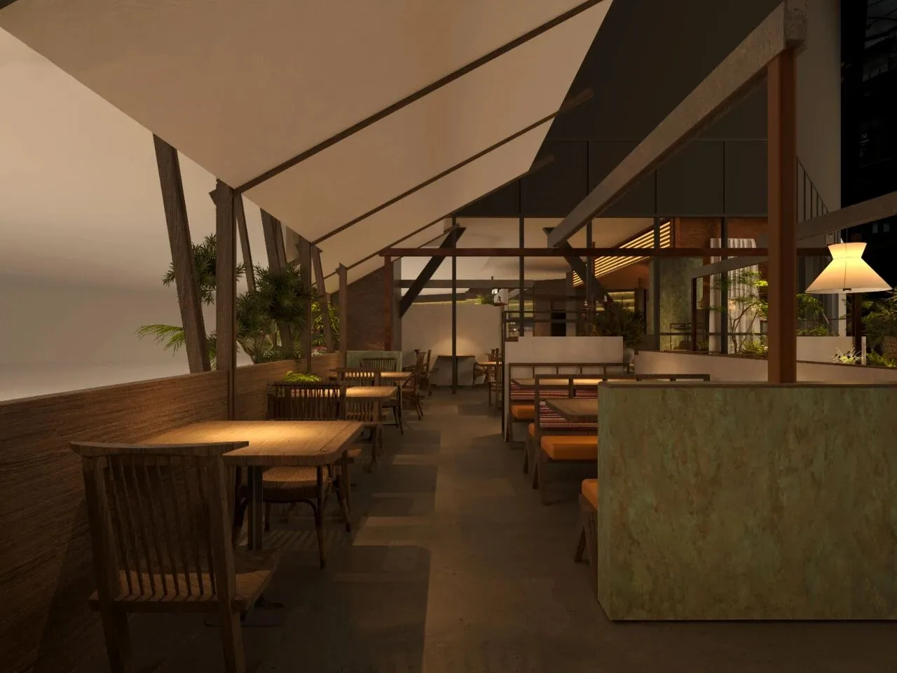
在此次空间设计上,我们依然保留了先前“山野”的概念方向。
在材质上,保留水泥、实木等天然原始材料,依据品牌VIS的升级,加入同类色系,如鎏金板。手法上,注重材料和结构的碰撞和解构,呈现与以往不同的风格面貌。
In this spatial design, we still retained the previous concept direction of 'mountain wilderness'.
In terms of material, natural raw materials such as cement an d solid wood are retained, and similar color schemes such as gold-plated boards are added based on the upgrade of the brand VIS. In terms of technique, emphasis is placed on the collision and deconstruction of materials and structures, presenting a different style and appearance from the past.
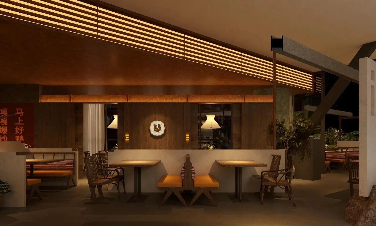
P.03
P.04
P.05
P.06
P.07
P.08
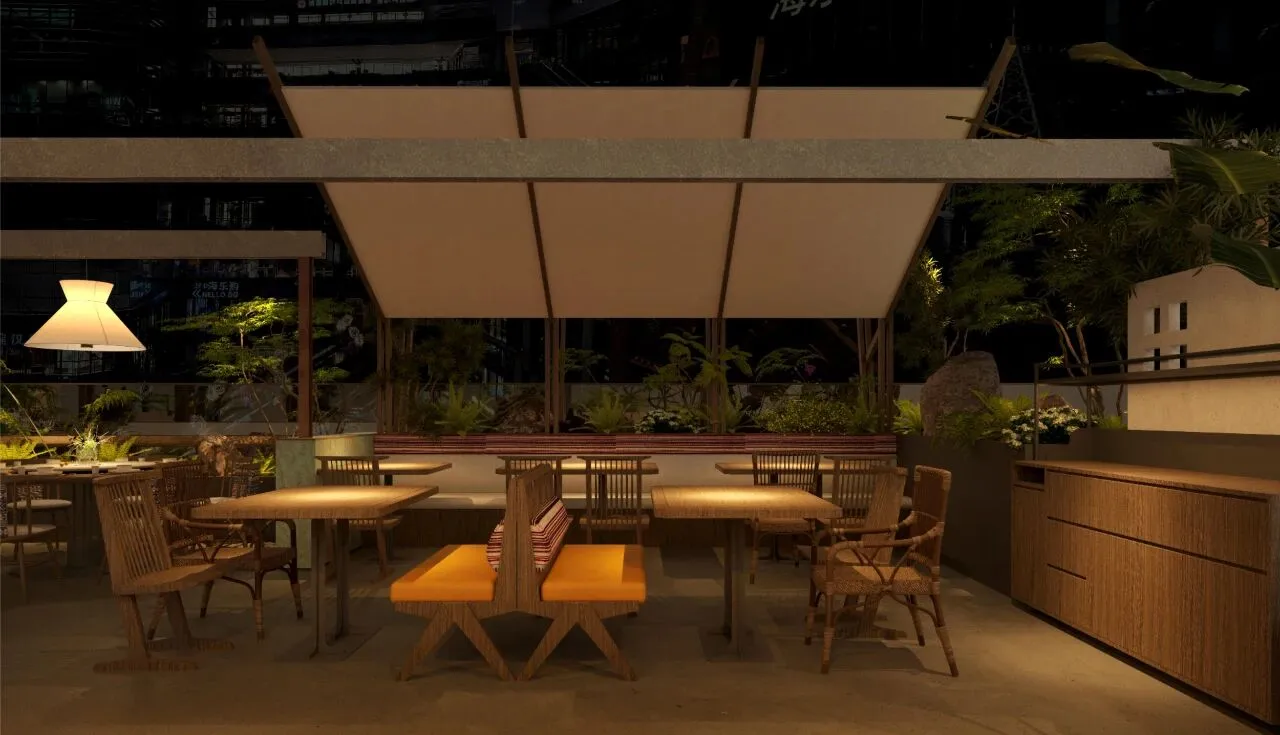
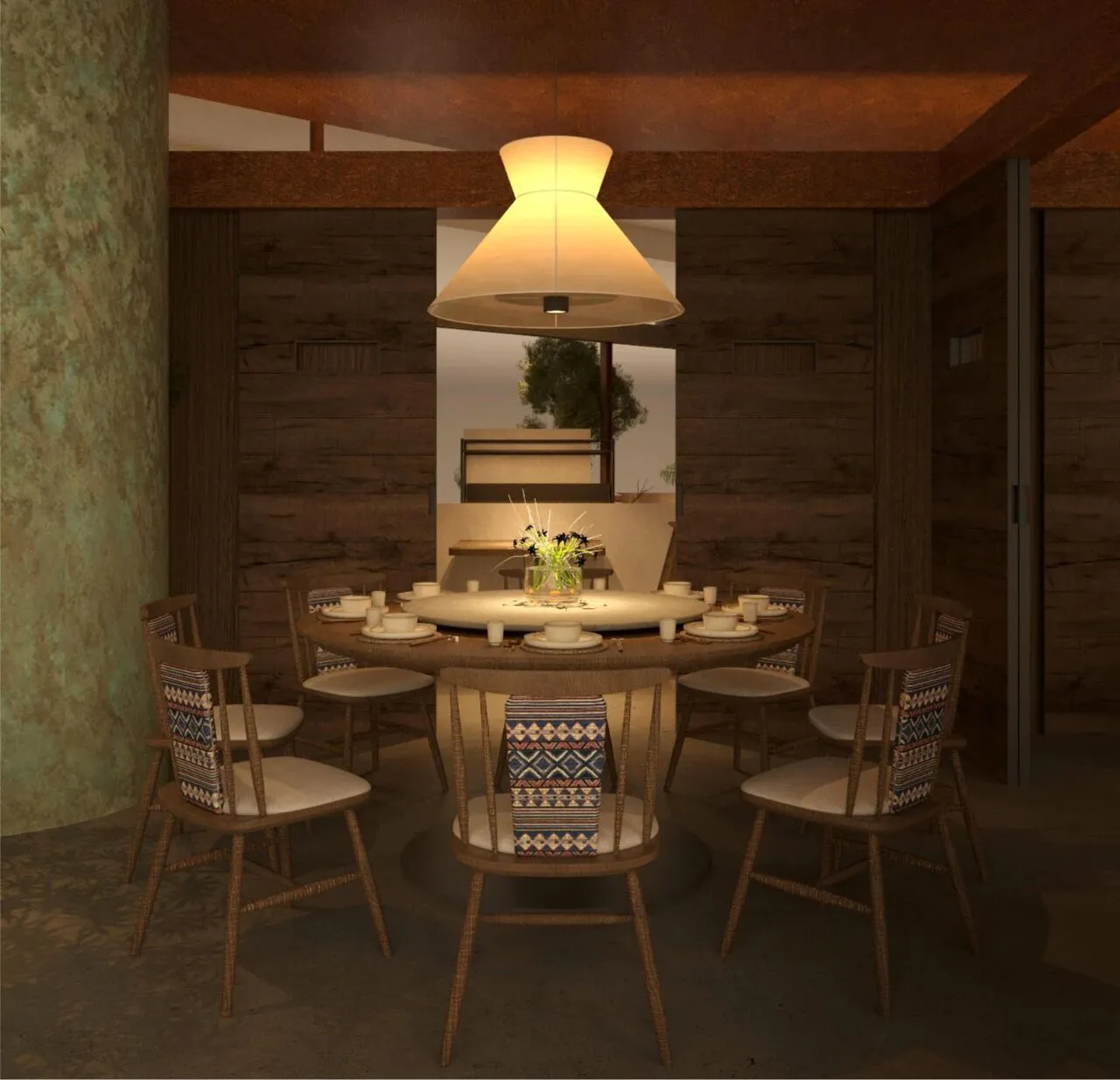
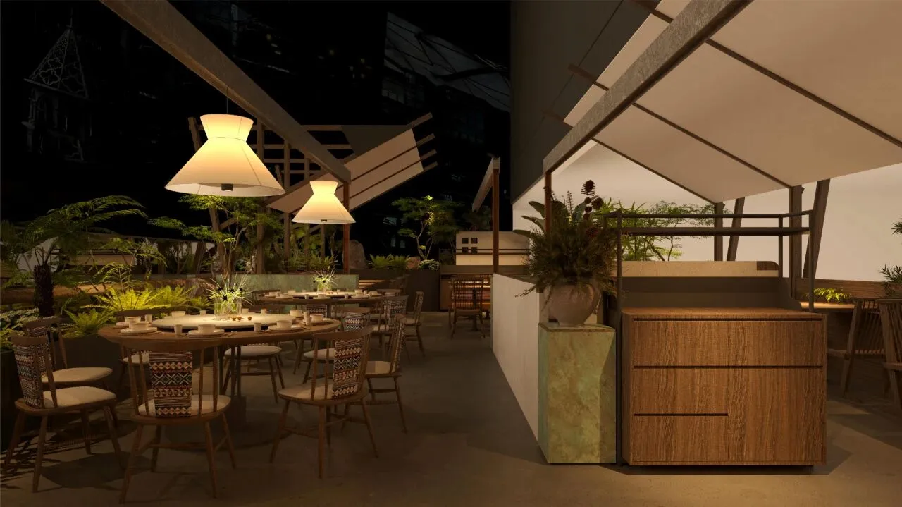
相较昆明万象城店凝练简化了许多。素色的帐幔、昏黄的灯罩、木质的桌椅、翠绿的植物,原始朴素之中又不缺少生机蓬勃的活力。
设计师捕捉滇地独有的传统风俗特征,将椅背加入民族纹样的元素,陈设融入空间之中,让走进餐厅的食客朦胧的感受到云南的风情特色。
Compared to the Mixc store, it has been condensed and simplified a lot.The plain curtains, dim yellow lampshades, wooden tables and chairs, and emerald green plants exude a vibrant vitality amidst their primitive simplicity.
The designer captures the unique traditional customs and features of Yunnan, incorporating ethnic patterns into the chair back and integrating the furnishings into the space, allowing diners entering the restaurant to vaguely feel the charm and characteristics of Yunnan.
P.09
P.10
-END-
-
PROJECT OVERVIEW
|项目信息|
项目名称 - 茄子恰恰
项目地点 - 云南 昆明
设计时间 - 2025年4月
建成时间 - 2025年5月
项目面积 - 338㎡
设计公司 - 界识设计团队
平面策划 - 逛吃逛吃品牌策划
主持设计 - 郭峰标 杨其波 朱思艺
参与设计 - 林高山 杨文进 傅锡辉 郑勇辉
-
界识设计是一间位于厦门的新锐设计机构,创立于2019年,致力于打破设计的边界,对话人文、艺术与城市等多元体系,营造具有识别度的当代空间。