
OYTT Design 欧阳跳 | 荣添记 | 解构空间,跳脱趣味

你必须找到那些分裂的东西
那许多的的碎片
只有在拼凑的断裂处
才能辨认其中的真实
——林贤治
You must find those fragmented things
The numerous pieces scattered around
Only at the joints where they are pieced together
Can the truth within be discerned.
— Lin Xianzhi
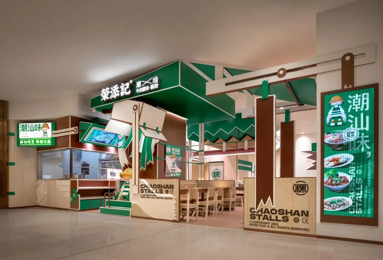
规整却呆板,整洁却庸常……当城市逐渐趋同,遗失了地域特色,置身其中的餐饮空间也不可避免的落入窠臼,成为千篇一律的“合格品”。如何通过艺术手法造就品牌自身的记忆点,以吸引年轻一代消费主力成为长期客户,已成为当下品牌与店面设计的重中之重。本案藉由建筑符号的延申与解构,完成对空间趣味性的探索,以跳脱于既定框架之外的个性化观感,给予顾客最佳的消费体验。
Standardized yet rigid, neat yet commonplace... As cities increasingly converge, losing their regional characteristics, the dining spaces within them inevitably fall into a rut, becoming indistinguishable "qualified products". How to create memorable brand identity through artistic techniques to attract the younger generation as long-term customers has become a primary focus in brand and store design today. This project leverages architectural symbols and deconstruction to explore the playfulness of space, offering a personalized perception that breaks free from conventional frameworks, providing customers with the ultimate consumer experience.
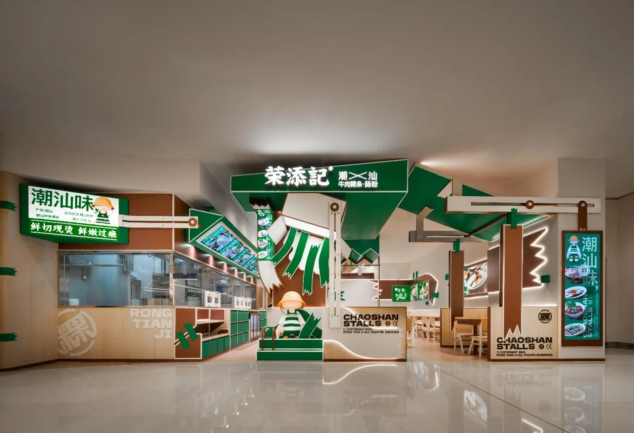
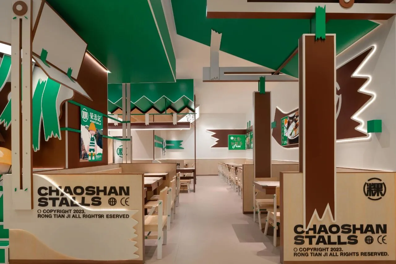

根植于潮汕饮食文化,追随当下品味潮流,设计师通过拆解餐饮空间与品牌形象的固有元素,将其重新排列组合,以期能够以全新的风貌诠释旧有空间,从而让设计的趣味成功捕捉年轻一代的目光,在商场林立的店铺中实现品牌的脱颖而出。
Rooted in Chaoshan cuisine culture and following current taste trends, the designer deconstructs the inherent elements of the dining space and brand image, rearranging them to interpret the old space in a fresh manner. This approach aims to capture the attention of the younger generation with engaging design, enabling the brand to stand out among the numerous stores in shopping malls.
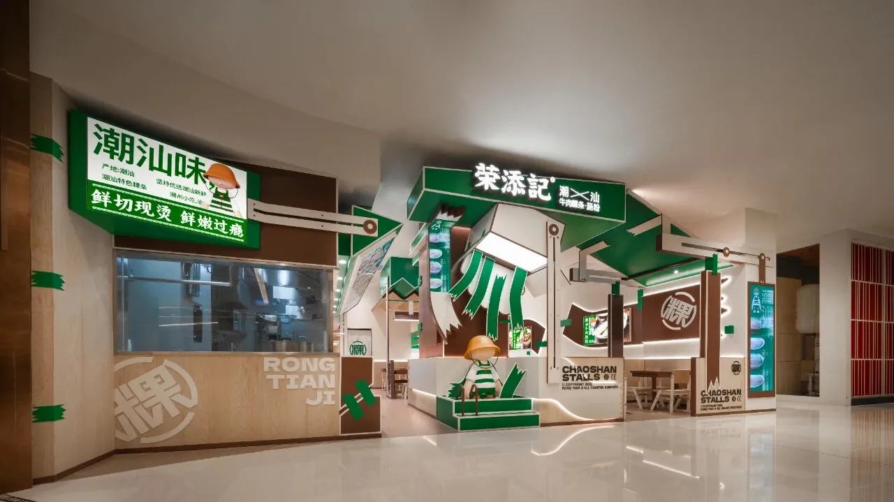
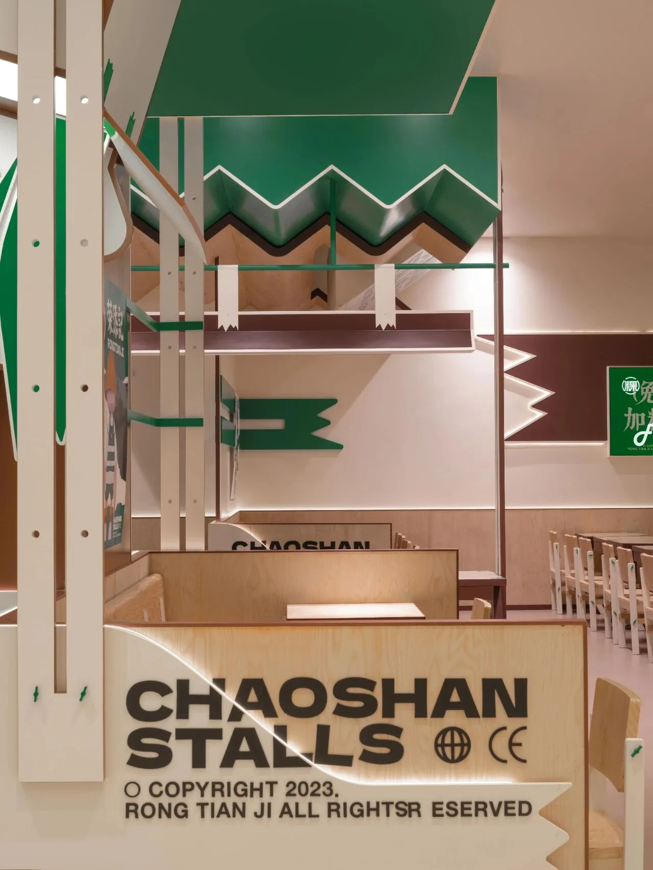
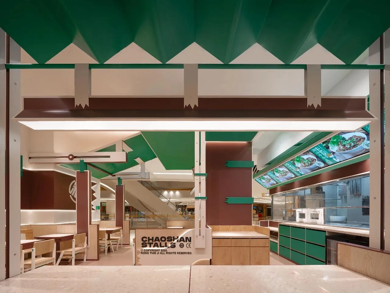
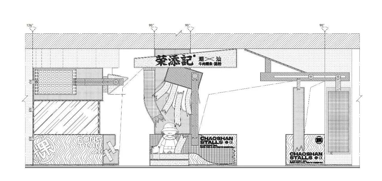
主门头以木色作为基底,取品牌卖点潮汕粿条的形色进行解构与重塑,撷取绿色与棕色装点出餐饮空间的别样观感。透明厨房、店面logo与临街卡座依次排列,多样的绿色体块与品牌元素穿插其中,由纵深之态形成强有力的视觉冲击,随之带来的层次韵律和沉浸体验则予人街巷般的生机与活力,逐步完成从吸引目光注意到引导进入消费的整个过程。
The main entrance uses a wood tone as the base, deconstructing and reshaping the shape and color of the brand's selling point, Chaoshan rice noodles, and enhancing the dining space with green and brown accents. A transparent kitchen, the storefront logo, and street-facing booths are arranged in sequence. Various green modules and brand elements are interspersed throughout, forming a powerful visual impact with a sense of depth. This creates a rhythmic layering and immersive experience that exudes the vitality and vibrancy of a bustling street, gradually leading the process from catching the eye to enticing customers to enter and make purchases.
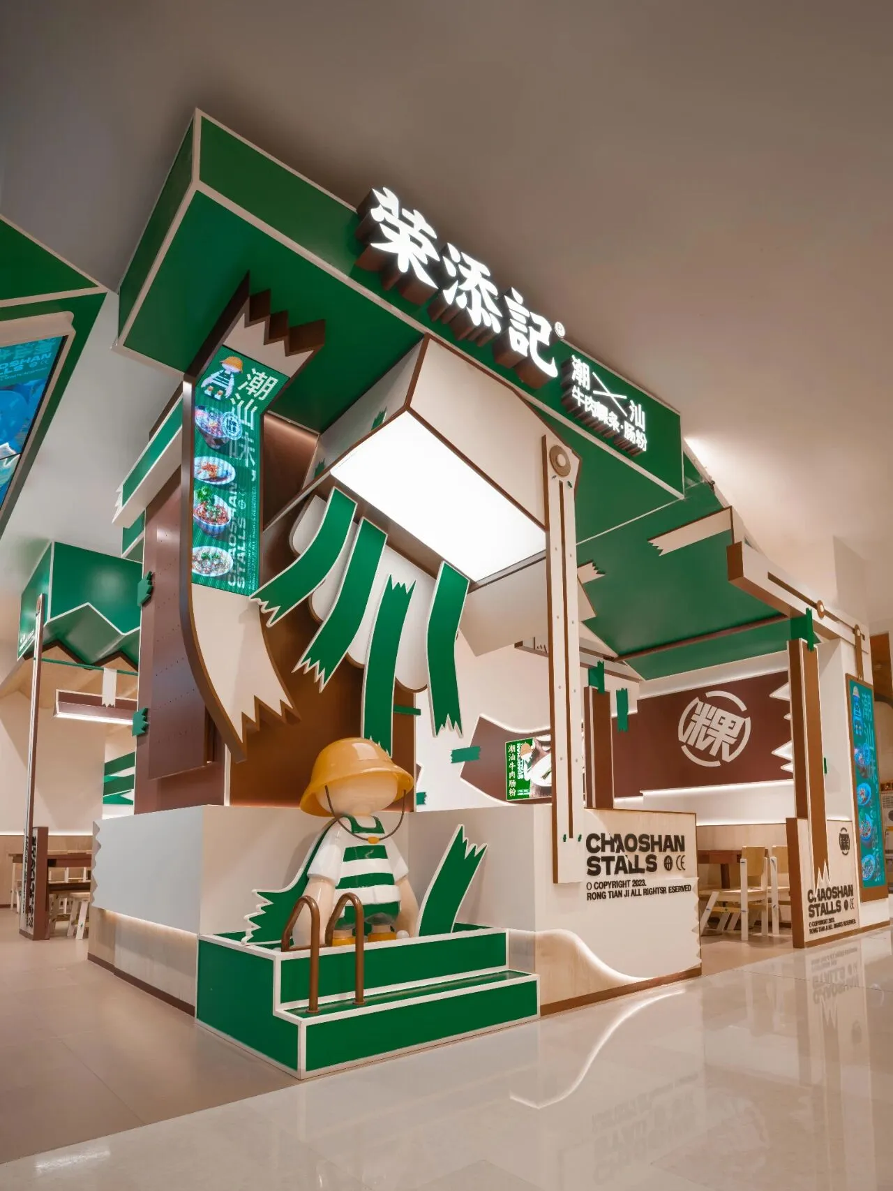
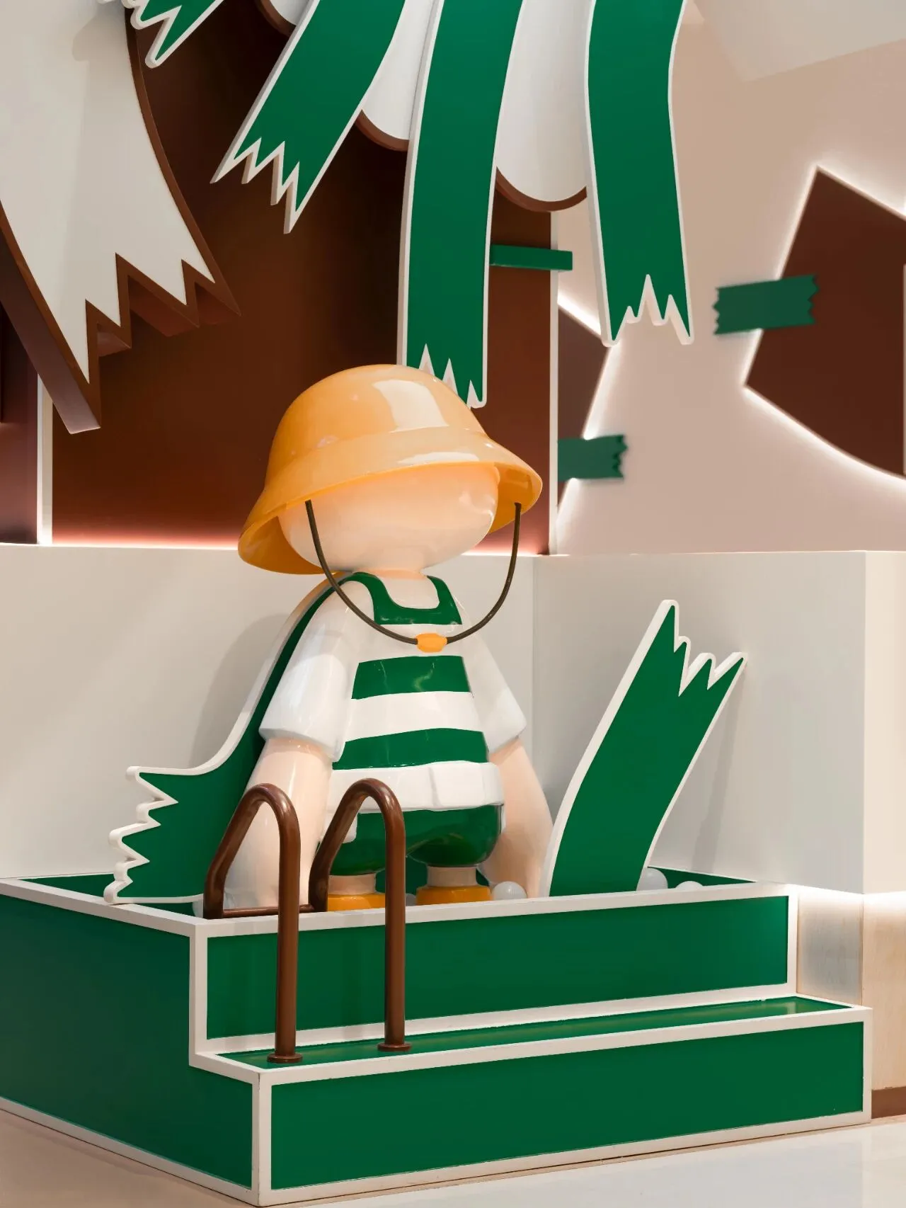
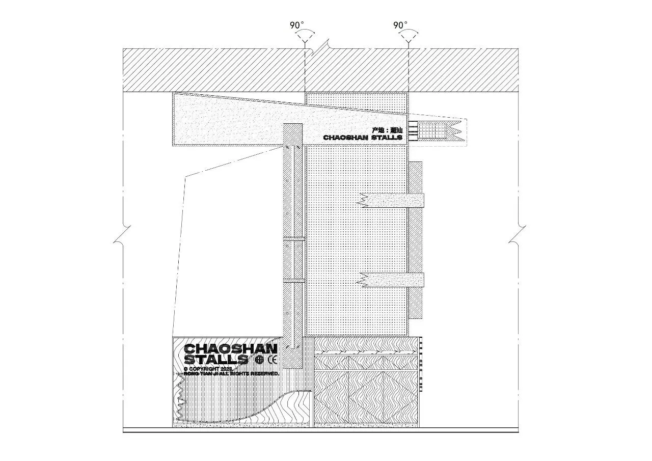
门头正中,不规则的色块构成强有力的视觉重心,而品牌logo置于其上为故事场景点名主题——透光的箱子倾倒处潮汕粿条的品牌人偶与多样的美食。IP人偶侧旁,美食展示与英文装饰相得益彰,展现出店面“小吃档口”的装饰定位,为淡漠的商业形态增添几许市井的烟火气息。
At the center of the entrance, irregular color blocks form a strong visual focal point, with the brand logo placed above to underscore the theme of the story scene—a transparent box tipping over, spilling Chaoshan rice noodle brand figurines and a variety of delicacies. Beside the IP figurines, the display of food complemented by English decorations enhances the "snack stall" decorative positioning of the storefront, adding a touch of marketplace liveliness to the otherwise bland commercial setting.
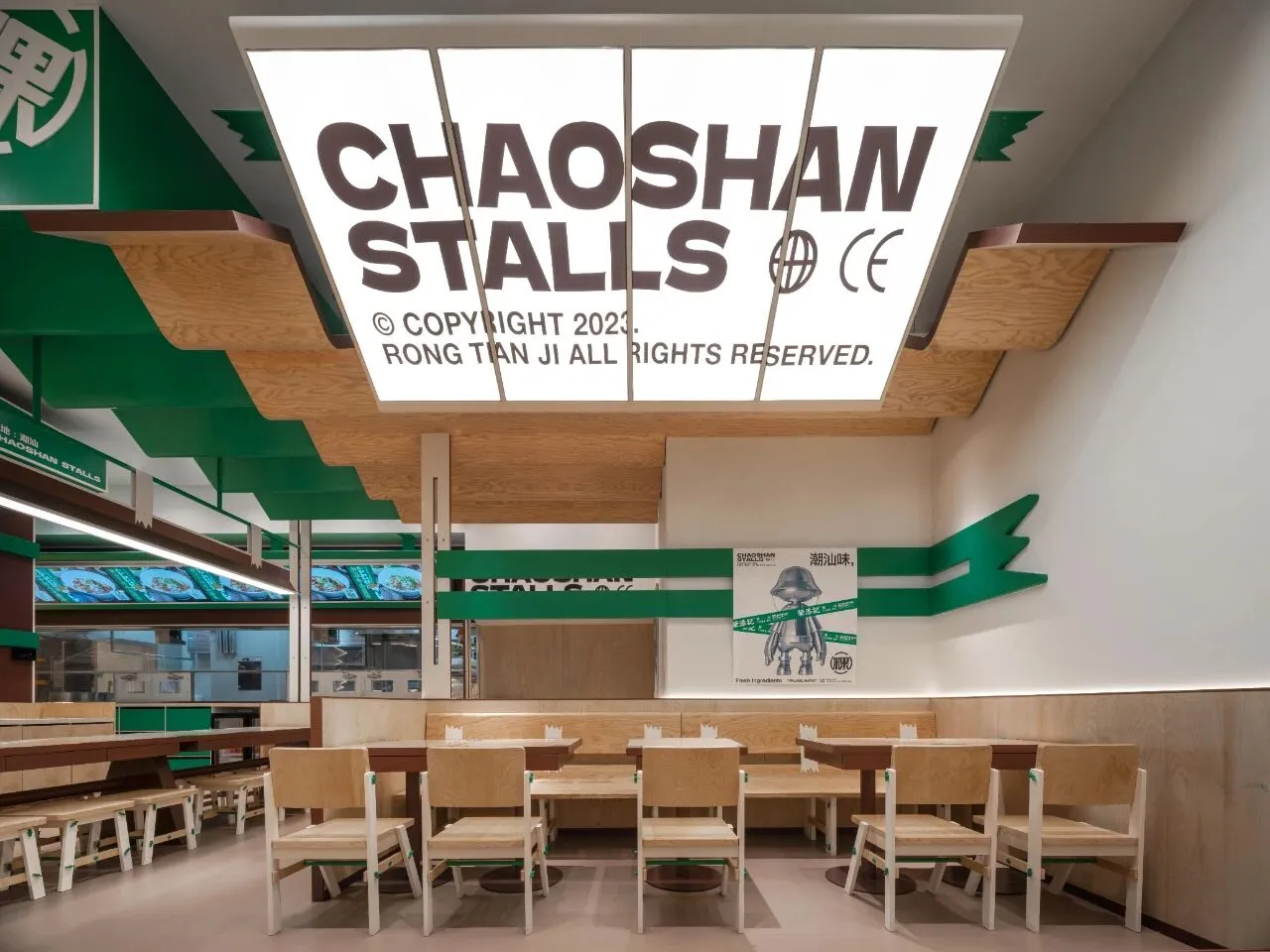
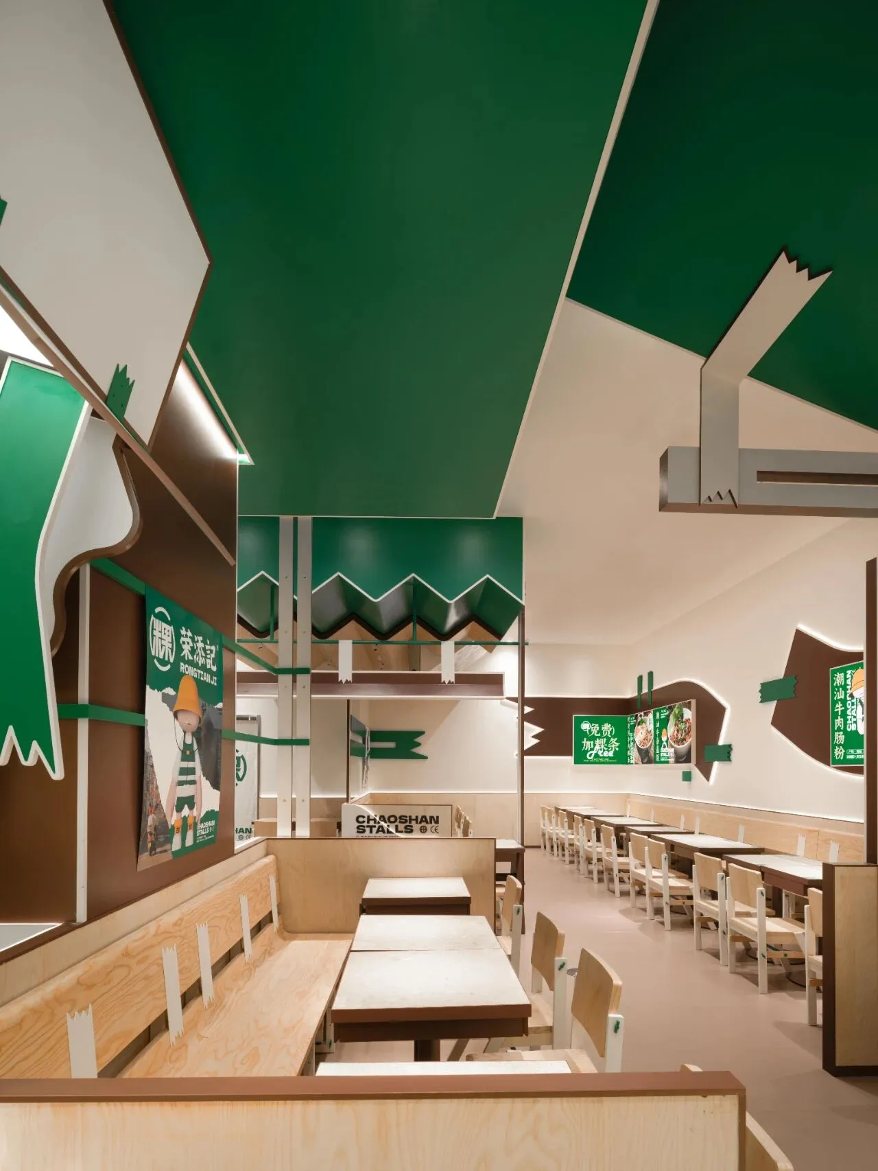
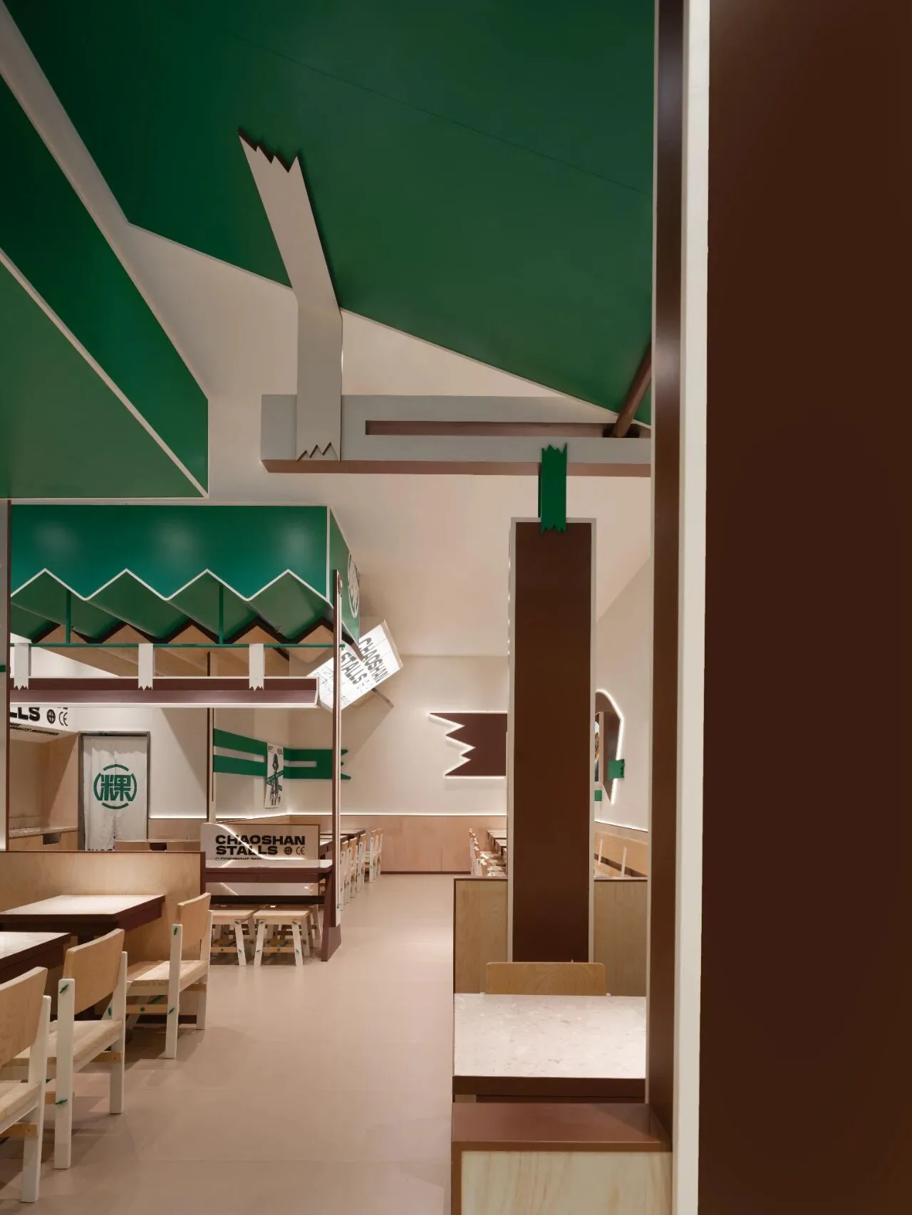
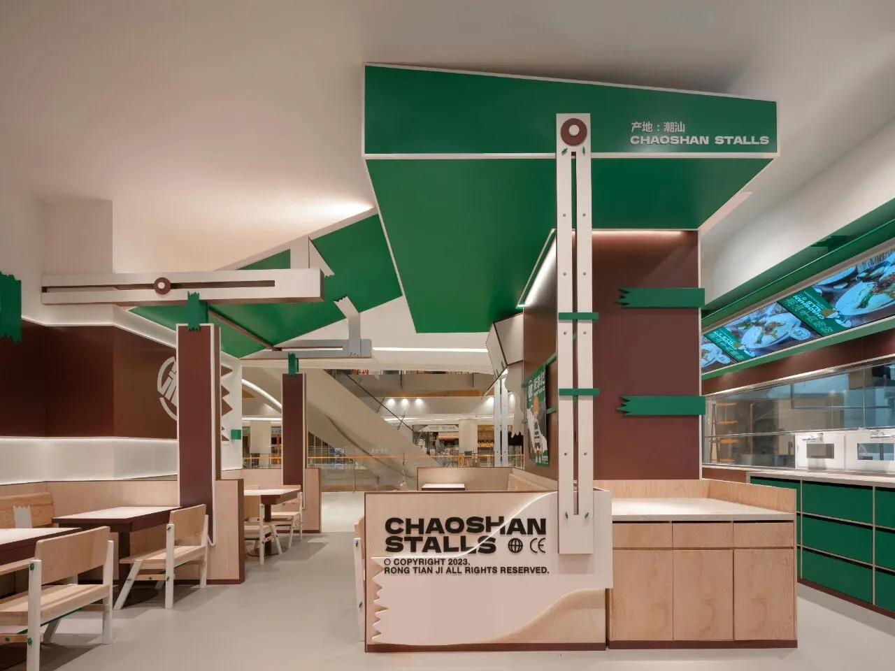
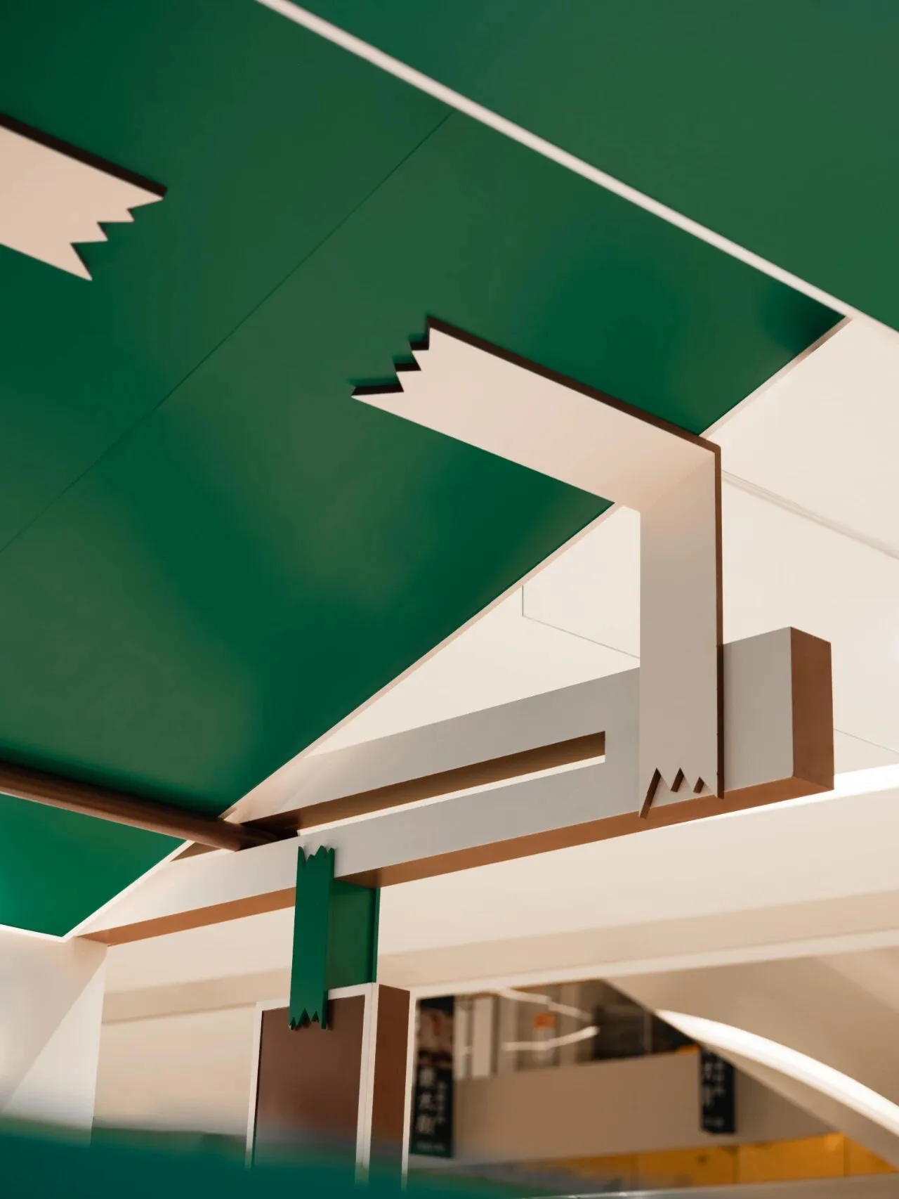
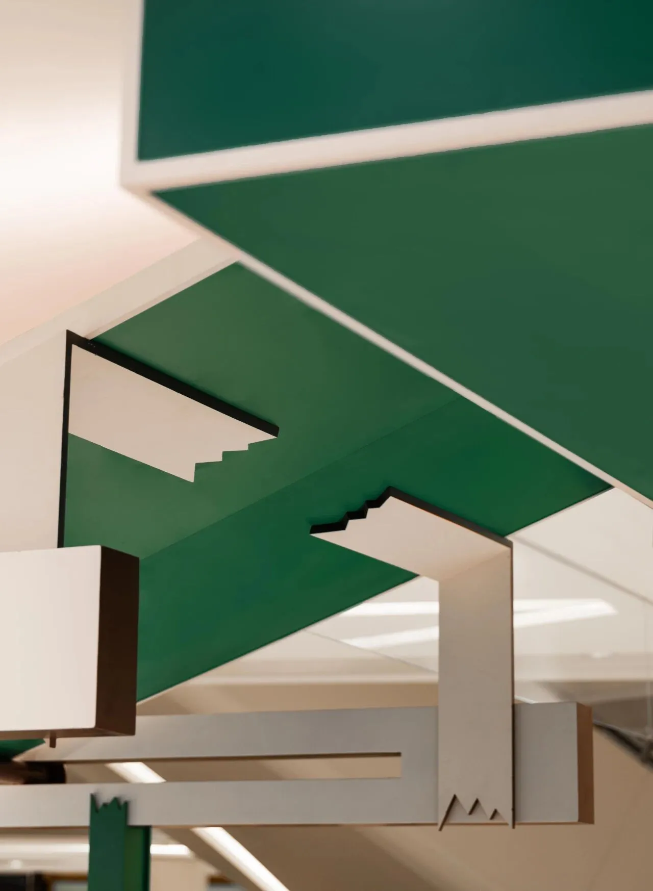
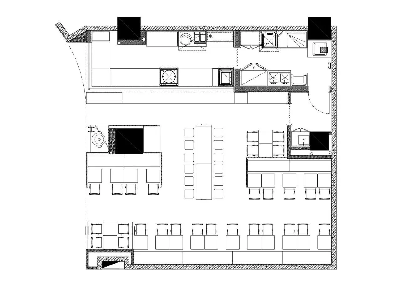
步入店内,明厨档口与就餐座位各置两侧,环形动线则让点餐就座于热闹非凡中也可兼有便利快捷之感。环顾店面,墙色淡然呼应光洁大理石桌面,而棕色与绿色交错,以断裂胶带的随意感张扬出品牌浓烈的亲切感。
Upon entering the restaurant, the open kitchen and dining seats are placed on opposite sides, while a circular flow allows for ordering and seating to be conveniently swift amidst the bustling atmosphere. Looking around the store, the light wall colors complement the polished marble tabletops, and the interplay of brown and green boldly expresses the brand's intense warmth through the spontaneous feel of broken tape.
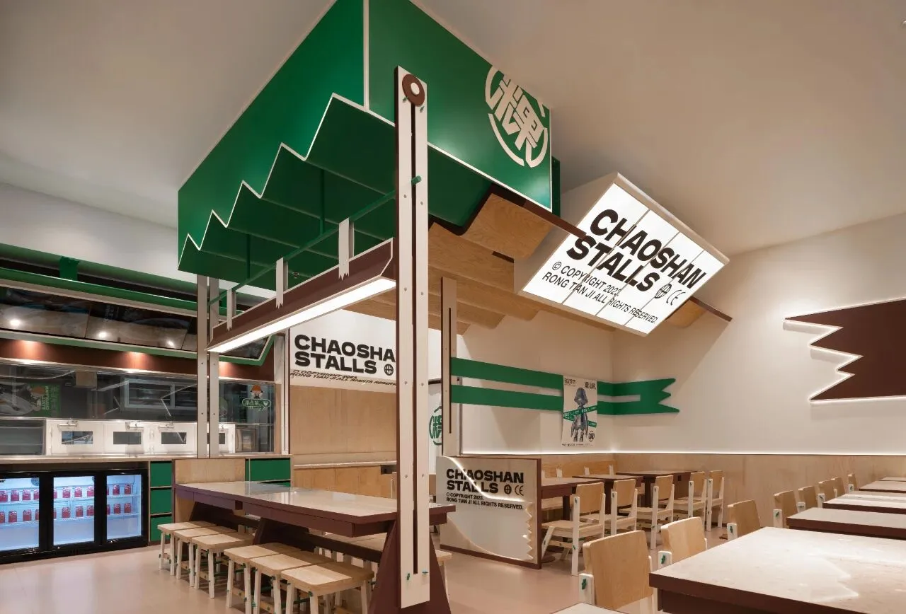
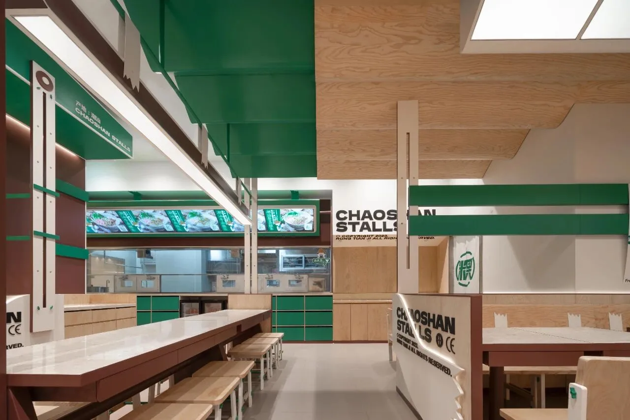
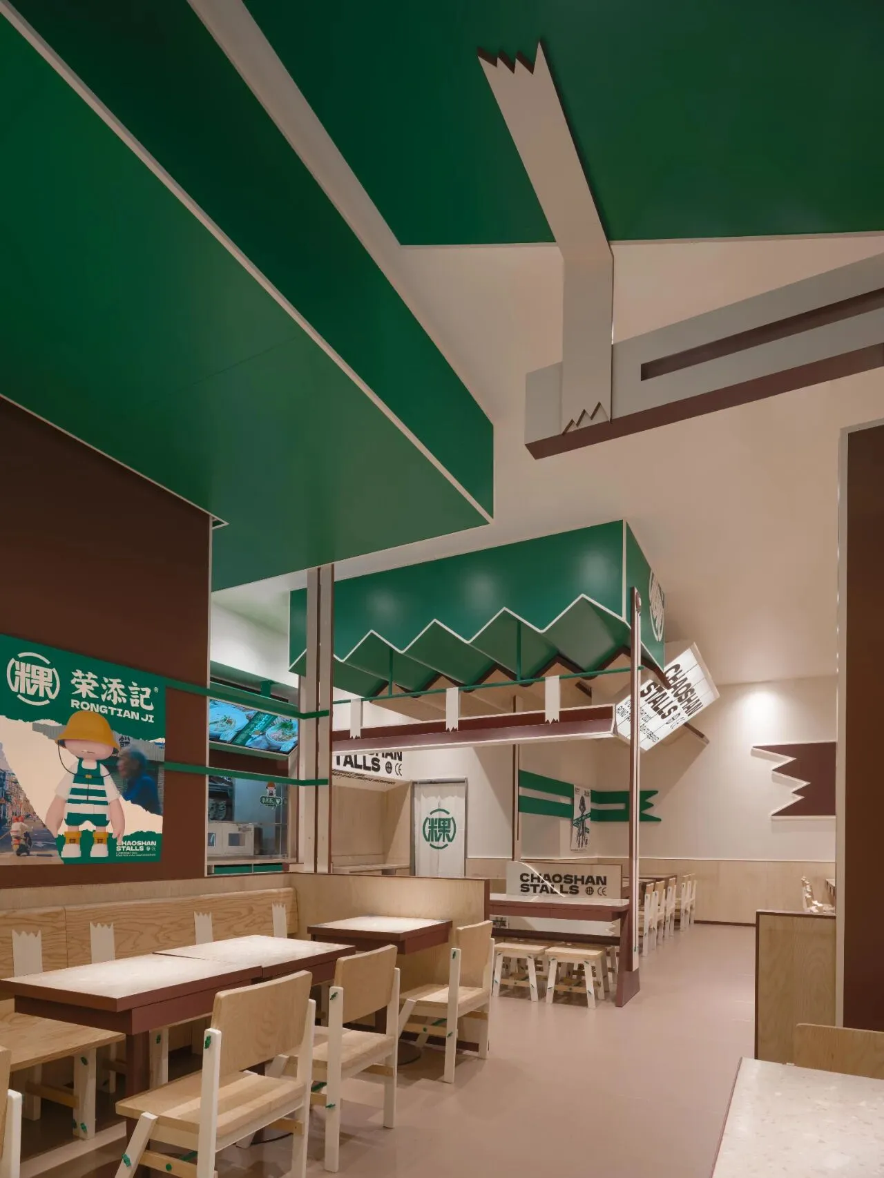
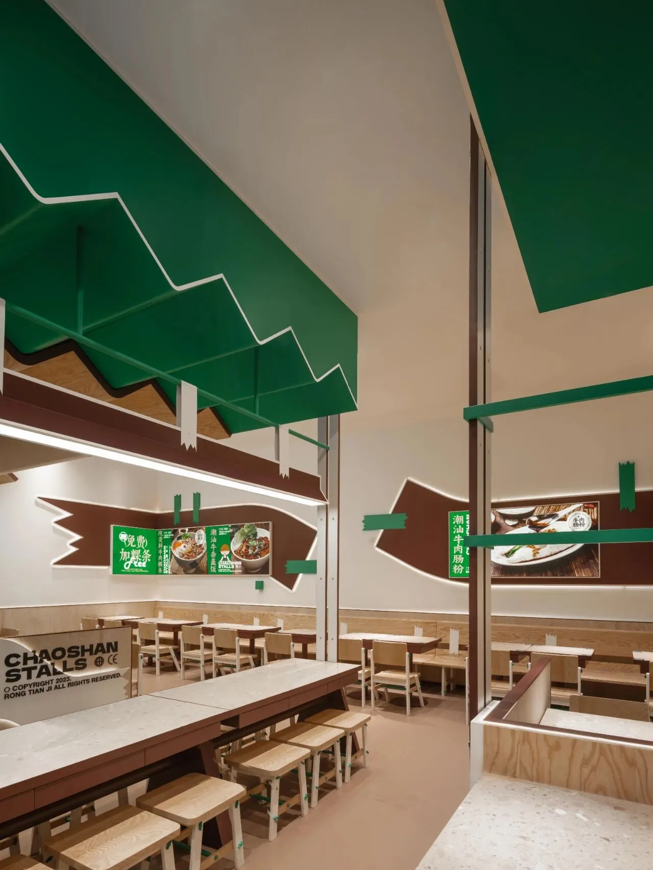
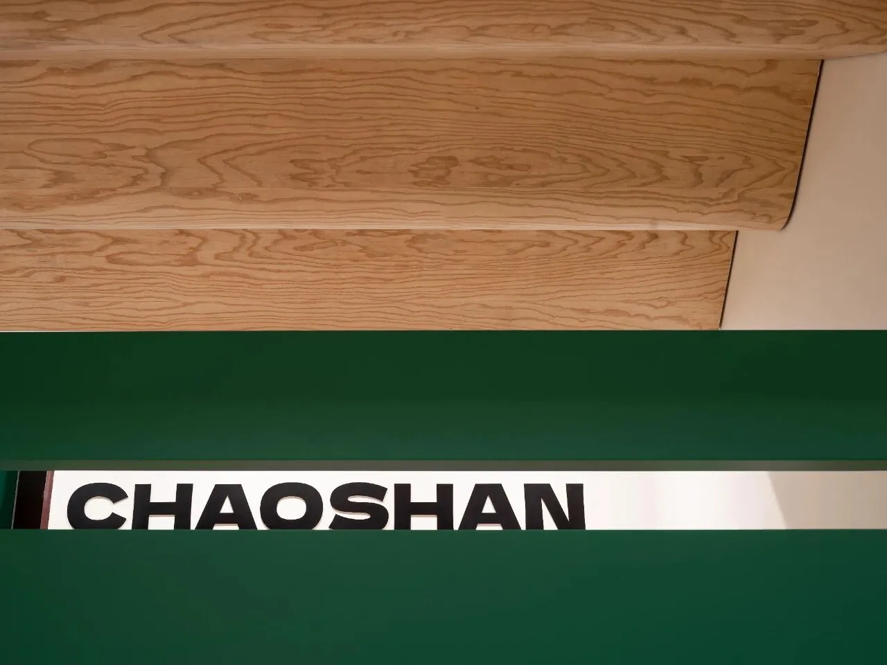
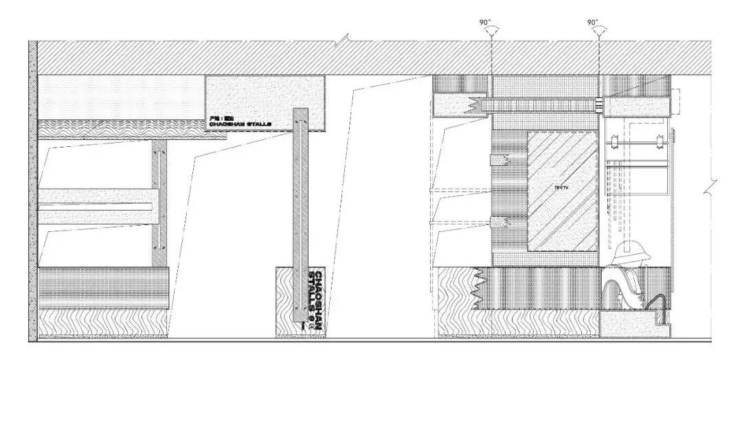
点单落座,大纹理桌面与浅色木纹基底构建柔和空间,自然、放松之感随之而来;而曲折天花装饰则保有旧时街摊特色,以波浪柔形衬托一碗潮汕粿条的旧时味道与记忆。正如丰富食材组合出的多样美味,适宜的解构方式也可让空间产生不同的空间效果,让更多人能领略到这一方美食的独特魅力与价值。
Upon ordering and seating, the large textured tabletops and light wood-grain base create a gentle space, bringing a sense of nature and relaxation. The intricate ceiling decorations retain the old-time street stall character, using wavy, soft shapes to enhance the nostalgic flavor and memories associated with a bowl of Chaoshan rice noodles. Just as a rich combination of ingredients creates a variety of delicious flavors, an appropriate deconstruction approach can also produce different spatial effects, enabling more people to appreciate the unique charm and value of this regional cuisine.
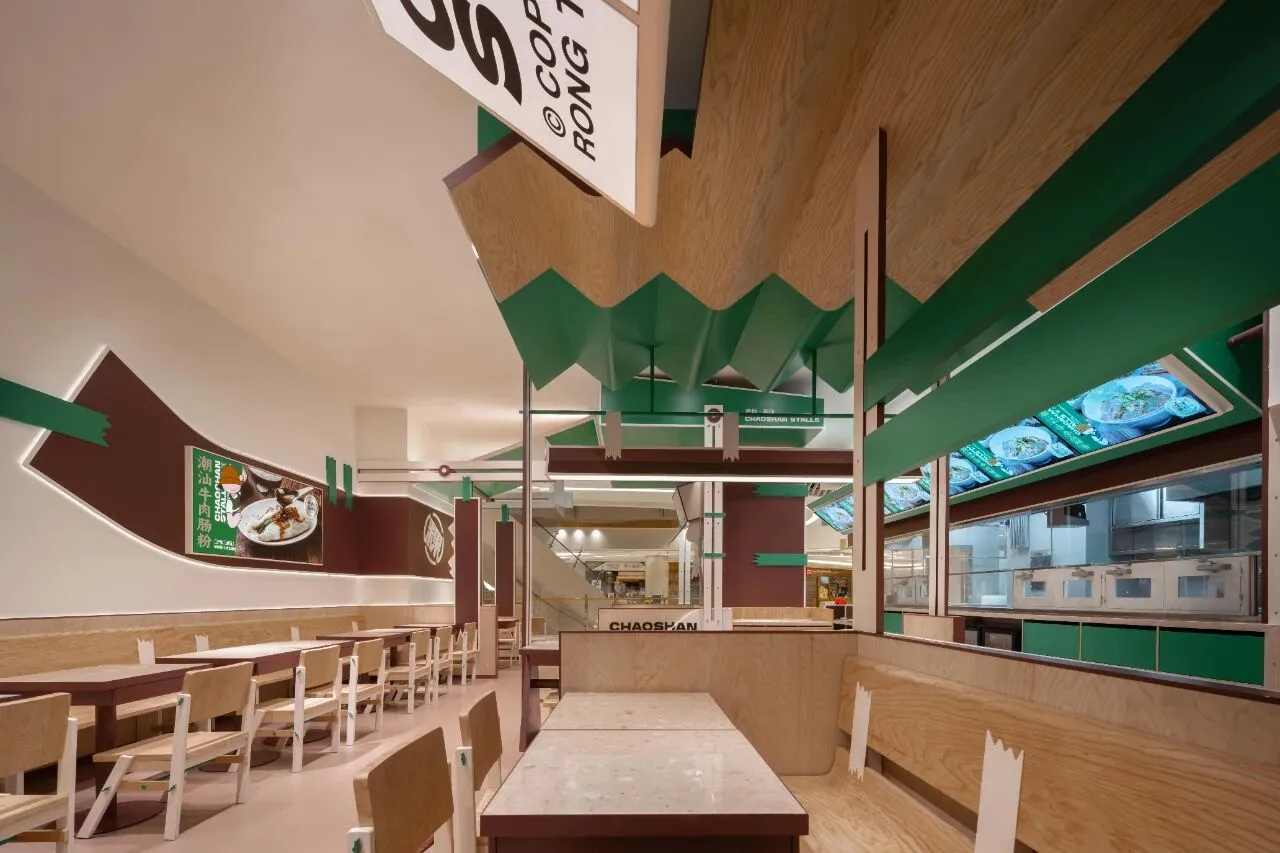
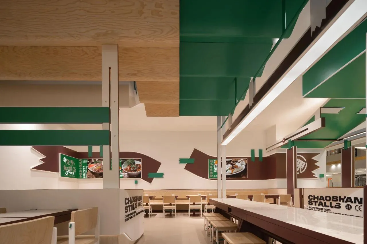
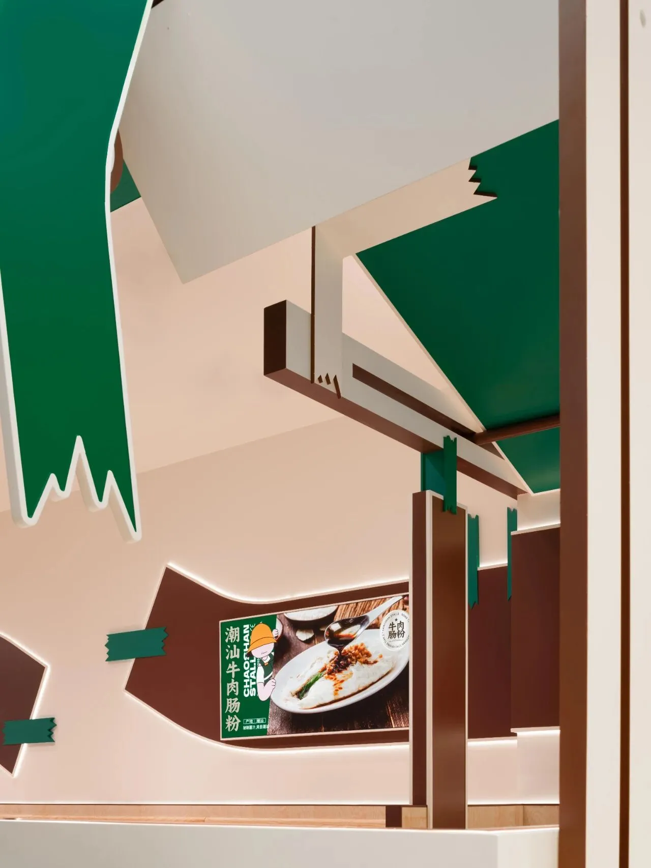
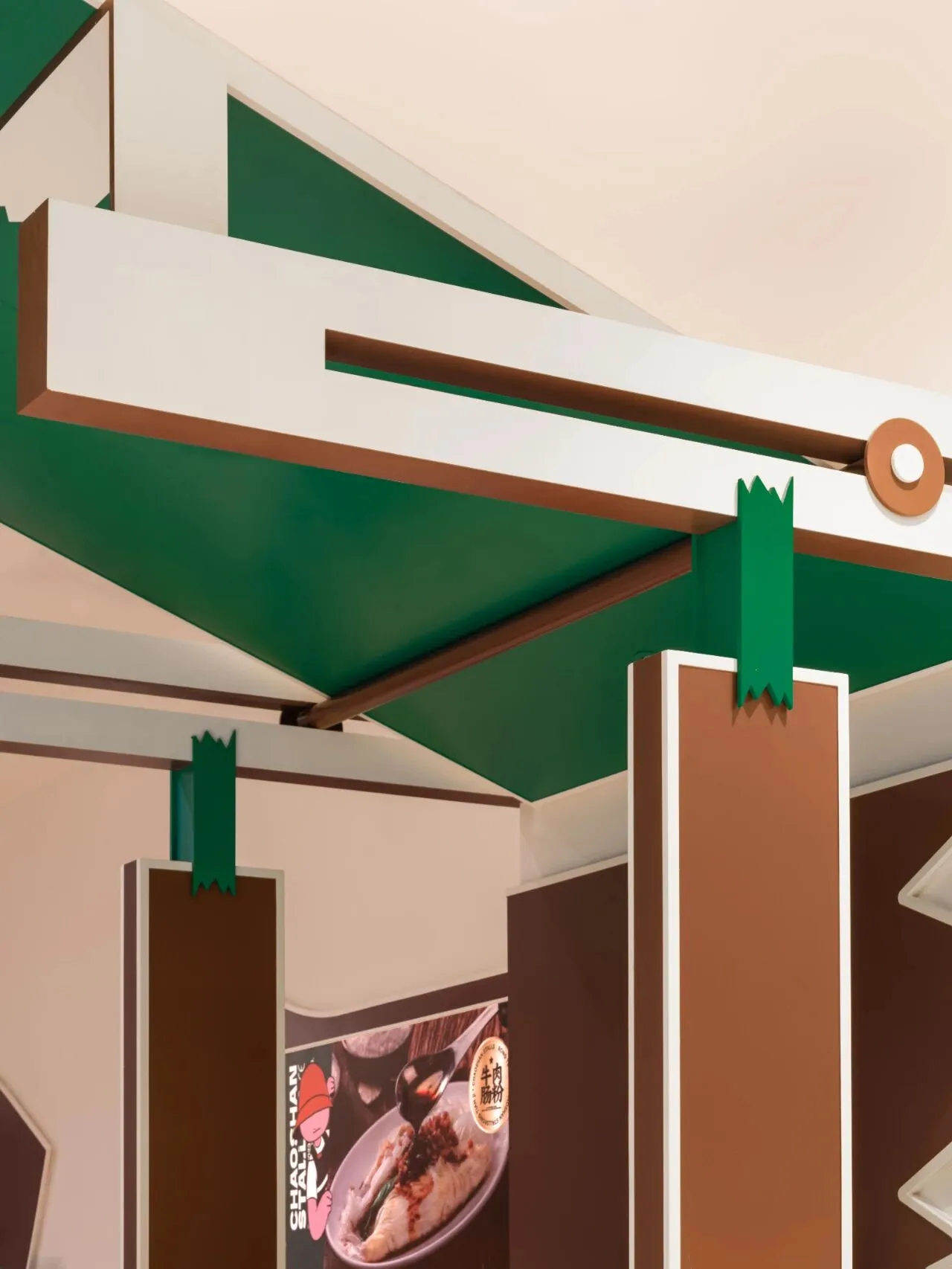
氤氲香气之中,天花曲直之下,长桌热闹而木座温柔,菜色展示或是档口招牌,由多样“胶带”拼贴一处,不羁与自由中,美食汤条与解构空间共同构成独属于本案的用餐体验,令往来顾客于自在氛围中享用这难忘一餐。
Amid the swirling aromas, beneath the undulating ceiling, the long tables are lively and the wooden seats are gentle. The display of dishes, or the stall’s signage, pieced together by various "tapes," creates an unruly and free spirit. Together, the delicious noodle soups and deconstructed spaces form a unique dining experience exclusive to this project, allowing patrons to enjoy an unforgettable meal in a relaxed atmosphere.
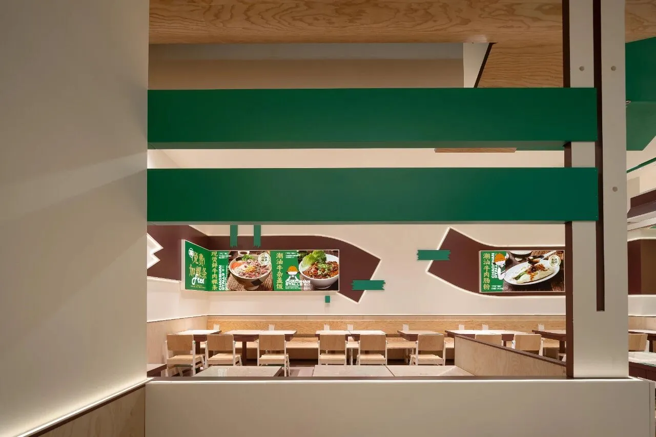
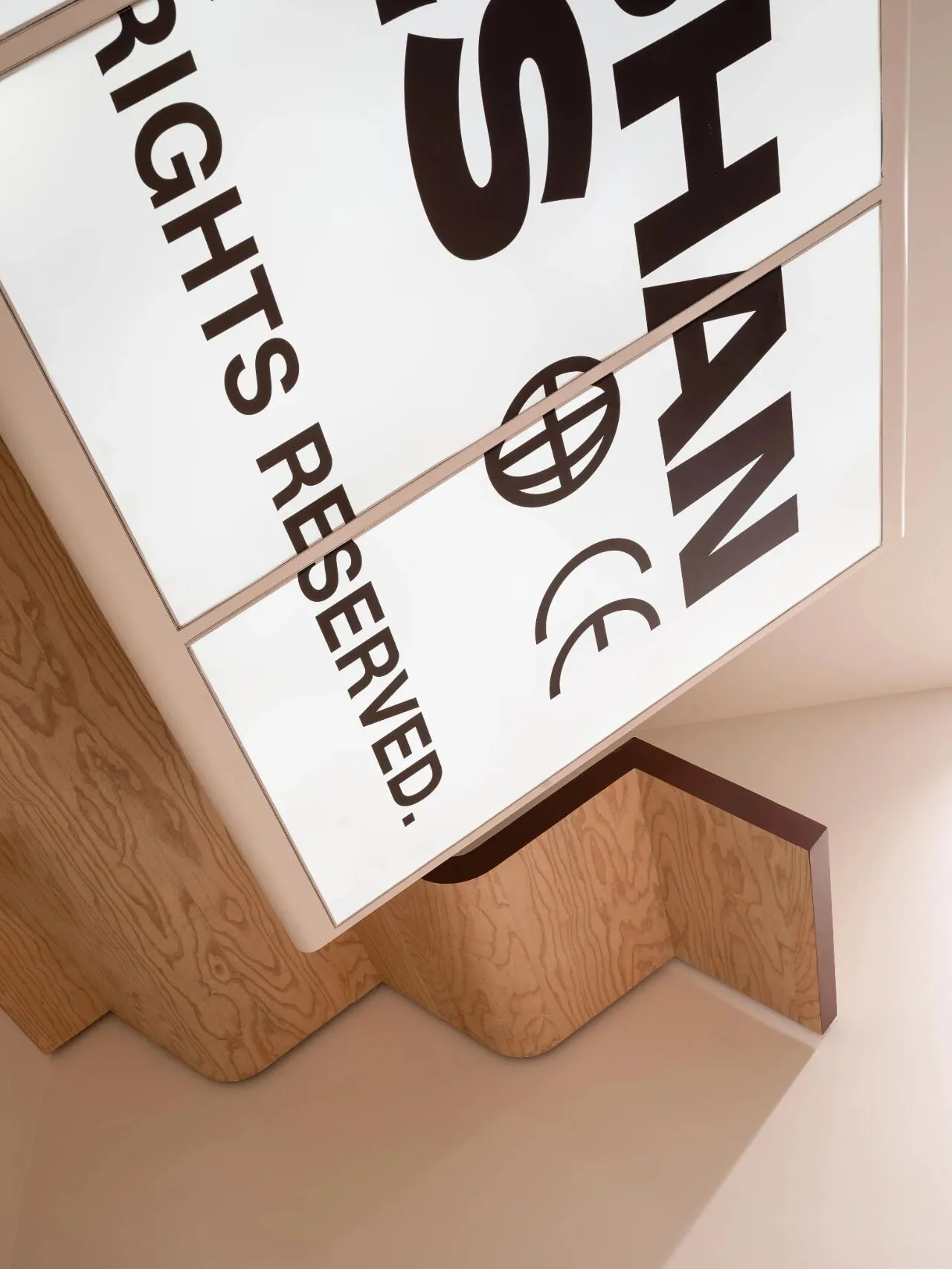
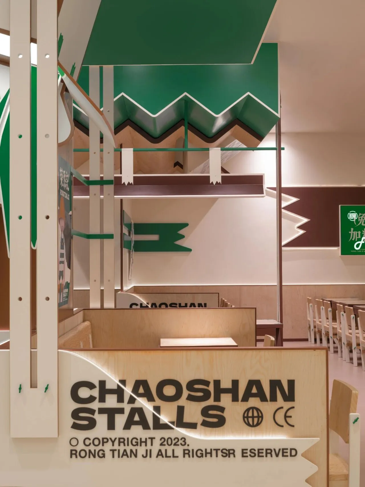
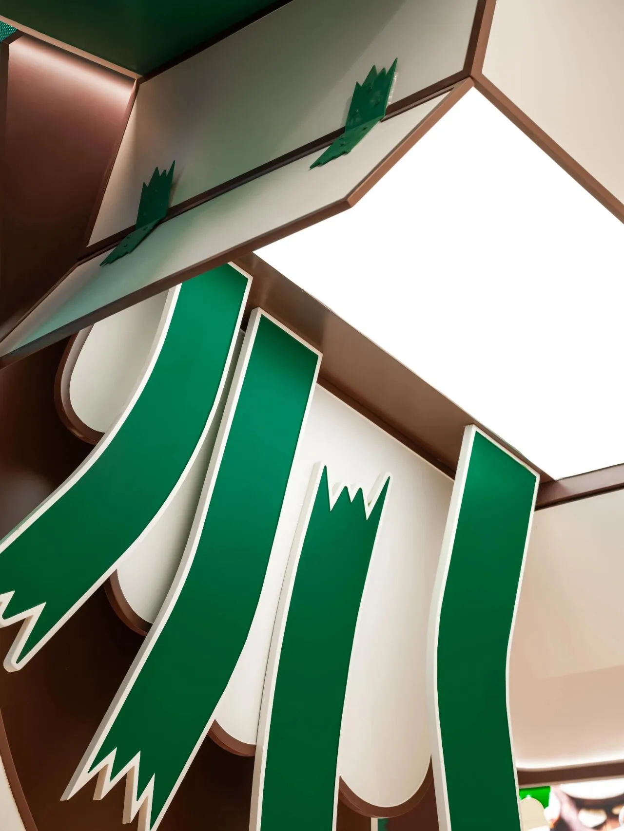
浅白木色予人温暖,方桌规整梳理秩序,餐饮空间的氛围便由此生成。而空间解构的趣味恰源于人们对未知世界的渴望和对日常环境重新审视的好奇心,于是色彩延展成为线条面块,而不规则的装饰则不断打破传统的空间结构和布局,用看似随意的重新组合与排列创造出全新的空间形态和视觉效果,挑战性与趣味性便也从设计之初一直到每一次路过与用餐……
The warm light wood tones and orderly square tables shape the atmosphere of the dining space. The interest in spatial deconstruction stems from people's desire for the unknown and curiosity to reexamine their everyday surroundings. Thus, colors extend into lines and planes, while irregular decorations continually disrupt traditional spatial structures and layouts. Seemingly random recombination and rearrangement create new spatial forms and visual effects, maintaining a sense of challenge and interest from the design's inception through every pass-by and dining experience...
▼轴测图

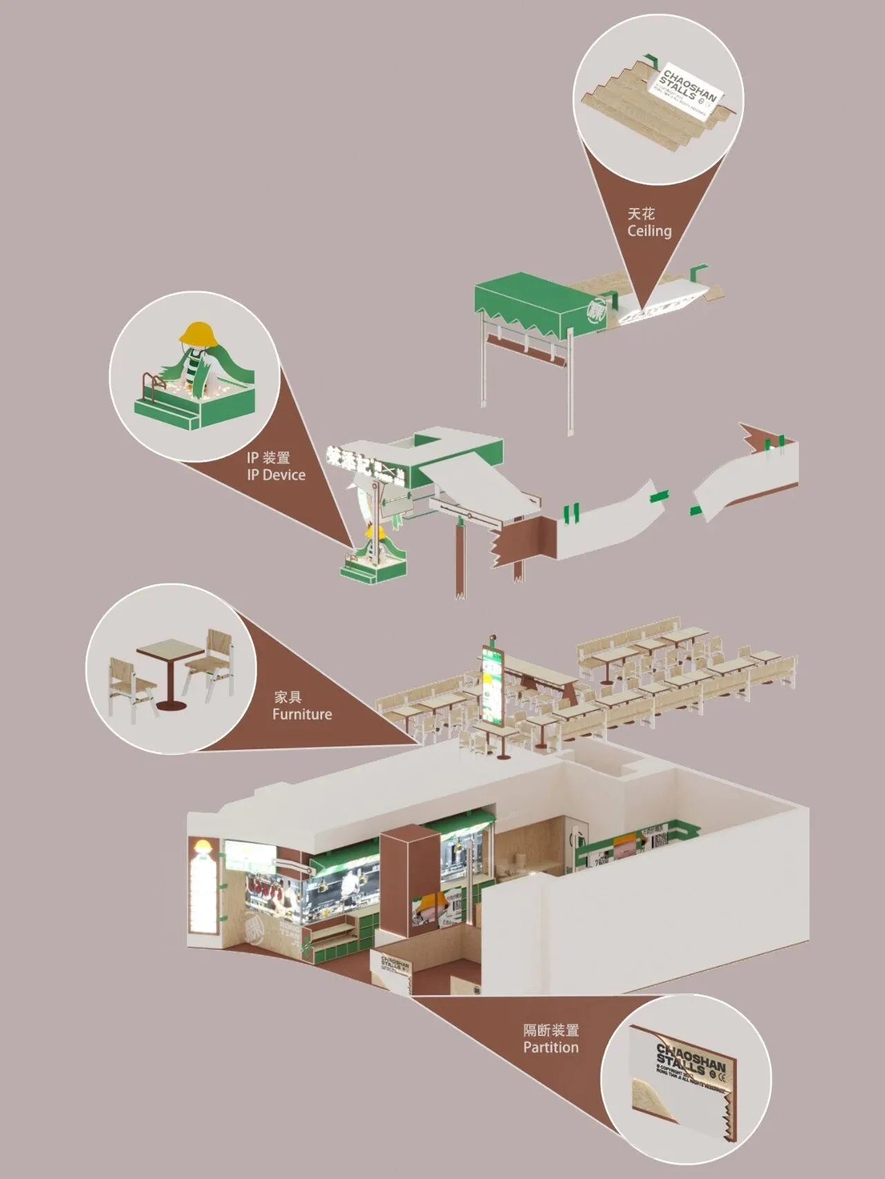
▼平面图
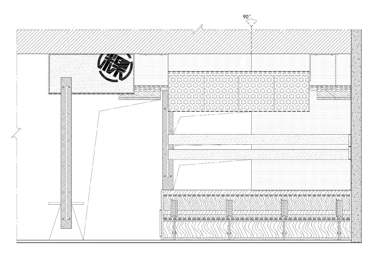
▼立面图
▽
项目名称:荣添记
Project Name: Rong Tian Ji
项目地址:苏州中心
Location: Suzhou, China
设计单位:无锡欧阳跳建筑设计有限公司
Design Company: OYTT Design
主案设计师:蒋越、欧阳跳
Chief Designer: Yue Jiang, Tiao Ouyang
执行主案设计师:周丹凤
Executive Chief Designer: Danfeng Zhou
辅助设计师:马小贝
Assistant Designer: Xiaobei Ma
项目面积:117平米
Area: 117 square meters
主材:防火板、砖、烤漆板
Main materials: fireproof board, brick, painted board
项目摄影:马利仁
Photographer: Liren Ma
设计成就:
• 加拿大 | 2023 加拿大GRANDS PRIX DU DESIGN设计大奖
• 中国 | 2023 第18届金外滩奖 最佳商业空间奖
• 美国 | 2022 Architizer A+Awards Popular Choice Winner
• 韩国 | 2022 亚洲设计奖Asia Design Prize
• 美国 | 2021 IDA DESIGN AWARDS HONORABLE MENTION
• 美国 | 2021 Best of Year Awards coffee/tea
• 中国 | 2021 NCA新商业空间设计师top10
• 中国 | 2021 NCA杰出新商业空间设计师TOP100
• 中国 | 2021 40UNDER40中国(无锡)设计杰出青年
• 德国 | 2020 红点奖
• 德国 | 2020 iF DESIGN AWARD
• 意大利 | 2020 意大利A'design award设计大奖 银奖、铜奖
• 荷兰 | 2020 Frame Awards
• 美国 | 2019 Best of Year Awards
• 美国 | 2019 Architecture Masterprize美国建筑大师奖
• 英国 | 2019 Restaurant & Bar Design Awards
• 意大利 | 2019 意大利A'design award设计大奖 金奖
• 法国 | 2018 IIDA全球设计大奖
• 美国 | 2018 美国IDA国际设计大奖优秀奖
• 中国 | 2019 中国设计·卓越青年城市榜(无锡)商业空间十强设计师
• 中国 | 2019 她设计年度优秀空间设计奖
• 中国 | 2019 金外滩奖餐饮空间类优秀奖
• 中国 | 2018 金堂奖年度优秀餐饮空间设计奖
• 中国 | 2018 红棉奖室内设计奖
• 中国 | 2018 IDS国际设计先锋榜优胜奖
• 中国 | 2017 金堂奖年度优秀休闲娱乐空间
▽
About Creative Director

欧阳跳OYTT DESIGN创始人
Ouyang Tiao OYTT DESIGN Founder
蒋越OYTT DESIGN创始人
Jiang Yue OYTT DESIGN Founder